
Back

Shruti
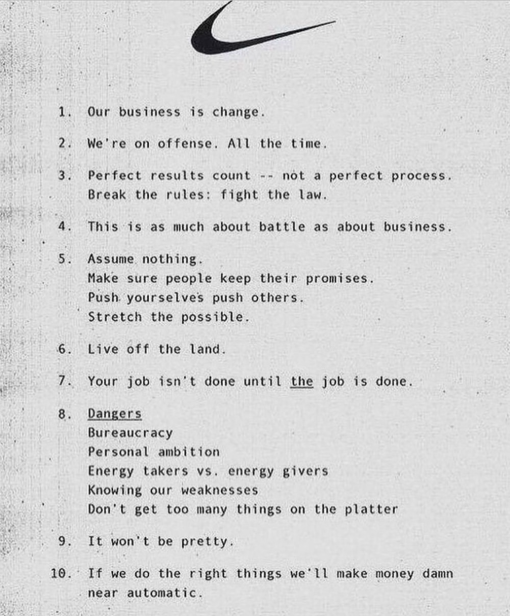
Student • 1y
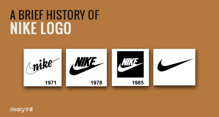
Did you know that Nike once had a different logo before the iconic Swoosh we know today? The original logo, designed in 1971 by Carolyn Davidson, was more complex and included the full name "Nike" alongside the Swoosh. Initially, it was not well-received by co-founder Phil Knight, who thought it would take time to grow on him. The logo was part of a broader visual identity for the company, which was then known as Blue Ribbon Sports before rebranding to Nike in 1971. Over the years, the logo underwent several modifications. In 1995, Nike simplified its branding by removing the company name entirely, opting for the Swoosh alone. This change reflected the brand's growing recognition, allowing the Swoosh to stand alone as a symbol of athleticism and victory, inspired by the Greek goddess Nike
Replies (9)


More like this
Recommendations from Medial


Hemant Prajapati
•
Techsaga Corporations • 1y
🔍 Nike: A Case Study in Branding and Innovation 🔍 🚀 The Rise of a Global Powerhouse 🔸 Founded in 1964 as Blue Ribbon Sports, later rebranded as Nike. 🔸 Founders Phil Knight and Bill Bowerman aimed to create superior athletic footwear. 💡 Bra
See More


Only Buziness
Everything about Mar... • 5m
Identity-based marketing focuses on aligning a brand with how customers see themselves — or who they want to become. Instead of selling products, it sells belonging. People don’t just buy sneakers; they buy the feeling of being athletic or trendy. Br
See More
/entrackr/media/post_attachments/wp-content/uploads/2021/08/Accel-1.jpg)


Download the medial app to read full posts, comements and news.