Back

Anonymous 3
Hey I am on Medial • 1y
If you're looking for tips, try focusing on the box model, flexbox, and grid—they're super helpful for designing responsive layouts. Keep up the momentum.
Replies (1)
More like this
Recommendations from Medial

Muttu Havalagi
🎥-🎵-🏏-⚽ "You'll N... • 1y
Here's a short roadmap for learning CSS: 1. Basic CSS: Start with understanding selectors, properties, and values to style HTML elements. 2. Box Model: Learn how the box model works, including margin, padding, border, and content. 3. Layout: Dive
See More

Vansh Khandelwal
Full Stack Web Devel... • 1y
Bootstrap is a powerful, open-source front-end framework for creating responsive websites quickly. Developed by Twitter, it features a 12-column grid system, pre-styled components, and extensive documentation. To get started, include Bootstrap via CD
See More
Jewelpik App
House of jewellery b... • 7m
Turn Your Instagram Page into a Mini Website with Grid Design Strategy In a digital-first world, your Instagram profile is often your first impression. With over 2 billion users, it’s more than a photo app—it's your brand hub. A Grid Design Strategy
See More
Makarand Mohite
Brand Designer • 3m
Behind every clean and professional design, there is an invisible grid. Grids are not about limiting creativity, they are about creating alignment and rhythm. When elements are placed with structure, the viewer’s eyes move smoothly, and the message
See More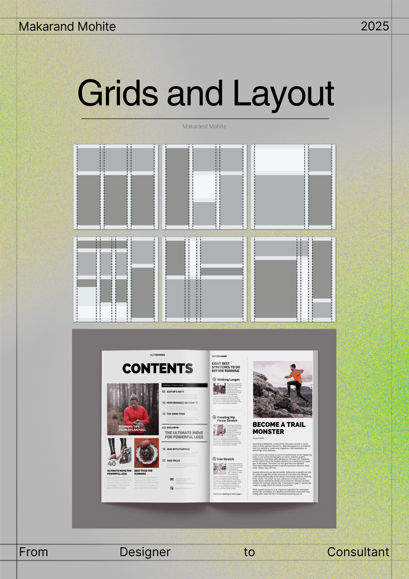


Om Badoni
B.tech CSE | A.I | M... • 1y
Hey everyone! I just wrote my first HTML program today and it feels amazing to finally dive into web development! 🚀 For all the experienced devs and beginners out there: 👉 What were your first steps in web development? Share your stories! 👉 Any
See More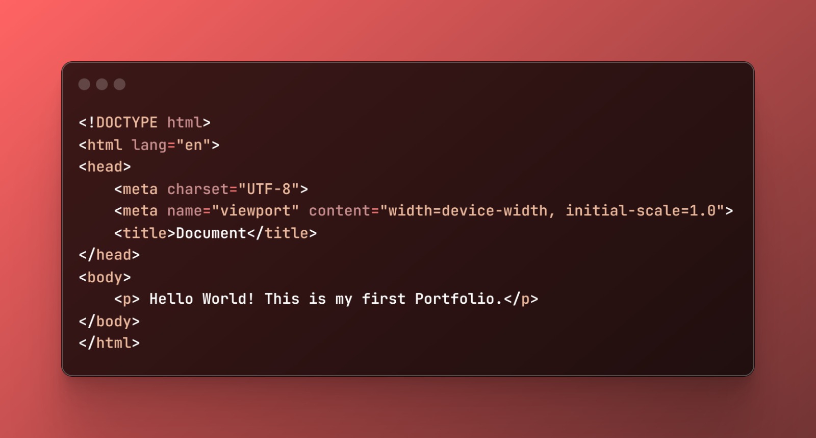


Makarand Mohite
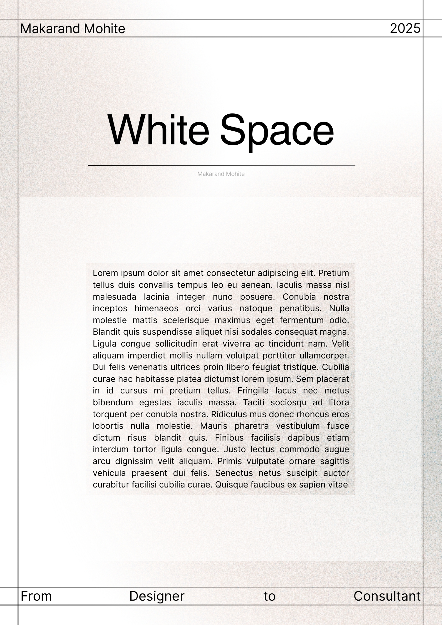
Brand Designer • 3m
Many beginners fear leaving “too much empty space” in their designs. But here’s the truth- White space is what makes your design breathe. It helps: Create focus on what matters most Improve readability Make layouts feel premium and intentional T
See More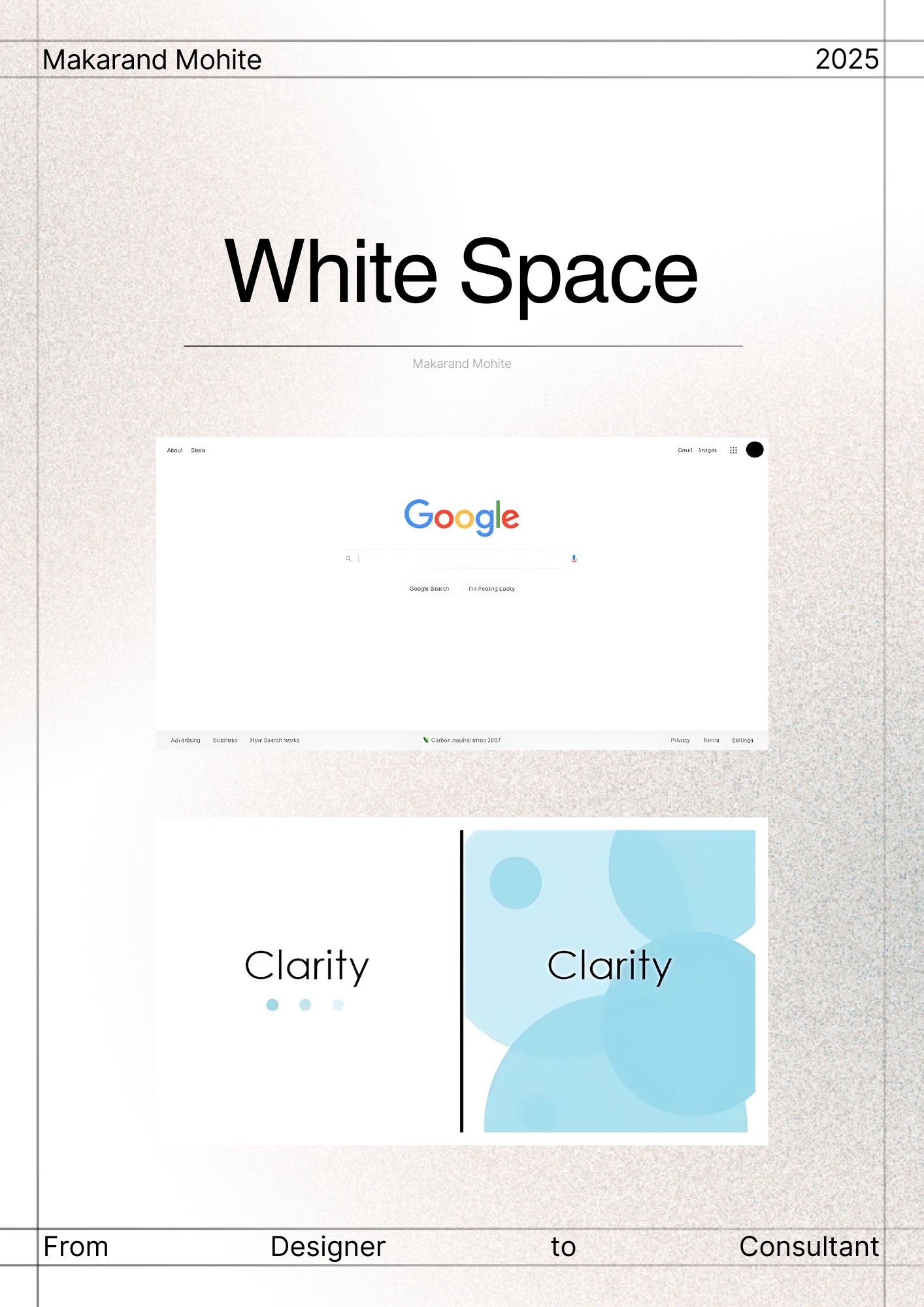

Prakhar Sharma
Hey I am on Medial • 5m
🚀 Hey everyone! I’m a student working on an exciting AI-powered personalized education platform that creates unique video lessons tailored to each learner’s pace and style. I’d love to hear your thoughts: What features would you find most useful i
See More
Thakshina Moorthy G M
Brand Designer • 6m
Do You Use the Golden Ratio in Your Design Process? As designers, we talk so much about layout, balance, and composition — but how many of us actually use the Golden Ratio (1.618) in our creative flow? The Golden Ratio has existed in art, architectur
See More


Download the medial app to read full posts, comements and news.