
Back

Mehul Fanawala
•
The Clueless Company • 6m
SaaS Audit #5: Lumi AI First impressions on a website matter a lot, especially when you’re asking users to book a demo. Even small frictions can quietly reduce conversions. When I explored Lumi AI’s website, here are a few observations that could make the journey smoother and more effective 👇 [1] SEO foundation: The site is missing a canonical tag. While invisible to users, it’s important for search engines to correctly index pages and avoid duplicate content issues. [2] Form validation: On the “Watch Demo” flow, I could submit entries like *a@b. com* and phone number “1.” Stronger validation not only improves data quality but also shows professionalism. [3] Demo booking flow: After form submission, the “Book Personalized Demo” button opens Calendly on the same page. Better to either: 1. Open it in a new tab so users stay on your site, or 2. Embed the calendar directly on your website for a seamless experience. [4] AI readiness assessment: Out of 10 questions, only 1 is mandatory. With so few required answers, results may not be meaningful. Adding more mandatory fields could make the insights stronger. [5] Calendar consistency: Currently, there’s a mix of HubSpot calendar on one page and Calendly on another. It’s best to standardize on one (ideally HubSpot, since it connects directly with CRM). This avoids confusion and eliminates manual entry. None of these issues are critical, but together, they create unnecessary friction. A clean, consistent flow gives prospects confidence that the product will feel the same way. 💡 Takeaway: In SaaS, consistency in the journey builds confidence in the product. ______________________________ This post is part of my SaaS Audit series where I review recently funded startups and share quick, actionable observations. If there’s a SaaS app you’d like me to audit next, drop it in the comments or DM me. I’d be happy to take a look!
More like this
Recommendations from Medial
Mehul Fanawala
•
The Clueless Company • 6m
SaaS Audit #6: SpaceBasic Booking a demo should feel effortless. Even small frictions can quietly reduce conversions and create a less-than-perfect first impression. I recently explored SpaceBasic’s website and noticed a few areas that could improv
See More


Mehul Fanawala
•
The Clueless Company • 6m
SaaS Audit #3: Plain A website demo flow should feel smooth and effortless, after all, it’s often the first real touchpoint with your product. When I reviewed Plain’s website, I came across a few areas where the experience could be made simpler and
See More
Mehul Fanawala
•
The Clueless Company • 6m
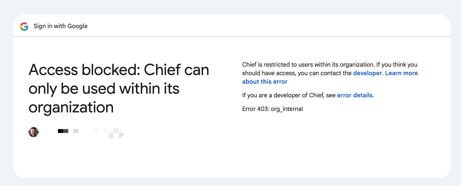
SaaS Audit #1: Chief Every SaaS founder dreams of a smooth user journey… But sometimes, even great startups unintentionally create roadblocks that hold users back. Recently, I explored Chief’s website and found a few areas where small changes coul
See More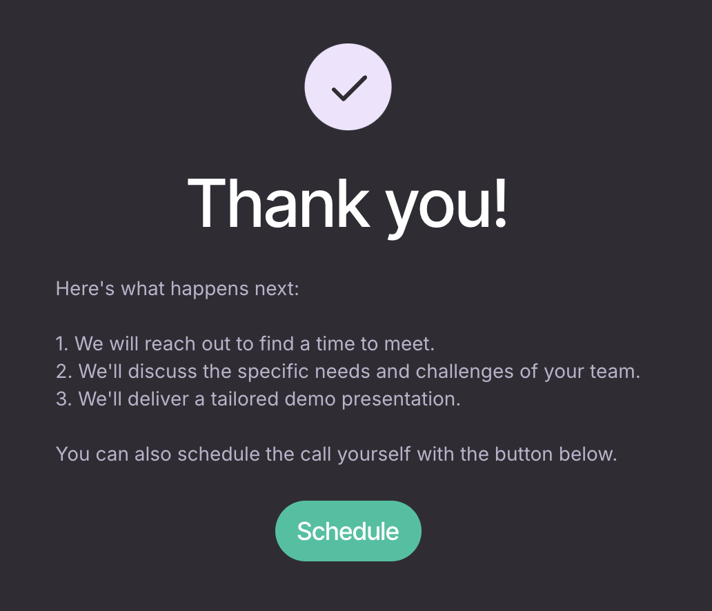


Mehul Fanawala
•
The Clueless Company • 6m
SaaS Audit #2: Qme Sometimes the smallest gaps on a website can create the biggest confusion for users. I recently explored Qme’s website and noticed a few areas that could be improved, not just for them, but as learning points for any SaaS founder
See More
Mehul Fanawala
•
The Clueless Company • 4m
What a Monday. I thought I’d get a few things done. Instead, I ended up setting half the startup on fire in the best way possible. I planned to set up Google Workspace, HubSpot, and ClickUp. Simple day. No drama. But once I started, it all snowbal
See More

/entrackr/media/post_attachments/wp-content/uploads/2021/08/Accel-1.jpg)


Download the medial app to read full posts, comements and news.