Back
Havish Gupta
Figuring Out • 1y
Why are logos getting simpler? For a long time, logos were real work of art filled with symbols, shape and what not. But now it's nothing more than just a text with a unique font. So this trend of simplifying logo mainly started in 2007 when Steve just got up and announced the iPhone! Coz of the iPhones, you can now create mobile apps and reach more users But there was a problem! Those older fancy logos didn't necessarily fit in the small square icon as required by an app, so thus they had to simplfy it. This trend was further gained momentum when companies like MasterCard n Apple further simplified their logo thanks to users who like minimalistic ui. And a bonus, having a simple logo made it easier for the companies to expand to new markets without having the need to make new or change their logos Tho, you can't deny that this trend has eroded the identity of some companies. What do you think?
Replies (15)
More like this
Recommendations from Medial
Shailesh Charan
Sophisticated in you... • 1y
Did you know that logos play a crucial role in branding? From colors to icons, every element symbolizes a brand’s identity! But guess what? Instead of creating unique symbols for their brands, many people are just copying others. If you're new to t
See More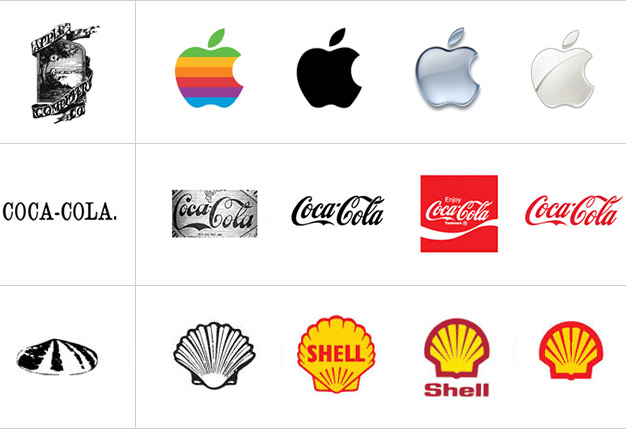
Pallav Burnwal
Want to create Somet... • 1y
🎨 Transform Your Brand with a Stunning Logo! Looking for a professional, creative, and unique logo to represent your business? Look no further! I specialize in designing custom logos that capture the essence of your brand and make a lasting impress
See More


Suhani Gupta
"Just figuring out w... • 8m
The First Indian Brands that Built Nations Branding is not just about products. It’s about identity. In pre-independence India, a few brands became symbols of pride: Tata: Industrial strength with integrity. Amul: The white revolution in a logo.
See MoreDownload the medial app to read full posts, comements and news.













/entrackr/media/post_attachments/wp-content/uploads/2021/08/Accel-1.jpg)


