Back
Sajin
•
Foundation • 1y
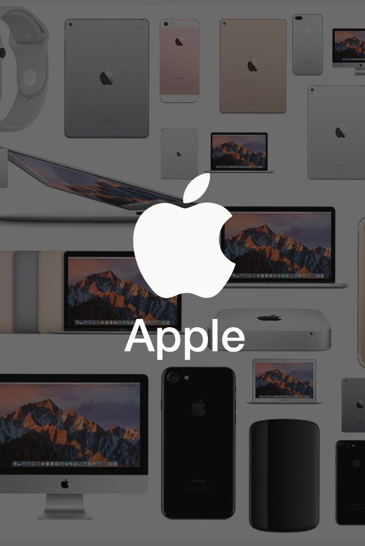
One of the reason is that app logos looked very cluttered on mobile screen when designed in 3D. This was also noticed by Microsoft on Windows Phone. Windows made their first switch in 2012 for Windows8. iPhone made the switch from 3D logos to shadowless simple flat logos with iPhone 5s release in 2013 realising the easy to use. Following this Twitter, Adobe, Instagram changed their logos Removing the visual noise was quite a good step. But now everything is simple from logos to interior design and handicrafts
Replies (1)
More like this
Recommendations from Medial
Rahul Agarwal
Founder | Agentic AI... • 1m
It’s Thursday. I track AI updates so you don’t have to. Here are 6 of them worth knowing. 1. OpenClaw (Clawdbot / Moltbot) Your WhatsApp can now control your laptop. Runs locally, executes tasks from text, and raises big security questions. 2. Cl
See MoreSyed Mohammed Sohail
"Innovator in AI Hea... • 8m
Did you know Uber started as a tiny MVP? When people talk about “building an MVP”, they don’t mean some big fancy app or website. 👉 It’s about building the smallest, simplest version of your idea to see if people actually want it. Here’s how some
See MoreDownload the medial app to read full posts, comements and news.














/entrackr/media/post_attachments/wp-content/uploads/2021/08/Accel-1.jpg)


