Back
Sajin
•
Foundation • 1y
I agree they didnt do their UI well, despite having a large design team. But separate apps could be another disaster when it comes to marketing and gaining users. I dont like using Swiggy simply because of their all in one home page makes more to scroll more buttons to press Dont you think separate tabs for separate verticals could be a much better option?
Replies (1)
More like this
Recommendations from Medial
Shreyash Siddharth
Engineer at Lana Hea... • 1y
Just an Idea for Food Delivery Apps To have a Food reels section cause MOST people cant decide what to eat online but if they scroll through their food reels section looking tasty , something will catch their eye and they will be more likely to or
See MoreHimanshu Dodani
Start now what you j... • 9m
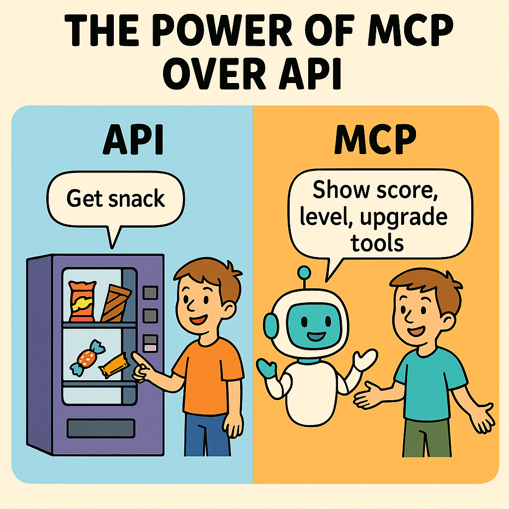
MCP – The Future Tech Everyone Will Use Tomorrow (Don't Get Left Behind!) -- Imagine you're playing a video game. You press a button, and the game shows your score. That button is like an API (Application Programming Interface). APIs help apps talk
See More
Siddharth K Nair
Thatmoonemojiguy 🌝 • 7m
YouTube is slowly becoming ShortTube. 😤 Is anyone else getting seriously annoyed by how YouTube pushes Shorts now? Every time I open the app, it jumps straight into Shorts. I didn’t ask for that. When I search for proper videos, I have to scroll p
See More
Harsh Gupta
Digital Marketer (Me... • 1y
Hi Niket Raj sir 👋 Just encountered an issue . If any post has too many comments (let say : 80+) then it became very irritating and frustrating to read the comments and their replies, since what is happening, assume i had scrolled down and tap on
See MoreLuv G
Put a little Luv int... • 1y
Instead of building a separate app, Threads, Meta should’ve integrated Threads in the Instagram app itself. 1. Users could switch b/w Instagram & Threads easily through the dropdown menu which would be more convenient. (img 1) 2. Every profile cou
See More

Aarihant Aaryan
Prev- Founder & CEO ... • 1y
Bangkok went from being a normal city to the tourism capital of the world, with 30M tourists visitng thailand every year, Infact today tourism contributes to 20 to 25% of their GDP In early 2000's Thailand was stuck in their own problems with asia
See MorePRIYANSHU GALANI
Pursuing BTech IT • 1y
🚀 "Imagine Learning While You Scroll." 🎧 We’re building Podware—a platform where podcasts go beyond listening: ✅ Interactive Q&A with podcasters ✅ AI-generated short reels tailored to your focus span ✅ Earn rewards while sharing valuable content
See MoreDownload the medial app to read full posts, comements and news.


/entrackr/media/post_attachments/wp-content/uploads/2021/08/Accel-1.jpg)


