Back
Raj
Raj • 10m
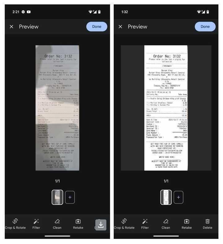
The scroll position loss bug and image cropping was a much needed fix. The updated UI is great. Do fix these two minor things as well - 1. The sequence in which like and bookmark buttons appear for the original post and the following reply. They somehow interchange their positions. 2. If the image and medial app's background have the same color, it's hard to tell if it's an image in the post or an actual post. Adding a contrasting drop shadow might help I guess.

Replies (1)
More like this
Recommendations from Medial
Download the medial app to read full posts, comements and news.

