
Back

Makarand Mohite
Brand Designer • 6m
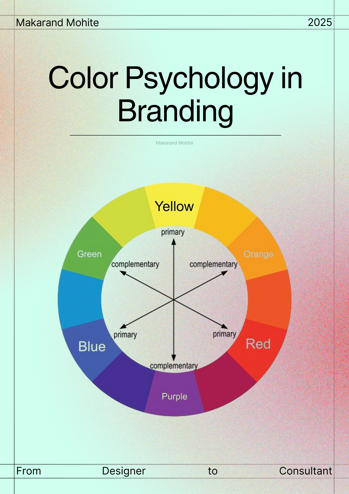
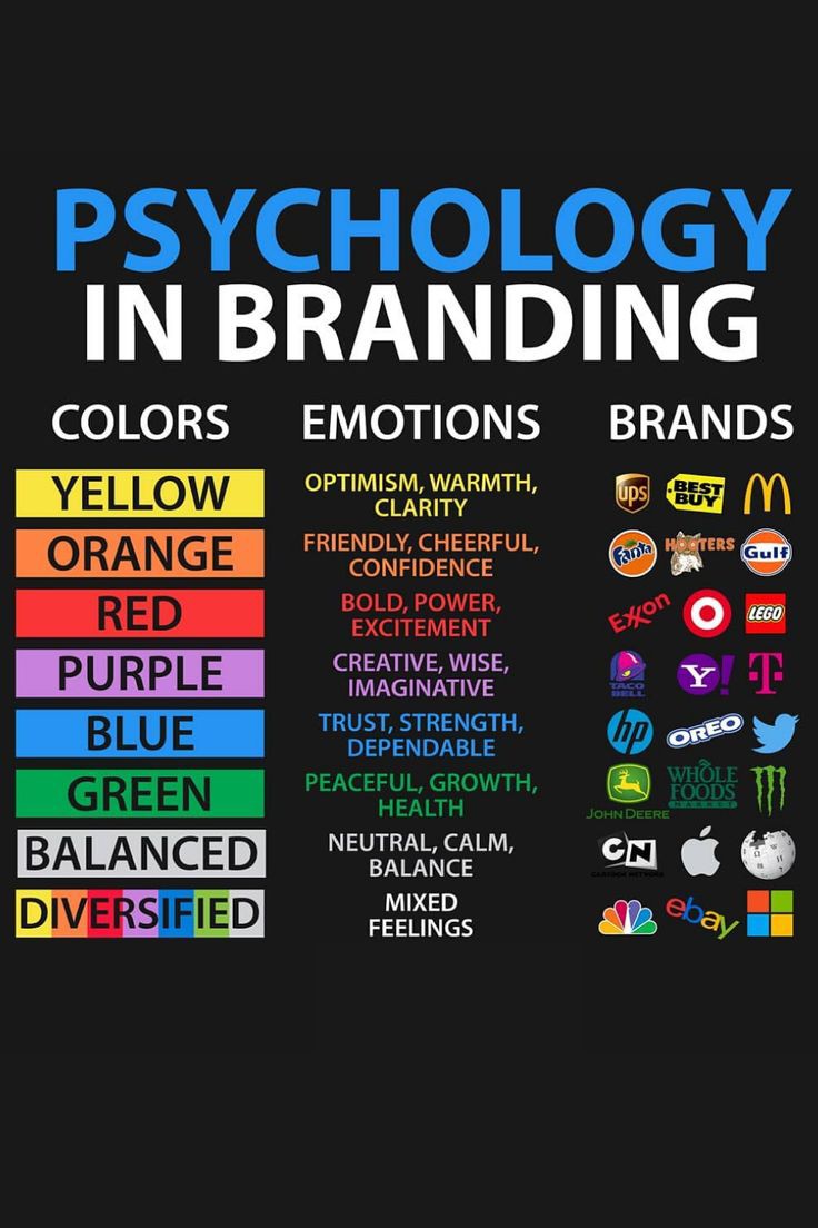
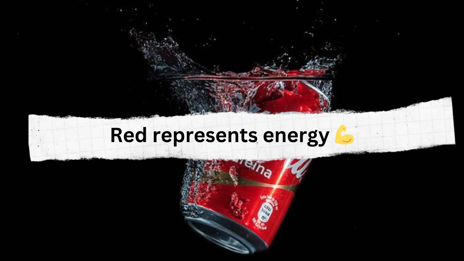
Colors aren’t just visuals, they carry emotions and shape how people perceive your brand. Choosing the right palette can make your design memorable and impactful. Red - Energy, passion, urgency (used in sales or food industry). Blue - Trust, calmness, professionalism (common in corporate brands). Yellow - Optimism, friendliness, attention-grabbing (great for cheerful brands). Green - Nature, balance, growth (used by eco-friendly or wellness brands). Black - Luxury, sophistication, authority (premium/luxury products). Purple - Creativity, wisdom, royalty (used in beauty and lifestyle). When selecting colors: Keep your target audience in mind. Stick to 2-3 core colors for a consistent identity. Always test colors in digital + print to ensure accuracy. Tip: Color psychology is a guide, not a strict rule, or experiment, but make sure your choices align with your brand story. If you found this helpful, check this out https://www.behance.net/gallery/234027023/Kawi-Cafe
More like this
Recommendations from Medial


Makarand Mohite
Brand Designer • 6m
Design without Marketing research is just decoration. Every strong brand is built at the intersection of creativity and strategy. Before you design, ask yourself: Who is the audience? Where do they spend their time? What problem are we solving fo
See More

Account Deleted
Hey I am on Medial • 1y
trend of luxury brands entering the world of sports: * Luxury brands are increasingly partnering with athletes and sports teams to reach a broader audience and tap into the growing influence of athletes as cultural icons. * This trend is being dr
See More
Makarand Mohite
Brand Designer • 6m
Behind every clean and professional design, there is an invisible grid. Grids are not about limiting creativity, they are about creating alignment and rhythm. When elements are placed with structure, the viewer’s eyes move smoothly, and the message
See More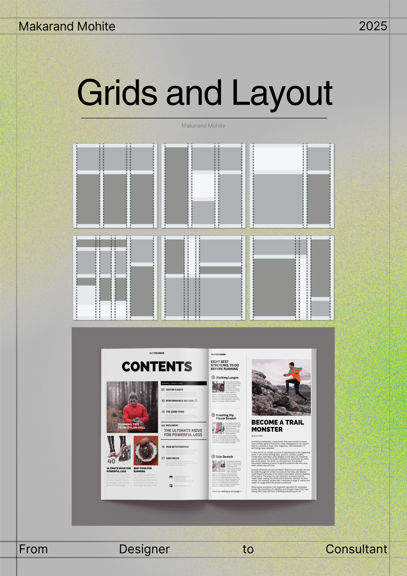


Shashank Vishwakarma
Be creative every ti... • 1y
Why luxury Brands started to targeting "Zen-G" more? And offers them there products on discounts. Now a day's people buys luxury products or premium products in loan just to show off not all but many, these are the things company get there products
See More


/entrackr/media/post_attachments/wp-content/uploads/2021/08/Accel-1.jpg)


Download the medial app to read full posts, comements and news.