
Back
Replies (1)
More like this
Recommendations from Medial


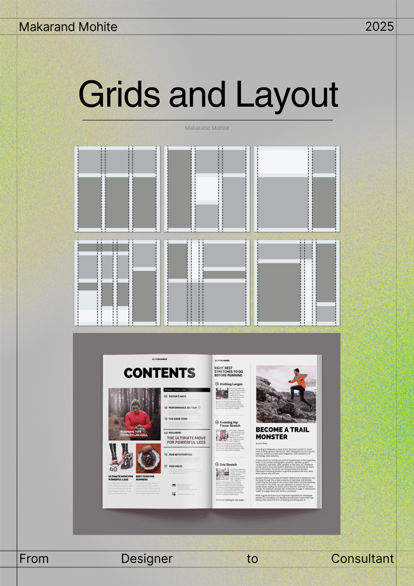
Makarand Mohite
Brand Designer • 6m
Colour ≠ Luxury. The right colour combinations = Luxury. Anyone can pick a fancy shade like emerald green, royal burgundy, or gold. But what makes a brand truly feel premium is how these colours are paired. Deep green with muted gold. Burgundy with
See More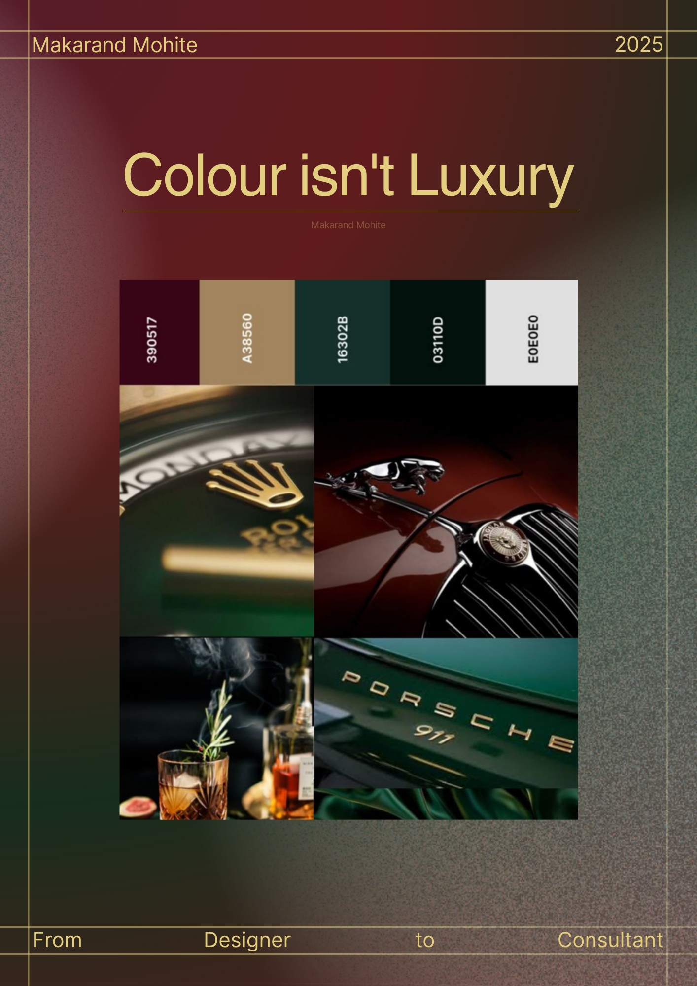
Reply
4
11

Ahemad Raza
Senior Graphic Desig... • 1m
There are three responses to a piece of design - yes, no, and WOW. And WOW is the one to aim for. WOW happens when design does more than look good. It feels right. It speaks without explaining. It makes people pause for a second longer. As a design
See More Reply
1


/entrackr/media/post_attachments/wp-content/uploads/2021/08/Accel-1.jpg)


Download the medial app to read full posts, comements and news.