
Back


Medina Jalal
•
Z Lane Marketing • 9m
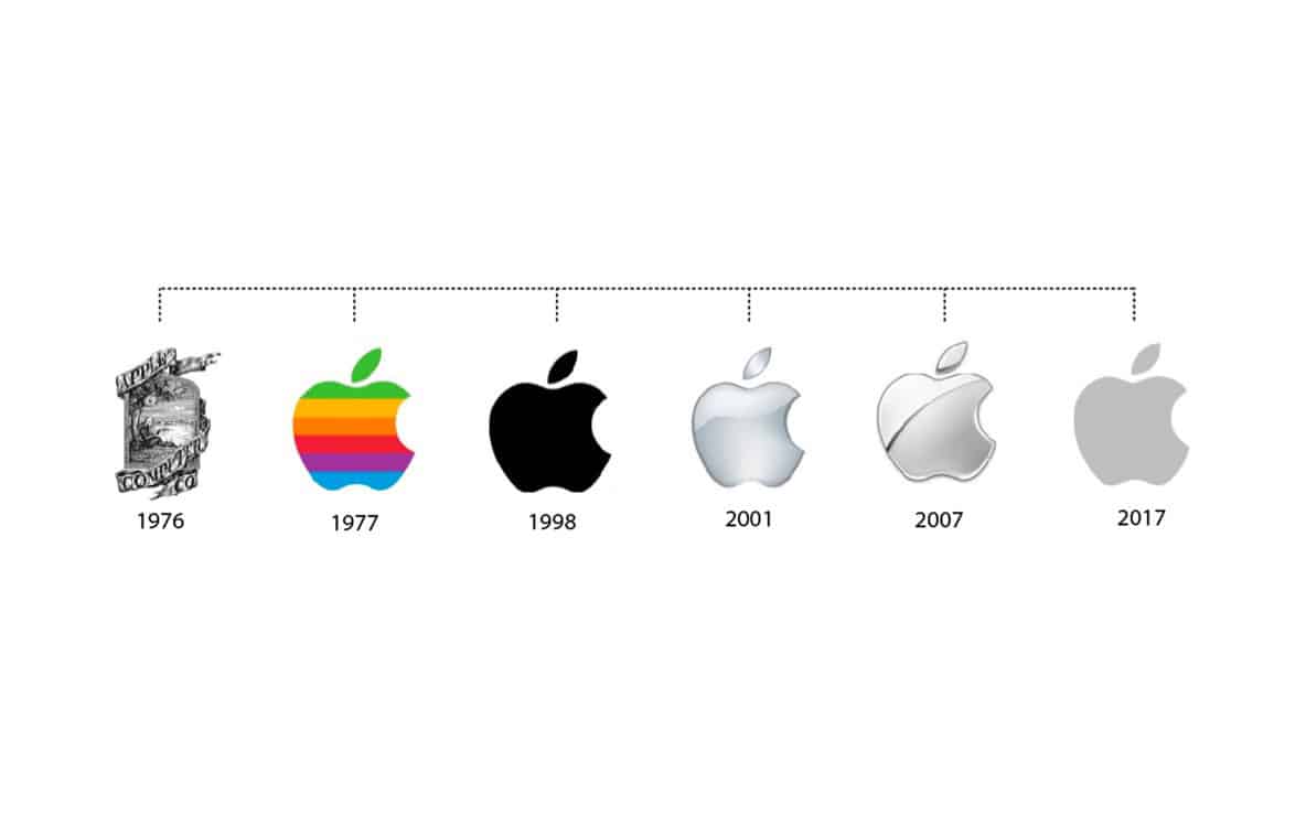
💰 Compensation At the time, Rob Janoff was a salaried employee earning $21,000 per year. He did not receive additional payment specifically for the Apple logo design. This is modest compared to today's branding budgets, which can reach hundreds of thousands of dollars . 🎨 Design Details Concept: Janoff purchased apples and studied their cross-sections to create a simple, recognizable shape. The "bite" was added to distinguish the apple from other fruits and to play on the word "byte" . Color: The rainbow stripes were included to showcase the Apple II's color display capabilities, a significant innovation at the time. The color order was chosen for aesthetic reasons, not symbolic ones . Presentation: Janoff presented multiple versions of the logo—striped, solid, and metallic—with and without the bite. Steve Jobs selected the striped version with the bite, which became the company's logo for over two decades .
More like this
Recommendations from Medial


Nareshcreates
Logo & Brand Identit... • 1y
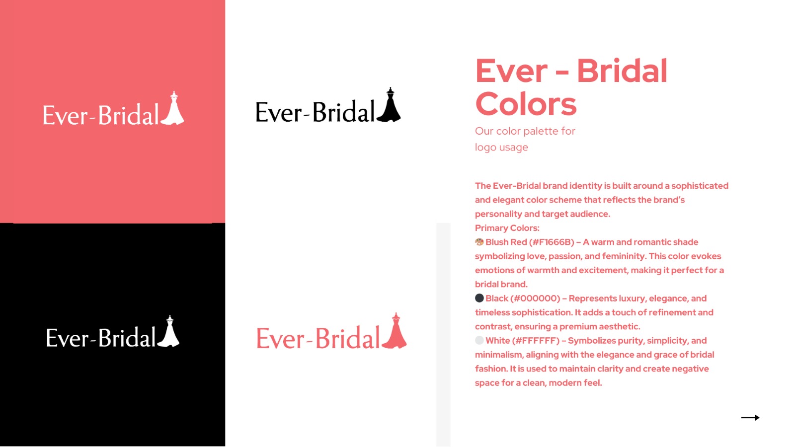
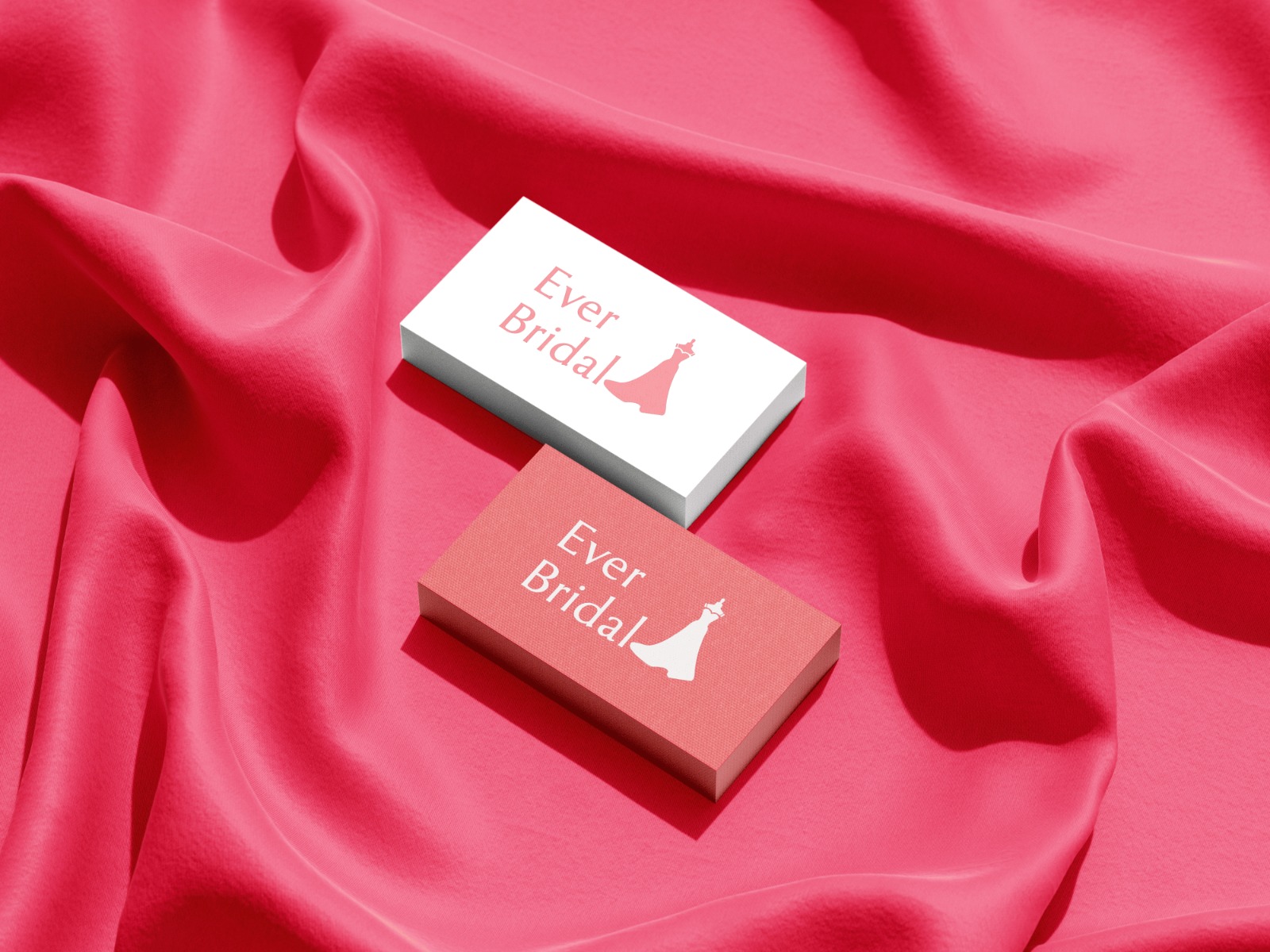
Excited to share my latest branding project – EverBridal! ✨ Designing this identity was an amazing journey, focusing on elegance, simplicity, and a timeless feel for the brand. From the logo to the color palette, every detail reflects the essence of
See More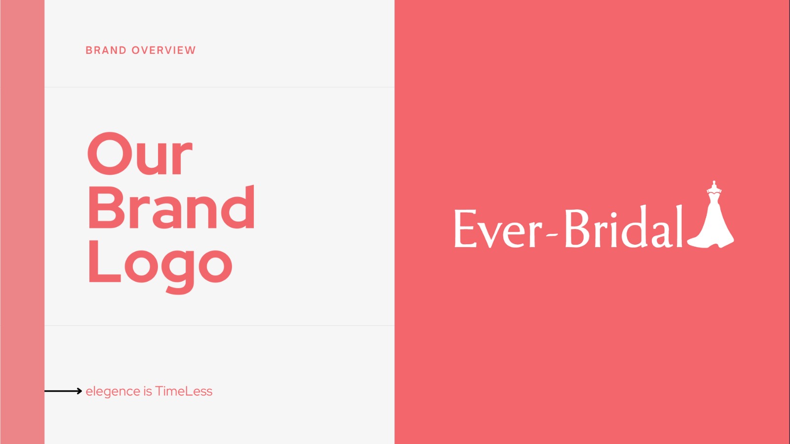


The Logo Guy
InkMyStartup | Fishy... • 8m
How many times has a client asked you to “try a few more color options”? Or as a client, how frustrating is it to wait for your designer to send back every single color version of your logo? 🎨 Imagine if you could change the colors yourself, experi
See More


Sulaiman P
Brand Identity Desig... • 1m
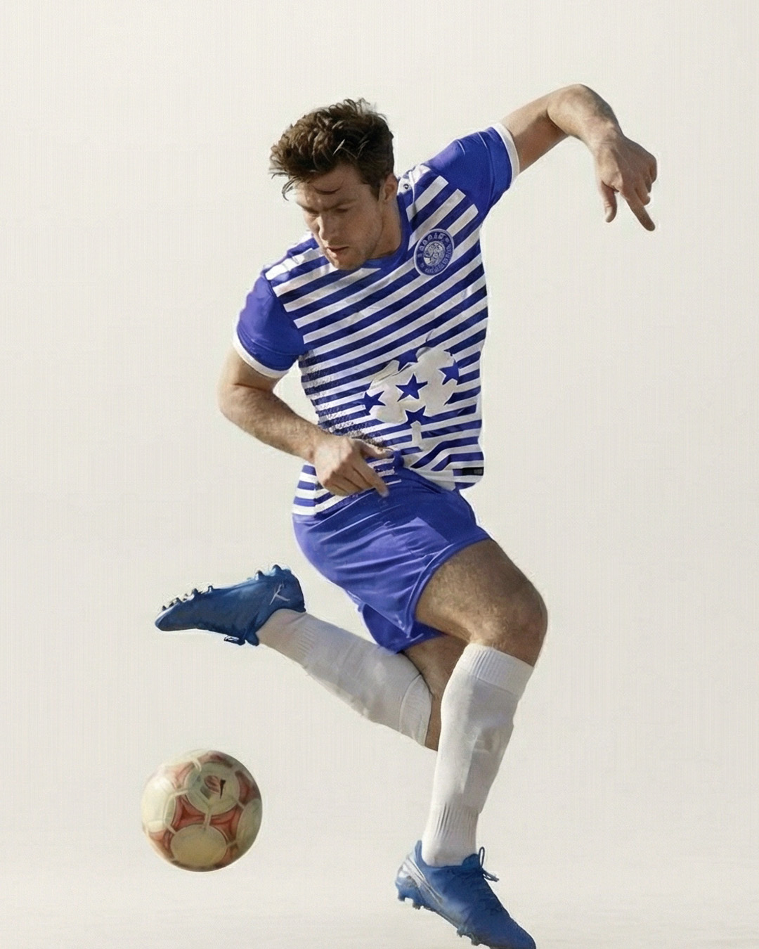
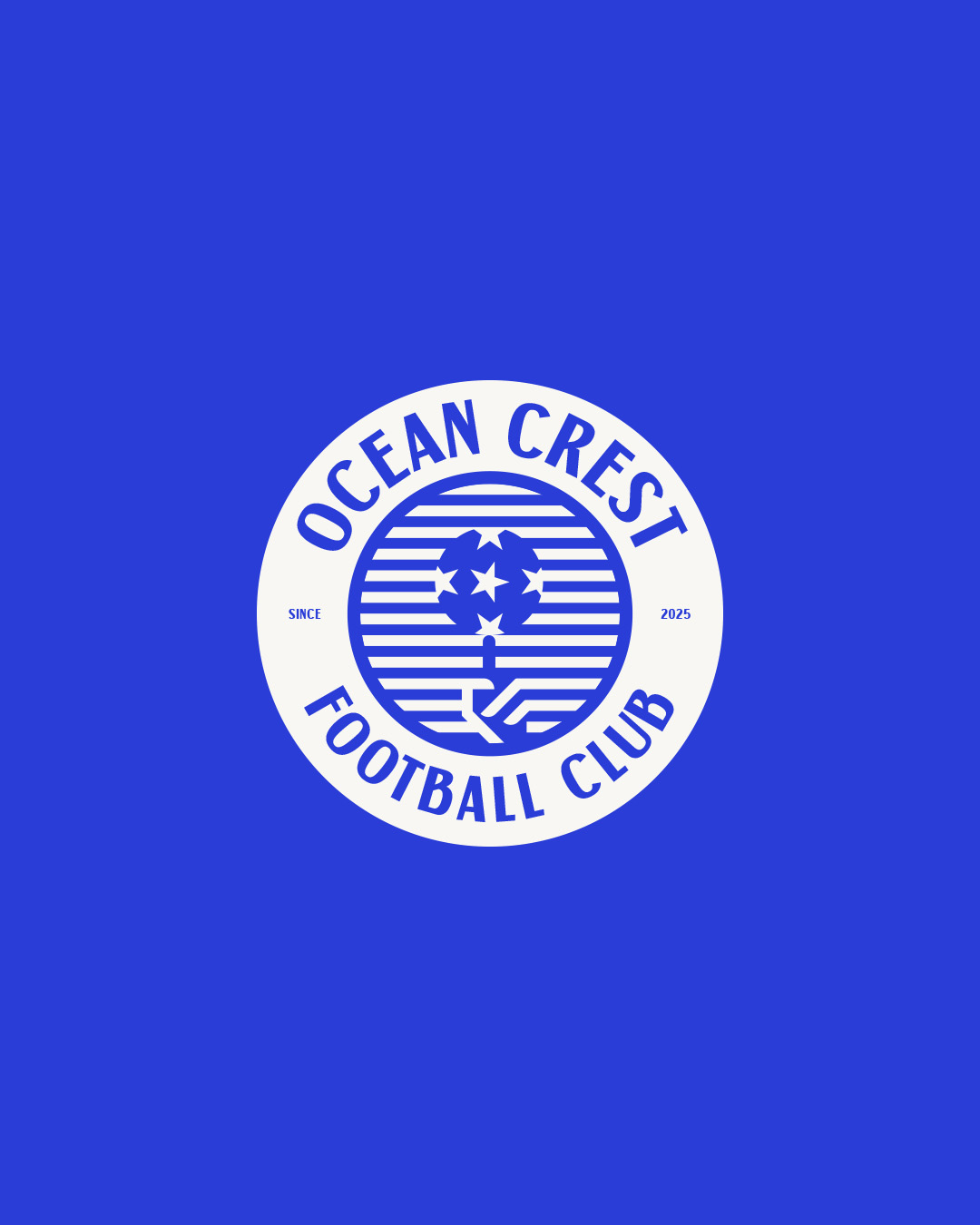
this logo design created for a local football club. The concept is inspired by a football spinning on the finger, symbolizing control, balance, and skill. Blue was chosen as the primary color to represent strength, trust, and unity core values of the
See More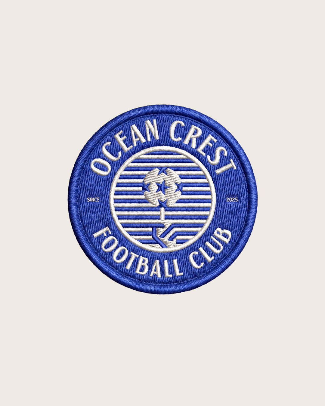


/entrackr/media/post_attachments/wp-content/uploads/2021/08/Accel-1.jpg)


Download the medial app to read full posts, comements and news.