
Back


Rupesh Kumar
Pharmacist | In Sear... • 10m
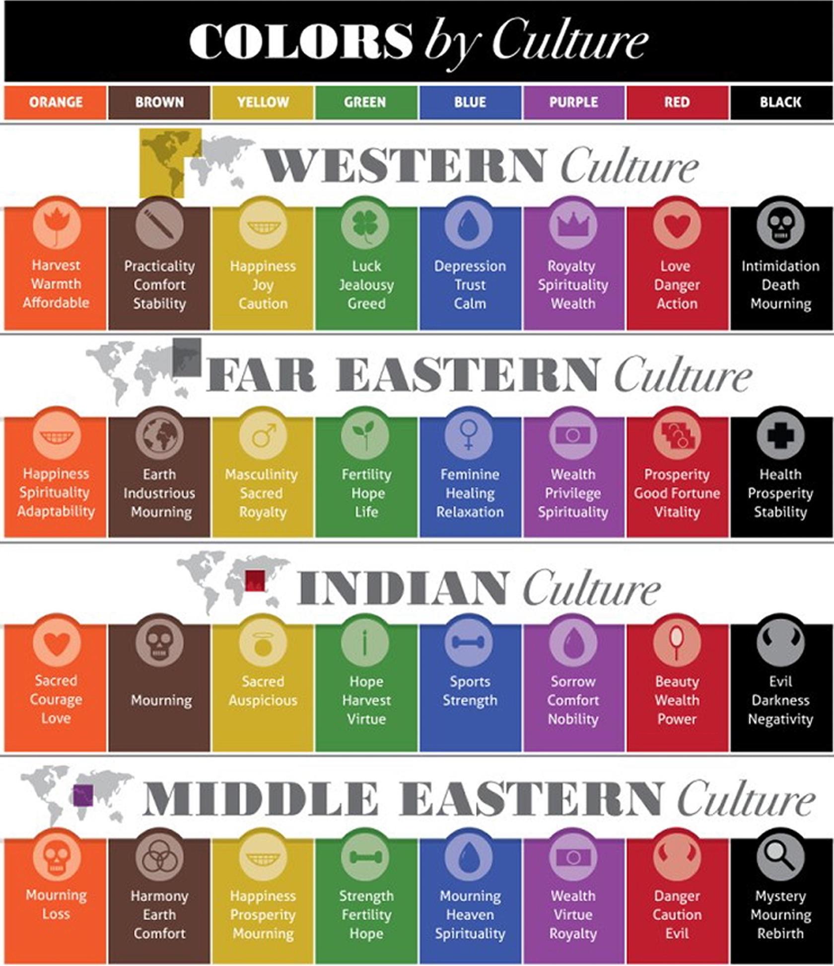
The logo and all over things good but it doesn't look smooth.. little disconnected feels between logo and fonts and colors... Make it more appealing.. maybe u can switch the drees logo into the right side and play with fonts & placing.
More like this
Recommendations from Medial


The Logo Guy
InkMyStartup | Fishy... • 8m
How many times has a client asked you to “try a few more color options”? Or as a client, how frustrating is it to wait for your designer to send back every single color version of your logo? 🎨 Imagine if you could change the colors yourself, experi
See More


Harshal Naidu
part-time writer, fu... • 10m
Hi Medial fam, Did you get a chance to look at the new 'G' - Google logo? It looks like a new change after a decade, shifting from solid colors to a colorful gradient. I'm looking forward to how this design could reflect Google's interconnected ec
See More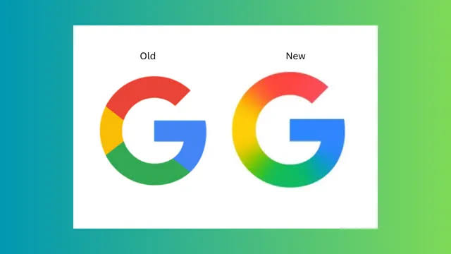


/entrackr/media/post_attachments/wp-content/uploads/2021/08/Accel-1.jpg)


Download the medial app to read full posts, comements and news.