
Back

Harshal Naidu
part-time writer, fu... • 10m
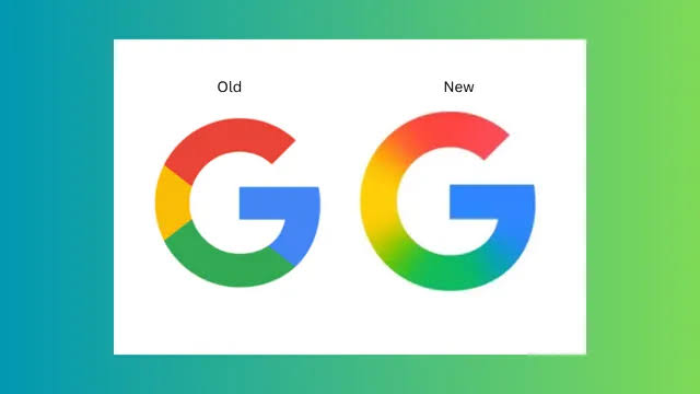
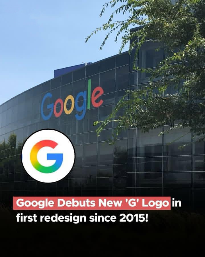
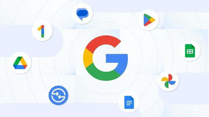
Hi Medial fam, Did you get a chance to look at the new 'G' - Google logo? It looks like a new change after a decade, shifting from solid colors to a colorful gradient. I'm looking forward to how this design could reflect Google's interconnected ecosystem across its products and services, with those colors blending together. Is it a move towards greater aesthetic and visual harmony, or is something potentially thrilling cooking in the Google labs for the future? What do you think the new logo represents? Can't wait to get your opinions! Photo credits: Social Samosa
Replies (2)

More like this
Recommendations from Medial


The Logo Guy
InkMyStartup | Fishy... • 8m
How many times has a client asked you to “try a few more color options”? Or as a client, how frustrating is it to wait for your designer to send back every single color version of your logo? 🎨 Imagine if you could change the colors yourself, experi
See More


/entrackr/media/post_attachments/wp-content/uploads/2021/08/Accel-1.jpg)


Download the medial app to read full posts, comements and news.