
Back

Gaurav Verma
Head - Revenue Marke... • 11m
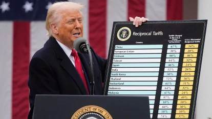
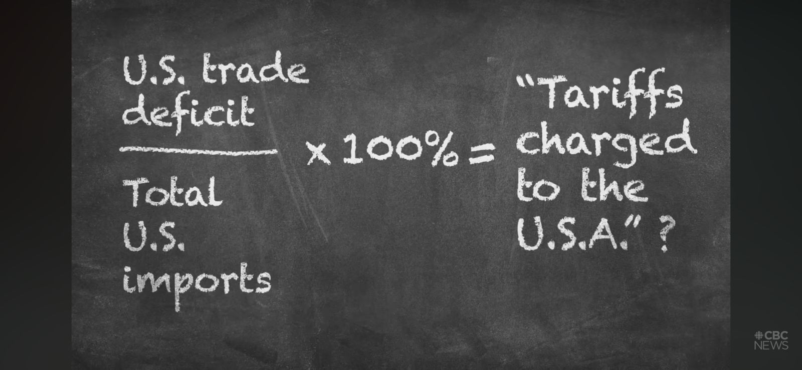
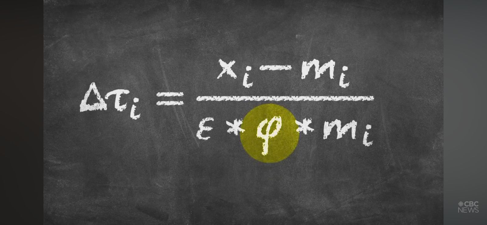
The “Complicated” Math Behind Trump’s Tariffs? Or is it really complicated? Or is it even math? So, Donald Trump announced his tariffs to the world, armed with some very serious-looking charts. One of them had a table with three columns: - Country Name - Tariff Charged to the USA (including currency manipulation and trade barriers) - The USA’s Discounted Reciprocal Tariff Now, let’s focus on column 2—because column 3 is basically just a remix of column 2 with a new label. Here’s the wild part. With access to top-tier economists, financial wizards, and bankers (theoretically), you’d think the Trump team would’ve analysed each country’s tariffs, trade policies, and central bank shenanigans, right? WRONG. Instead, the number shown on these charts—brace yourself—is calculated as: (US trade deficit with a country) ÷ (Total US imports from that country). That’s it. That’s the math. And it was copy-pasted for every country. So: - No analysis of actual tariffs those countries impose on US goods - No study of currency manipulation - No nuance - Just vibes And the President of the United States—the leader of the world’s largest economy—was out here flashing this chart like it was a Nobel Prize-winning thesis. WTF. But wait, it gets better. The White House explained their logic: Tariff = (US trade deficit) ÷ (Customer sensitivity to price × Likelihood of price increase × Total US imports) Sounds fancy, right? Except... they set Sensitivity = 4, and Likelihood = 25%. Multiply those and you get 1. So... the formula simplifies back to: Tariff = Trade Deficit ÷ Imports AKA: The exact same basic ratio as before—but now with glitter. WTF x2. I was legit LOL-ing and LMAO-ing while writing this, but the fallout of this "genius" math is no joke. Global markets are reacting—and not in a good way. People will lose money, people will lose jobs and livelihood. MAGA? More like "Math Ain't Got Answers."

More like this
Recommendations from Medial


VIKRAM VARAL
EXIM TRADE IN COMMOD... • 6m
Trump’s new executive order cutting tariffs on metals, pharma, and other goods 🔑 Key Highlights of the Order Tariff Cuts: Over 45 product categories to see reductions, including: 1. Metals: Nickel, gold, graphite (important for stainless steel
See More
ProgrammerKR
Founder & CEO of Pro... • 11m
Trump Imposes Heavy Tariffs, China and EU Retaliate Former U.S. President Donald Trump has introduced a 104% tariff on Chinese imports and new duties on electronics, leading to retaliation from China and the European Union. Global markets responded
See More


Dr Sarun George Sunny
The Way I See It • 4m
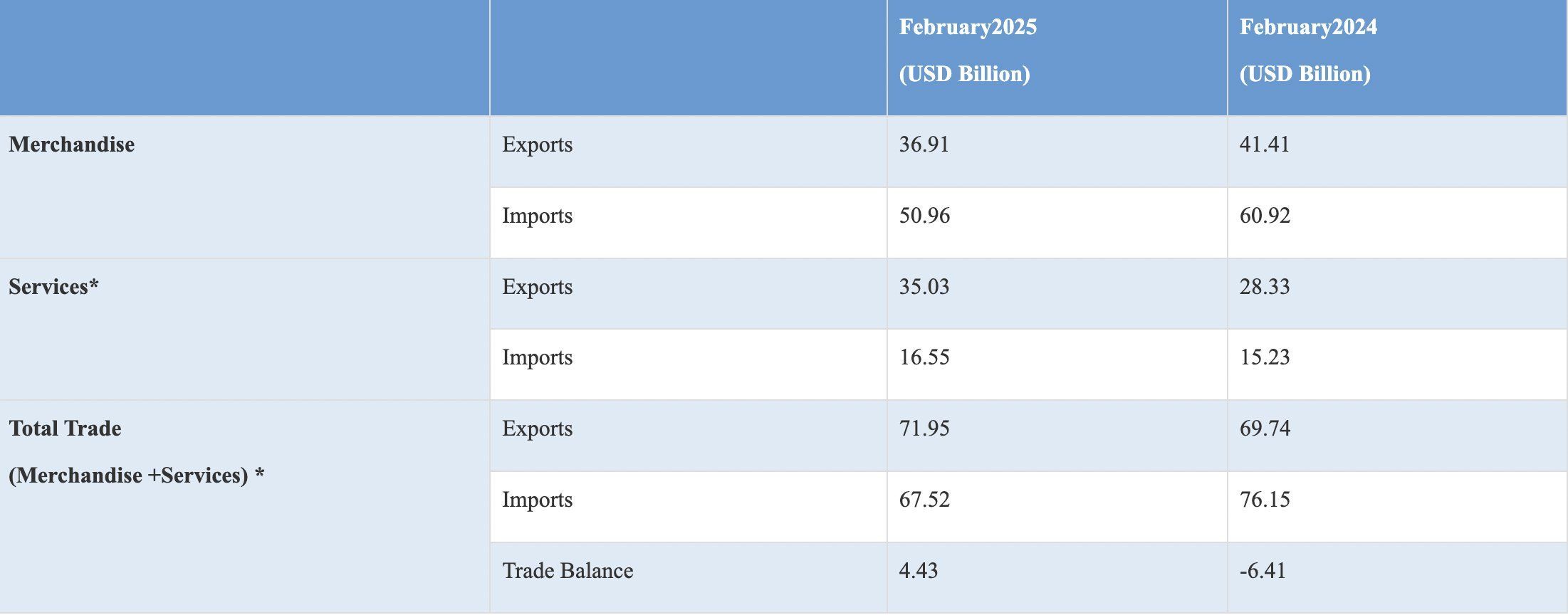
📌Rupee is Asia's worst performing currency' Asia’s worst‑performing currency” is not a headline any country wants but that is where the rupee finds itself in 2025. With a 4.3% depreciation versus the dollar, record trade deficits fuelled by US tar
See More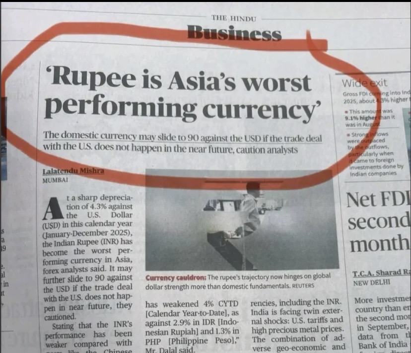

/entrackr/media/post_attachments/wp-content/uploads/2021/08/Accel-1.jpg)


Download the medial app to read full posts, comements and news.