
Back

Pulakit Bararia
Founder Snippetz Lab... • 1y
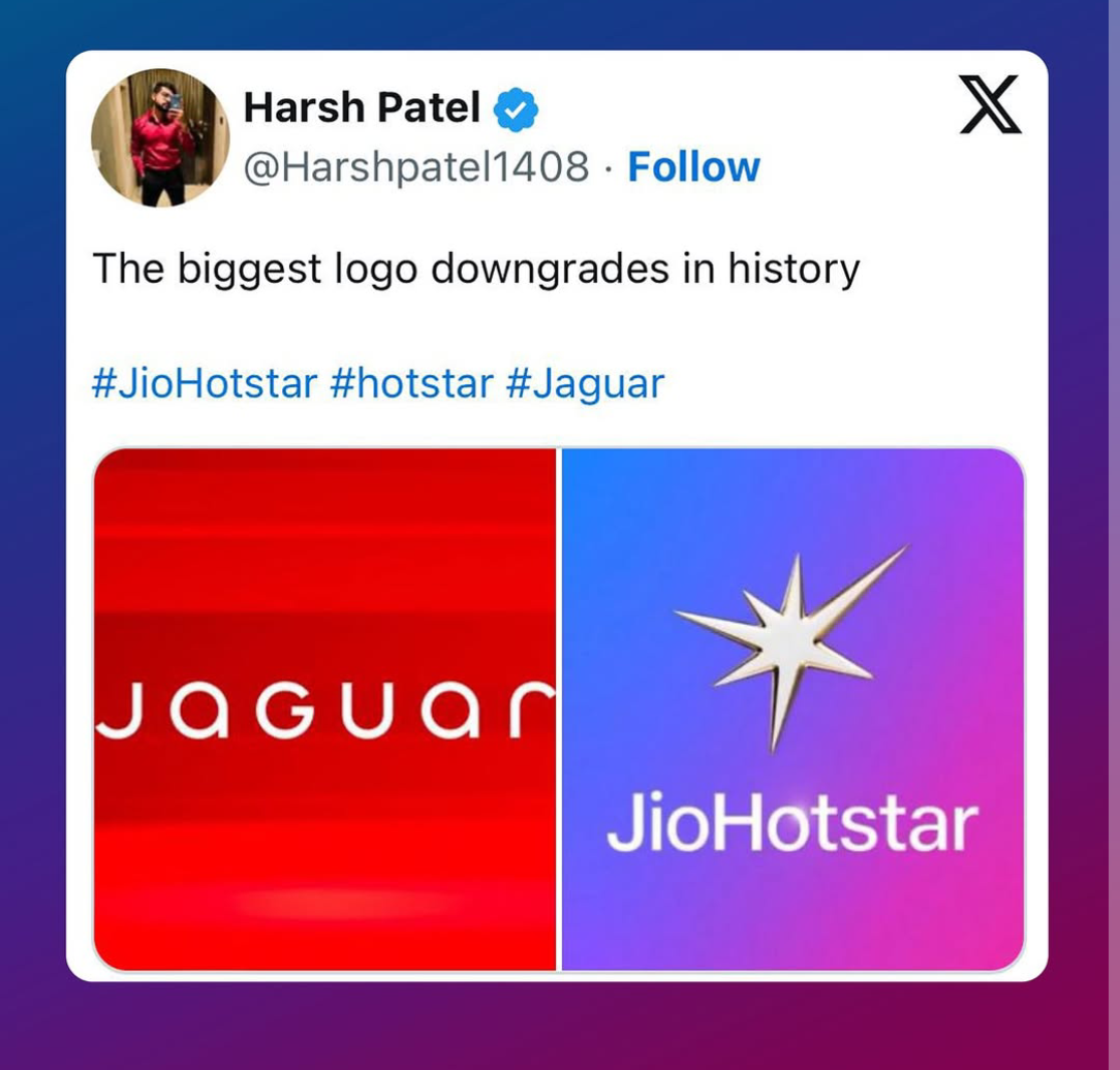
There has been some controversy surrounding the JioHotstar logo, particularly about the irregular pattern around the star. Some argue that a more traditional, symmetrical design would have been a safer choice, but that's precisely what makes this logo so brilliant-it dares to be different. Rather than opting for a conventional, polished star, JioCinema chose an asymmetrical approach. This isn't a flaw; it's a deliberate artistic decision that gives the logo character. The uneven edges serve a deeper purpose- they symbolize the vast and dynamic diversity of the platform, representing a multitude of languages, genres, and storytelling styles. . More importantly, this design choice ensures longevity. Symmetrical logos can sometimes feel too rigid or predictable, but a slightly imperfect, organic design like this one has a timeless appeal. It evolves with the brand, maintaining relevance even as visual trends
Replies (11)


More like this
Recommendations from Medial

Maniraj N G
Marketing & Systems ... • 1y
Symmetrical vs. Asymmetrical Business Models Understanding these two models can help you analyze how businesses operate and grow. Here's a simple breakdown: Symmetrical Business Model You get paid directly for the value you deliver. Example: A
See More
Sulaiman P
Brand Identity Desig... • 7m
Rate this Logo ★★★★★ When a qatar-based digital marketing agency approached me to rebrand their outdated wordmark logo, the challenge was clear: “Make it unforgettable—something that breaks the mold.” The client’s original design felt generic, but t
See More


Vishnu kumaran
Design guide for you... • 1y
9/10 AI companies use the "⭐" icon? Look around, almost every AI-powered feature has a star icon attached to it. But why? It’s not just a random choice. It’s branding psychology at play. Let’s break it down: 1. Stars symbolize excellence & trust T
See More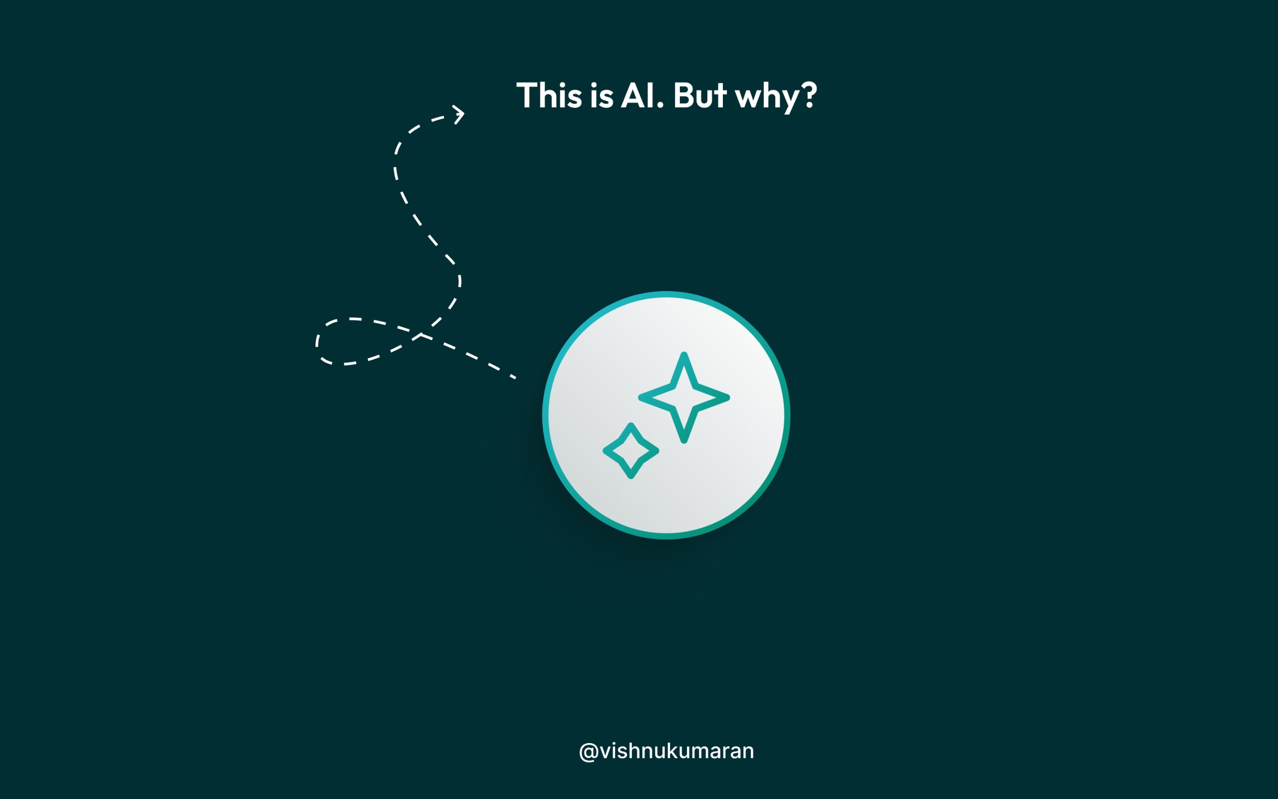

Bartik Saha
On my way to revolut... • 1y
JioHotstar just unveiled its new logo—and the internet is in an uproar. Critics are calling it outdated, tacky, and amateurish, suggesting even a small design firm could have produced better results. But what if this reaction was exactly what JioHots
See More


/entrackr/media/post_attachments/wp-content/uploads/2021/08/Accel-1.jpg)


Download the medial app to read full posts, comements and news.