Back
Anonymous 2
Hey I am on Medial • 1y
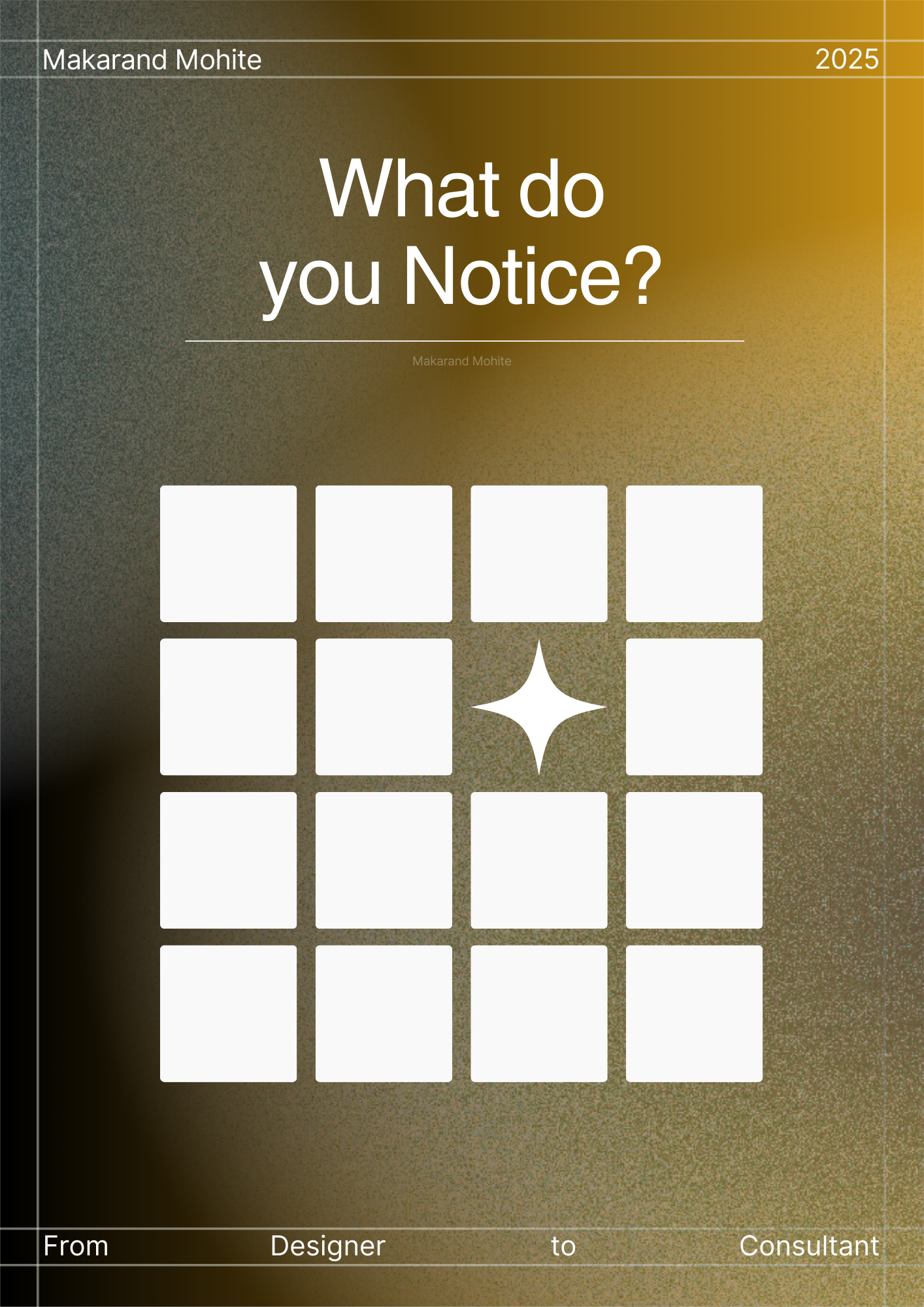
Bhai the rocket thing is okay but why did you go for this color gradient of shifting from blue to yellow? makes it difficult to read to be honest at such big size, I can only assume how readable it must be in a smaller size.
Replies (1)
More like this
Recommendations from Medial
TREND talks
History always repea... • 1y
💡 Business Idea: Colorful Flame Candles Let's embark on creating unique candles that will captivate attention with their beautiful colors. 🌈✨ 🔥 To make such a candle, you need to melt paraffin and add special salts. 🚀 For instance, salt from
See More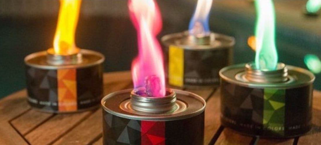
Makarand Mohite
Brand Designer • 6m
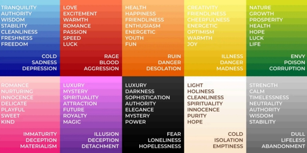
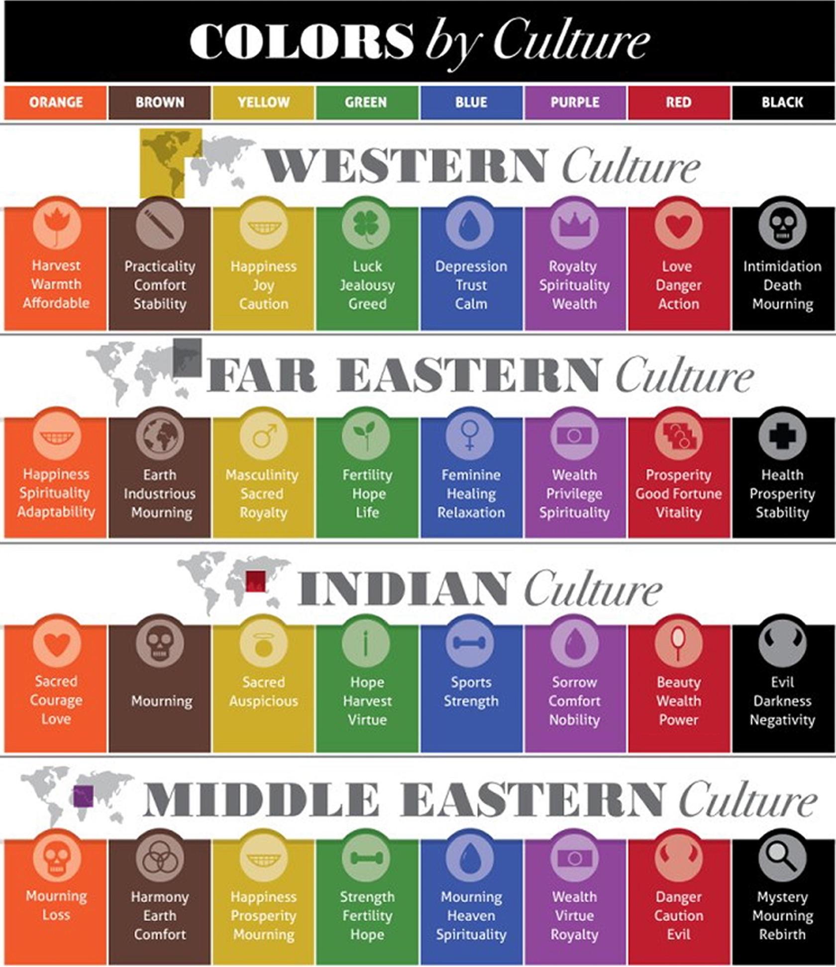
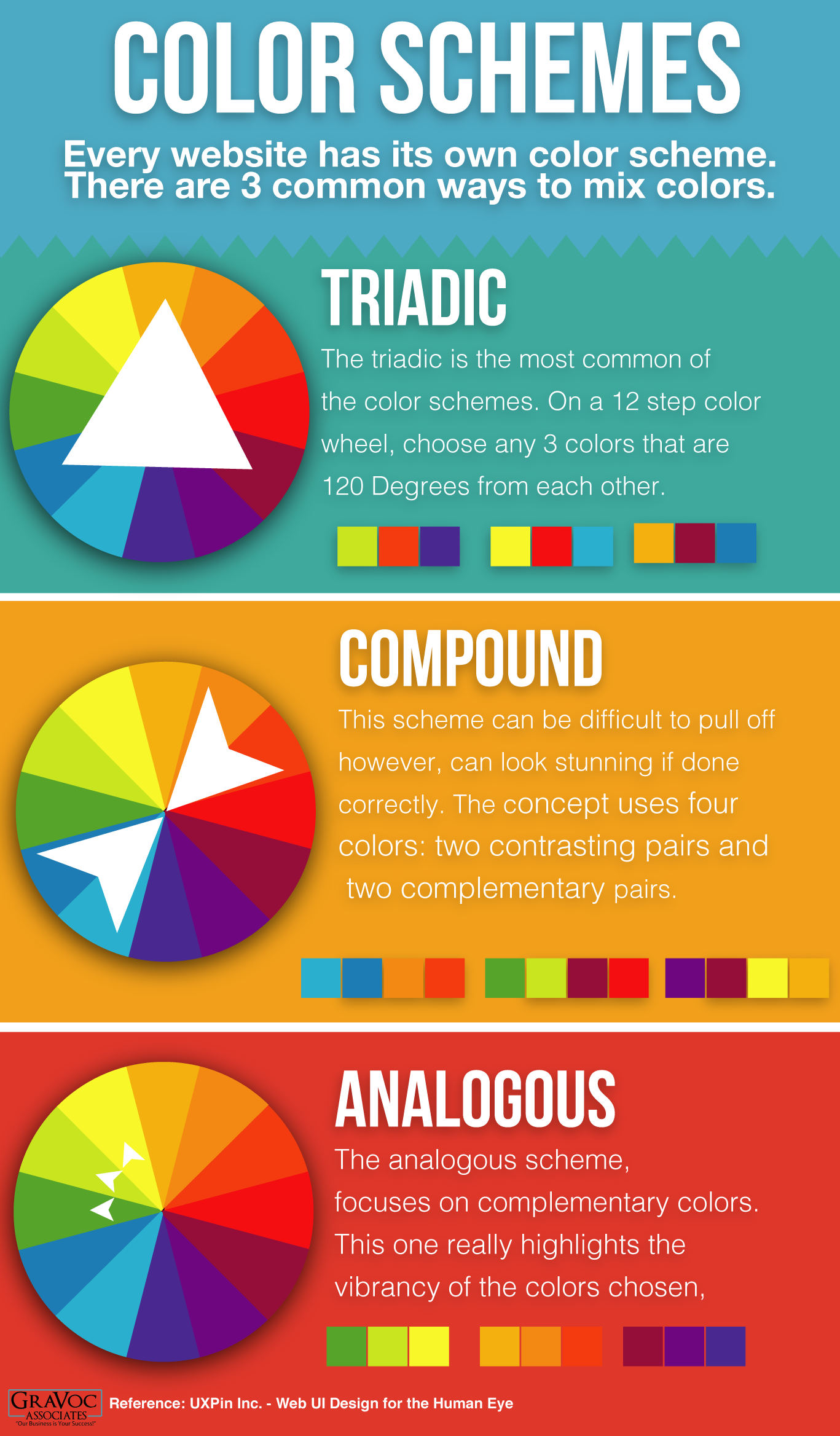
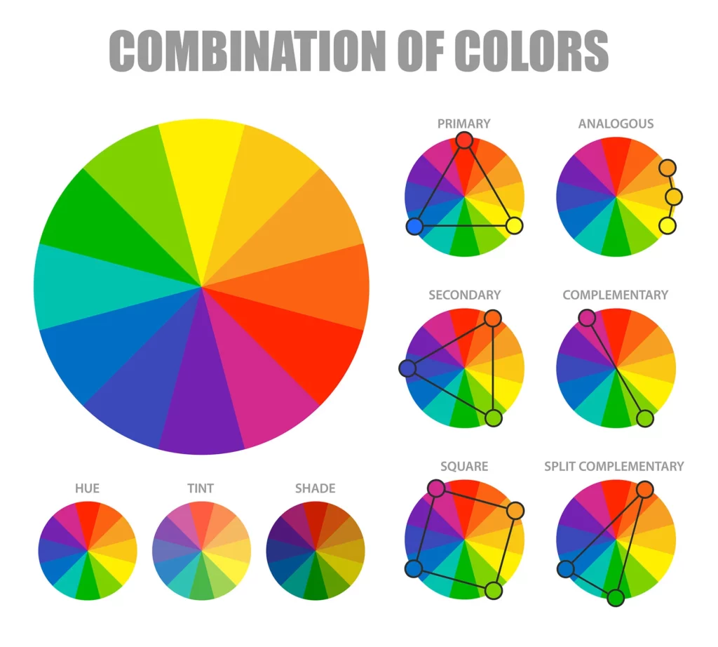
Colors aren’t just visuals, they carry emotions and shape how people perceive your brand. Choosing the right palette can make your design memorable and impactful. Red - Energy, passion, urgency (used in sales or food industry). Blue - Trust, calmne
See More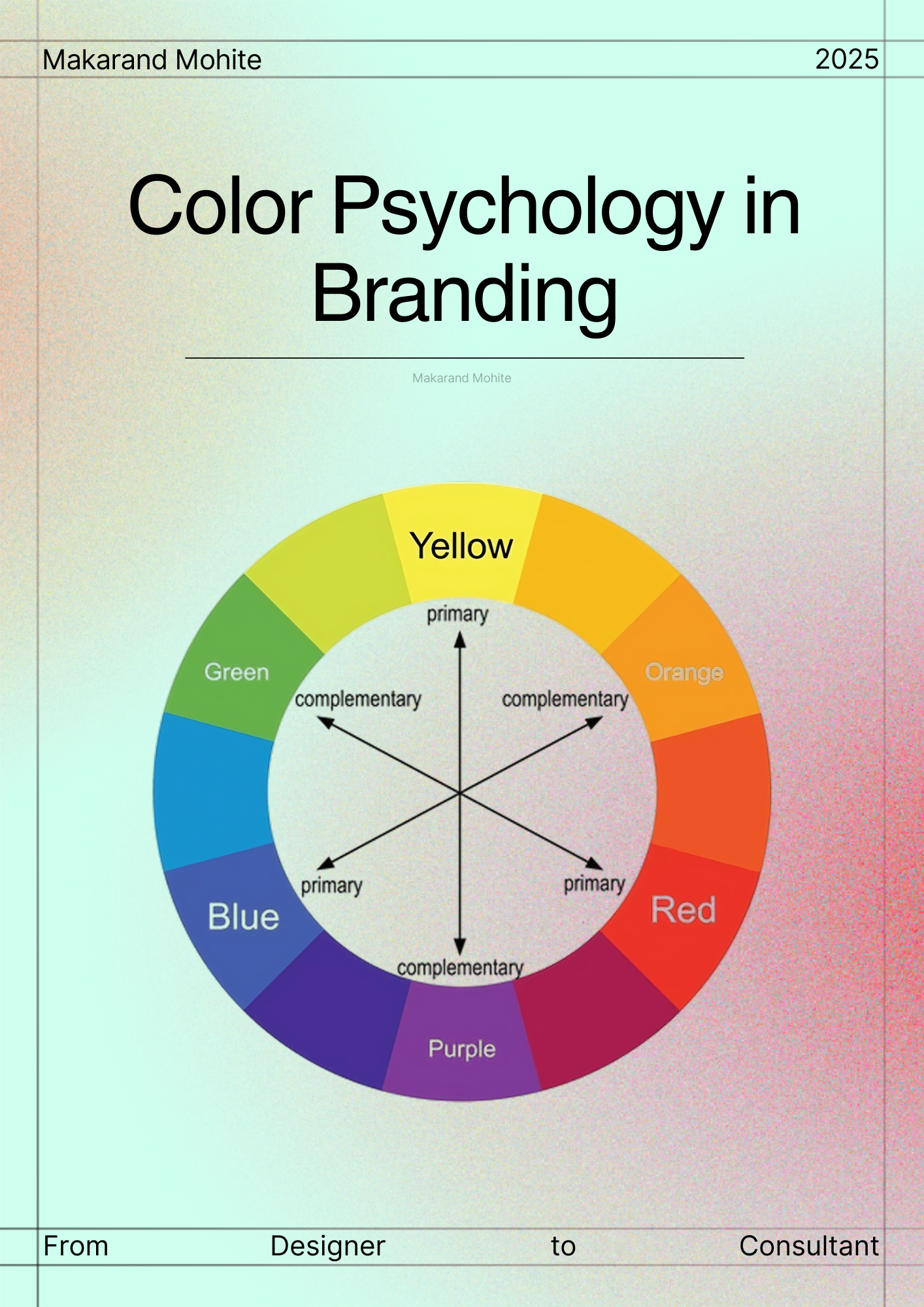
nidhi sharma
Making brands discov... • 2m
How Wearing Sustainable Fabrics Can Reduce Skin Irritation Let’s be honest — we’ve all had that moment when a shirt looked amazing but made our skin itch within minutes. Sometimes it’s not your detergent or the weather. It’s the fabric. The clothes w
See More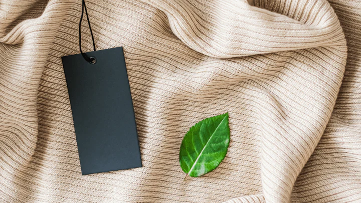
Download the medial app to read full posts, comements and news.





















/entrackr/media/post_attachments/wp-content/uploads/2021/08/Accel-1.jpg)

