Back
Varun Bhambhani
•
Medial • 1y
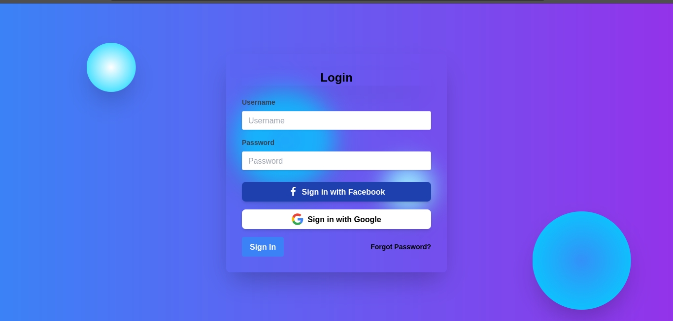
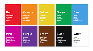
- The labels should be white in color (If you stick with the current design palette) - The text inside the textboxes should be in black - Already have an account / Forgot Password -> Text should be in white - The form UI should be in a light strong color like white to stand out from the BG, if you make use of this then ensure that the text labels are black - Stick to Opensans font family to ensure easy adaptation for the developers - Study more about color palettes to understand more about colors that complement each other for better outputs. These were my 2 cents on a quick glance over your image, try experimenting and you will definitely improve upon it 👍
More like this
Recommendations from Medial


Anonymous
Hey I am on Medial • 1y
This photograph is black and white, with only the lines on it being colored. Our perception system requires very little to construct a full-color image. The same principle applies to details—our eyes only see a small, focused area in detail, while th
See More
Sheikh Ayan
Founder of VistaSec:... • 1y
Beware of These Black Hat SEO Techniques Black hat SEO tactics might seem tempting, but they can damage your reputation and get your site penalized. Here's what to avoid: ❌ Keyword Stuffing: Overloading content with unnecessary keywords. ❌ Cloaking
See MoreRavi Handa
Early Retiree | Fina... • 7m
From an investment perspective, real estate is a very localised play. If you have some black money to put in, land in a growing city almost always works. If it is all white, there could be still some bets worth taking but the number goes down sharp
See More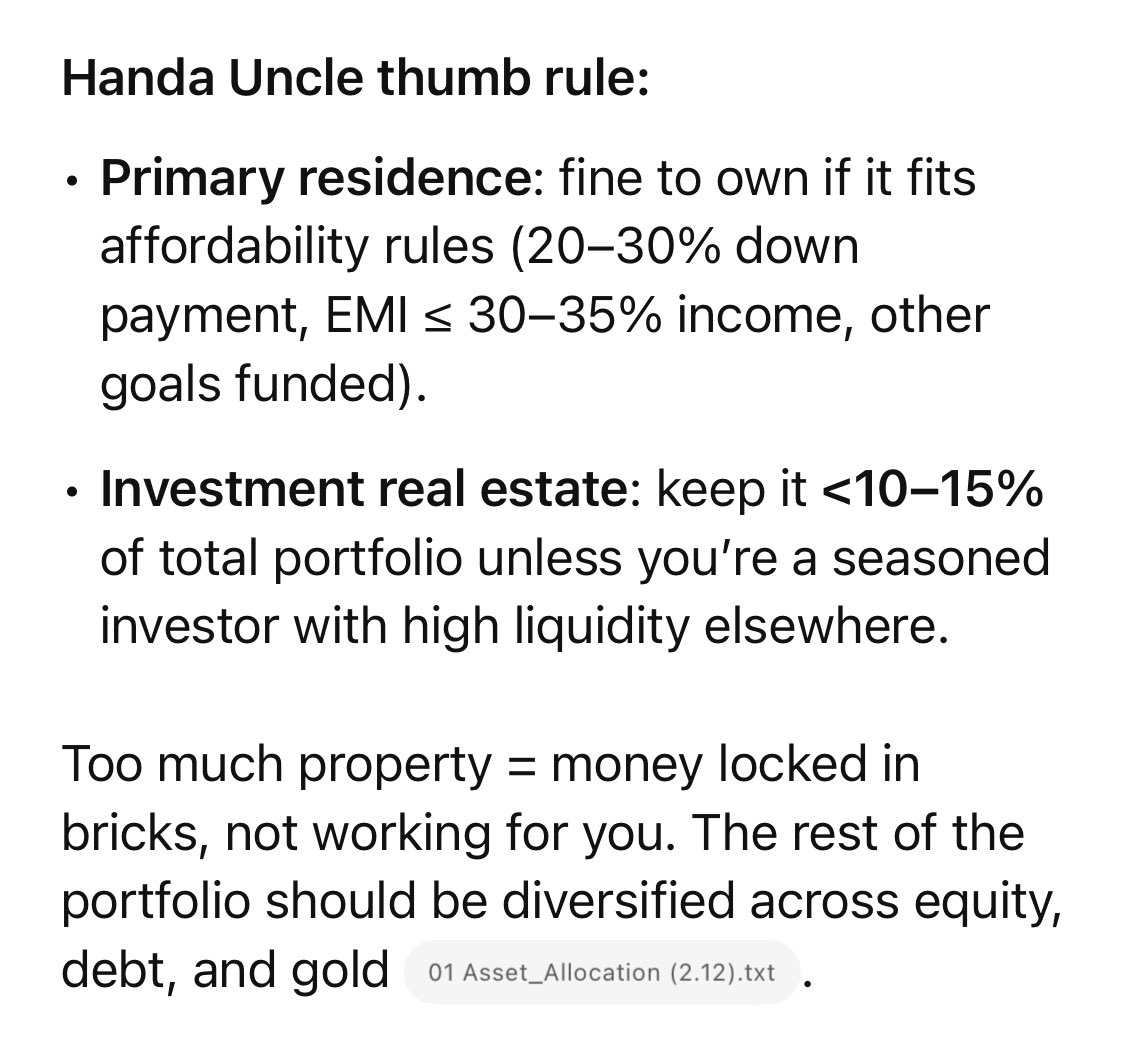
Download the medial app to read full posts, comements and news.






/entrackr/media/post_attachments/wp-content/uploads/2021/08/Accel-1.jpg)


