
Back

Makarand Mohite
Brand Designer • 6m
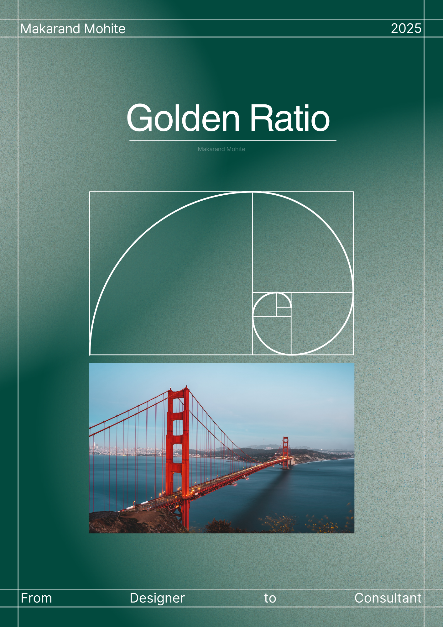
The Golden Ratio (1.618) isn’t just a math concept; it’s a timeless design secret used by nature, art, and top brands. It helps bring balance, harmony, and a sense of “rightness” into your visuals. Here’s how you can apply it in your design process: Typography: Set font sizes in proportion. For example, if your body text is 16px, your heading would be 16 × 1.618 ≈ 26px. This naturally creates a clean visual hierarchy. Layout / Composition: Divide your canvas into sections based on the Golden Ratio to build balanced grids. Place important elements like logos, CTAs, or hero text at the spiral’s focal points to draw attention. Branding: Use golden proportions in logo design with circles or rectangles to create harmony. Apply it to spacing in brand patterns so everything feels “naturally right.” Designers like Le Corbusier, Da Vinci, and even Apple have relied on the Golden Ratio. 👉 If this was helpful, check my project for more design breakdowns: https://bit.ly/425ai82


Replies (3)

More like this
Recommendations from Medial

Thakshina Moorthy G M
Brand Designer • 8m
Do You Use the Golden Ratio in Your Design Process? As designers, we talk so much about layout, balance, and composition — but how many of us actually use the Golden Ratio (1.618) in our creative flow? The Golden Ratio has existed in art, architectur
See More


Poosarla Sai Karthik
Tech guy with a busi... • 8m
Collapse Theory: Knapsack in a smarter way :) Just came across a fascinating idea that rethinks how we approach optimization, especially the classic Knapsack Problem. In short, you’re packing items with different weights and values into a limited s
See More

Harshal Naidu
part-time writer, fu... • 10m
Hi Medial fam, Did you get a chance to look at the new 'G' - Google logo? It looks like a new change after a decade, shifting from solid colors to a colorful gradient. I'm looking forward to how this design could reflect Google's interconnected ec
See More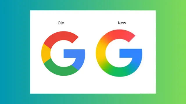


Hemant Prajapati
•
Techsaga Corporations • 1y
🚀 Boost Your App's Success with ASO! 🌟 App Store Optimization (ASO) is crucial for increasing your app's visibility and downloads. Here are some key strategies to help you master ASO: 1. 🔑 Keywords are Key! Research and use relevant keywords in
See More

MUHAMMED SULTHAN KC
Startup enthusiastic • 2m
🚀 The 4 Personalities Every Startup Needs After working with countless startups, the most successful teams have these four roles covered: THE HUSTLER 💼 Drives revenue and growth. Closes deals, builds partnerships, and sells the vision relentlessl
See More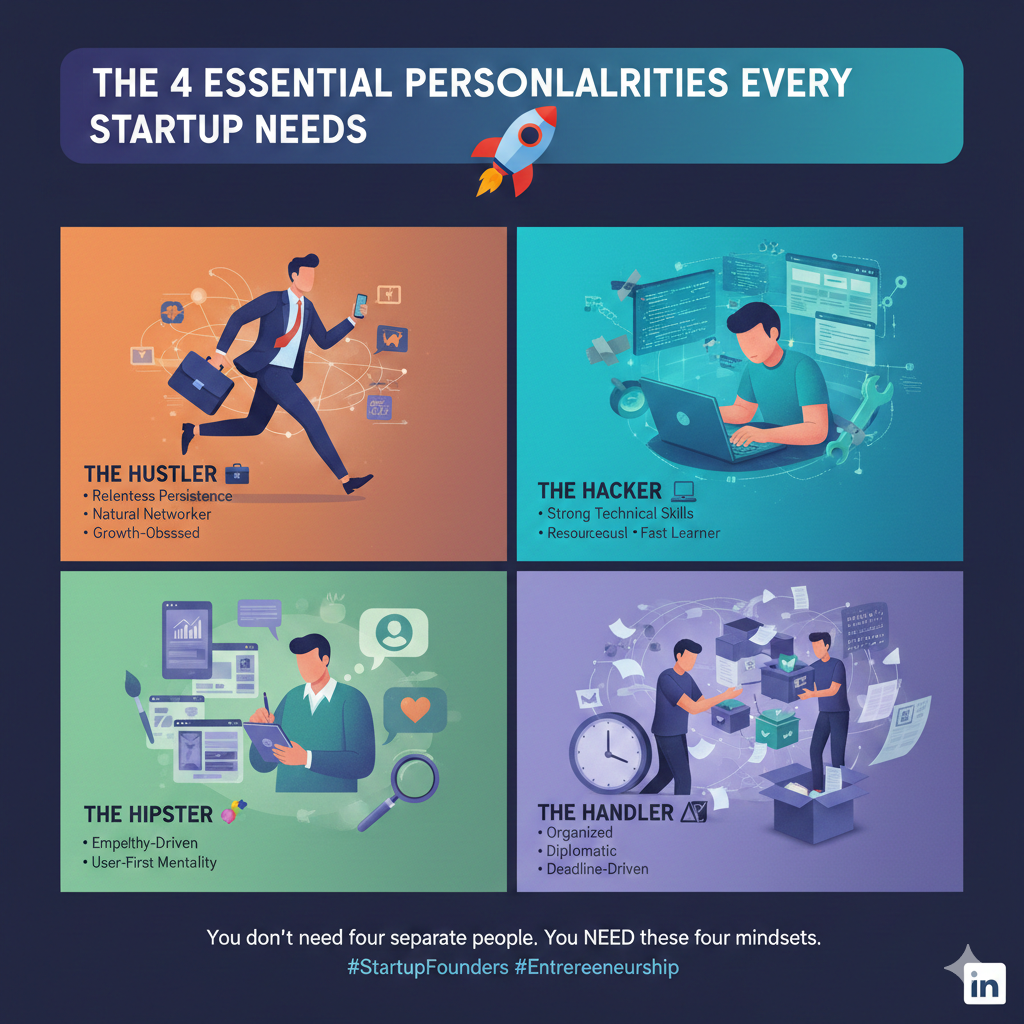

/entrackr/media/post_attachments/wp-content/uploads/2021/08/Accel-1.jpg)


Download the medial app to read full posts, comements and news.