Back

Arpit Yadav

Building @ Nonomate • 1m

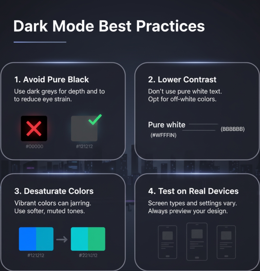
Good suggestion, Harsha! The theme colors should be soft for better readability. A pure black background with white text often feels too harsh on the eyes.

1 Reply
1
Replies (1)

More like this

Recommendations from Medial

Image Description

Merwin Rebello

Build to earn • 6m

Suggestion : what kind of color combination that goes on a dark theme app background what other colors should be there like with black

1 Reply
1

vishakha Jangir

 • 

Set2Score • 4m

𝗛𝗼𝘄 𝘁𝗼 𝗱𝗲𝗰𝗶𝗱𝗲 𝗰𝗼𝗹𝗼𝗿 𝘁𝗵𝗲𝗺𝗲 𝗳𝗼𝗿 𝘆𝗼𝘂𝗿 𝘀𝘁𝗮𝗿𝘁𝘂𝗽 ? 1. Define Your Brand Personality Ask: If my brand were a person, how would it behave? Professional & Trustworthy → Blue, Gray, Navy Bold & Energetic → Red, Orange Cr

See More
Reply
5
Image Description

Harshavardhini Manickam

AI-ML • 1m

Just a req about the color palette on Medial... the use of pure black (#000000) makes reading quite tough especially for longer articles. apps like Insta, X nd Reddit use softer tones like #0b1014, #0d1114 or cultured pearl, timberwolf for better rea

See More
2 Replies
6

Comet

#freelancer • 2m

*Graphic Design A-Z Guide:* *A* – Alignment: Arranging elements to line up on a page for better flow. *B* – Branding: Creating a unique identity through visuals, logos, and colors. *C* – CMYK: Color model used for printing (Cyan, Magenta, Yellow

See More
Reply
5

vishakha Jangir

 • 

Set2Score • 3m

𝗚𝘂𝗶𝗱𝗲𝗹𝗶𝗻𝗲𝘀 𝗳𝗼𝗿 𝗖𝗵𝗼𝗼𝘀𝗶𝗻𝗴 𝗮 𝗖𝗼𝗹𝗼𝗿 𝗖𝗼𝗱𝗲 𝗳𝗼𝗿 𝘆𝗼𝘂𝗿 𝘀𝘁𝗮𝗿𝘁𝘂𝗽 !! 1. Define Brand Identity: Choose colors that reflect urgency, safety, trust, and professionalism. Think about how you want people to feel when th

See More
Reply
6
16

Sheikh Ayan

Founder of VistaSec:... • 7m

Beware of These Black Hat SEO Techniques Black hat SEO tactics might seem tempting, but they can damage your reputation and get your site penalized. Here's what to avoid: ❌ Keyword Stuffing: Overloading content with unnecessary keywords. ❌ Cloaking

See More
Reply
1
Image Description
Image Description

Aryan patil

 • 

Monkey Ads • 11m

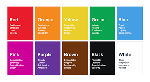
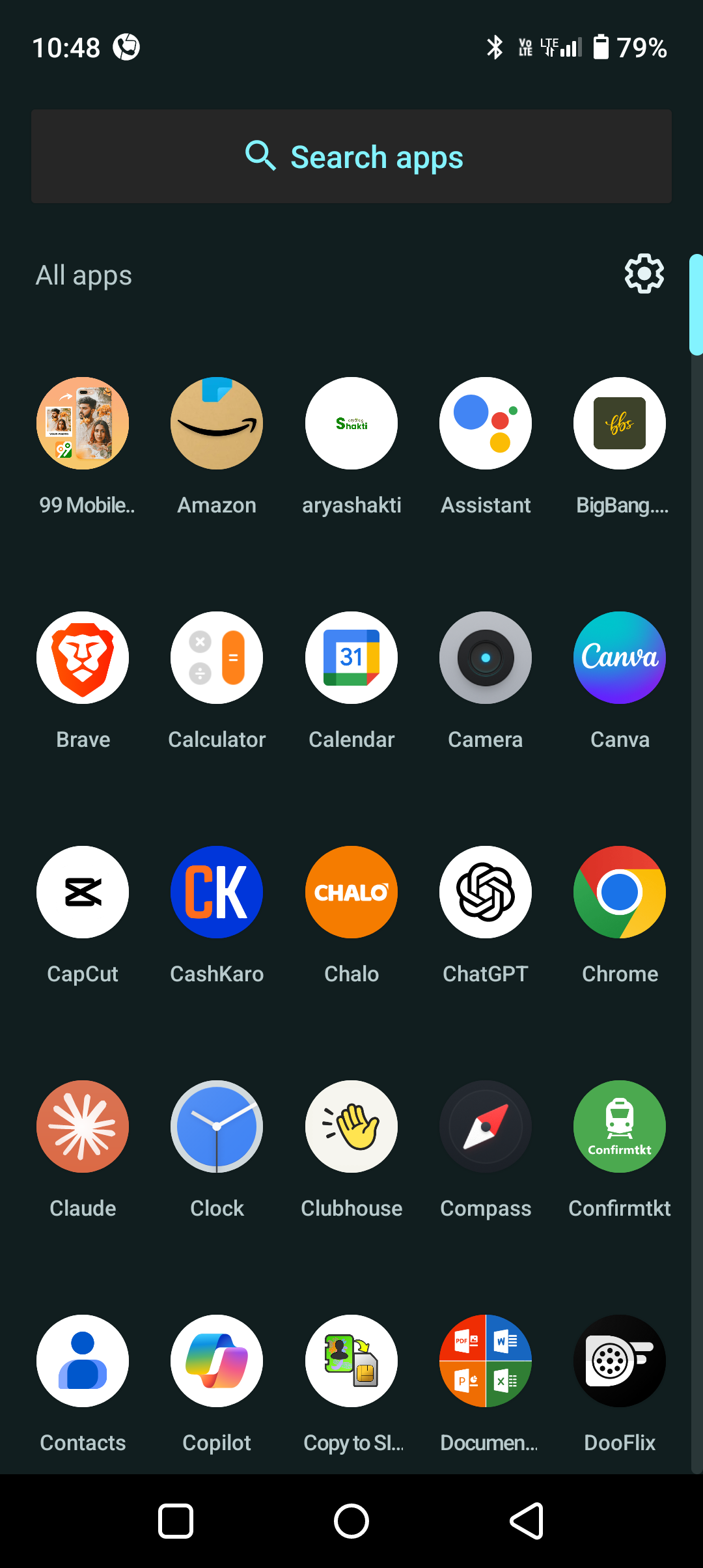
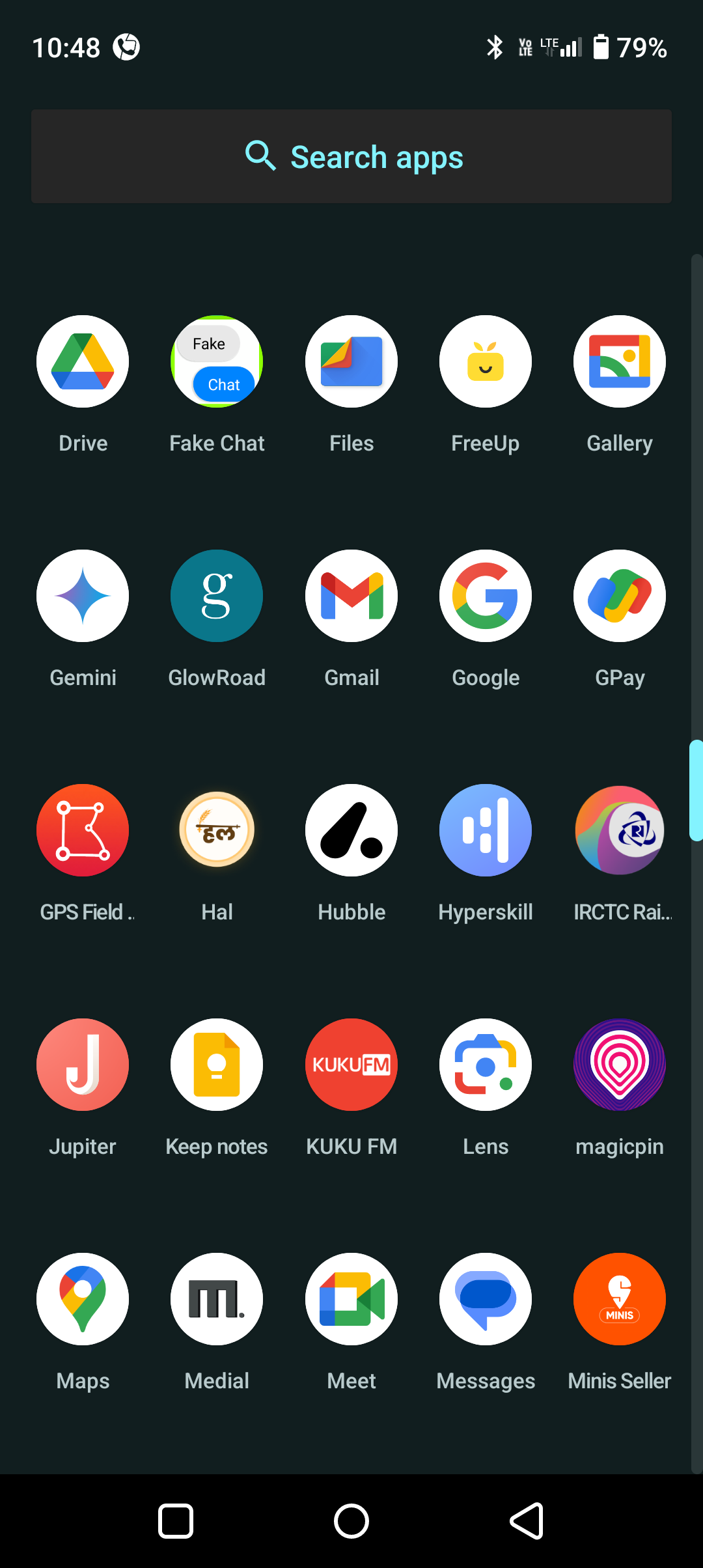
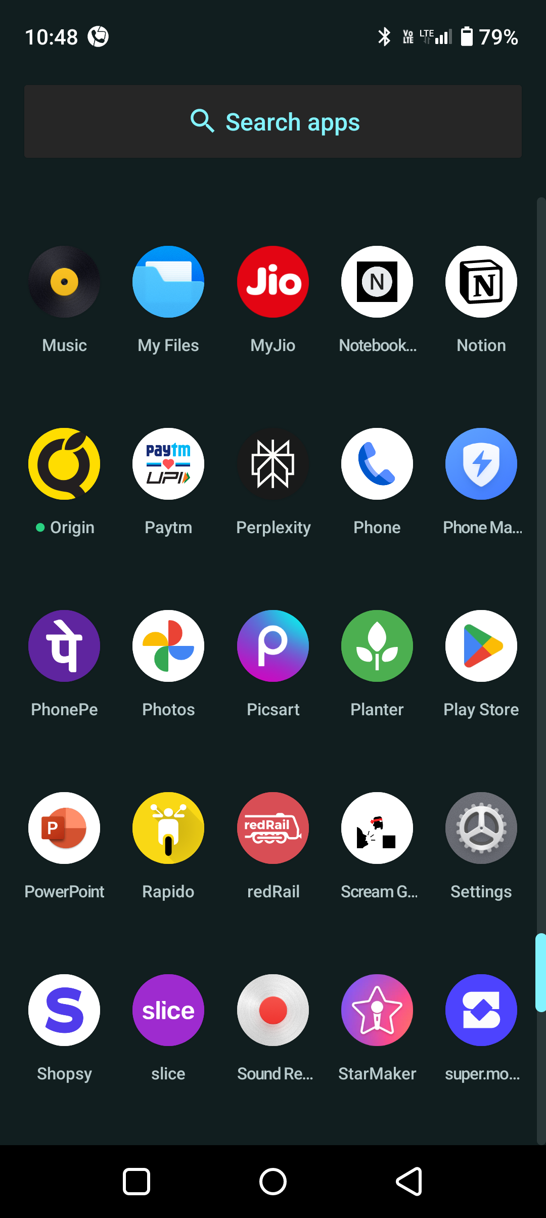
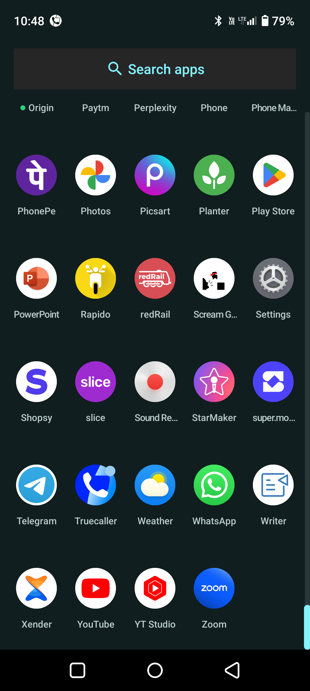
I asked Claude Ai to extract the colors from all the 65 app icons of my phone and here are the results: Color popularity (approximate percentages): 1. Blue: 25% 2. Red: 12% 3. Multicolor: 11% 4. Orange: 8% 5. Green: 7% 6. Yellow: 6% 7. Purple: 5% 8.

See More
9 Replies
1
19

Comet

#freelancer • 27d

✅ *Graphic Design Roadmap – Step 2: Graphic Design Principles* 🧩🎯 Master these *timeless principles* to create clear, engaging, and professional designs: 1️⃣ *Balance* ⚖️ Distribute elements evenly (symmetrical/asymmetrical) for visual stabilit

See More
Reply
1

Comet

#freelancer • 5d

Graphic Design Roadmap – Step 2: Graphic Design Principles Master these *timeless principles* to create clear, engaging, and professional designs: 1️⃣ *Balance* ⚖️ Distribute elements evenly (symmetrical/asymmetrical) for visual stability. 2️⃣ *

See More
Reply
1

Download the medial app to read full posts, comements and news.