Inquisitive • 11m
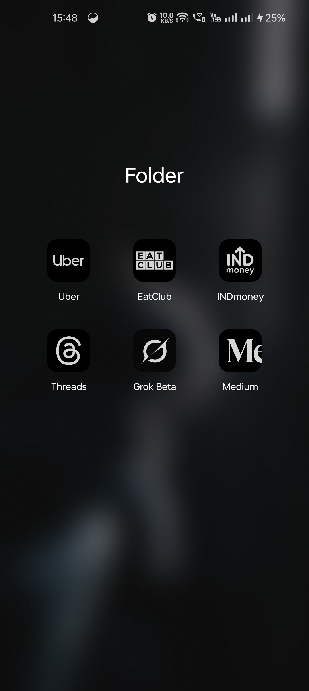
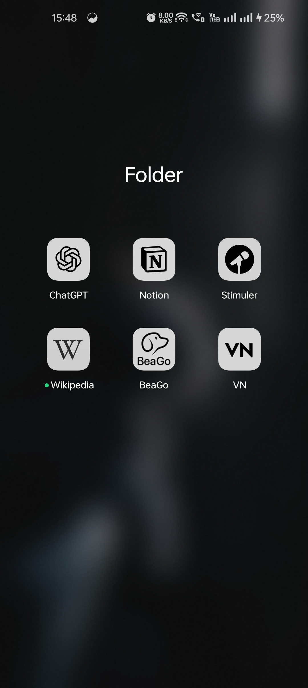
Why are most of the brand's apps icons so similar like these, do they convey anything? I'd prefer the first design over the second.
Hey I am on Medial • 11m
A minimal design makes the logo easily recognizable and scalable across different devices (phones, tablets, smartwatches).
and why would most of them play with only two colours: black n white?
Thatmoonemojiguy 🌝 • 11m
monochromatic is a trend nowadays 🌝
🌚
🌝
Spam Bot Crisis Hits Digg, Trigge ...
BackOps Raises $26 Million in Ser ...
Kelly Loeffler: AI's Role in Smal ...
Download the medial app to read full posts, comements and news.


/entrackr/media/post_attachments/wp-content/uploads/2021/08/Accel-1.jpg)


