
Back


Replies (1)
More like this
Recommendations from Medial


Yogesh Kuhade
"I am not a job seek... • 1y
"We are thrilled to unveil the logo of our new startup, Momo Craving! After careful consideration, we chose a bold and vibrant red logo that demands attention and captivates the human eye. The red color represents energy, passion, and excitement – p
See More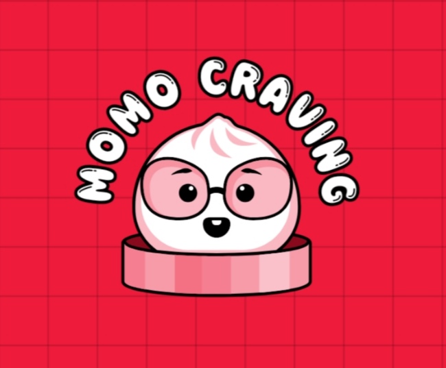


Only Buziness
Everything about Mar... • 4m
Colors don’t just decorate—they dictate decisions. Red excites hunger, blue builds trust, and green calms the mind. That’s why brands like McDonald’s use red to trigger appetite and Paytm uses blue to symbolize safety. Color psychology is silent pers
See More


Tushar Aher Patil
Trying to do better • 10m
💡 Why the color red makes you spend more — and you don’t even realize it. Walk into a store or open any shopping app. Spot something? 🟥 Red. Red sale signs. Red banners. Red timers ticking down. It’s not just about looking bold. It’s behavioral sci
See More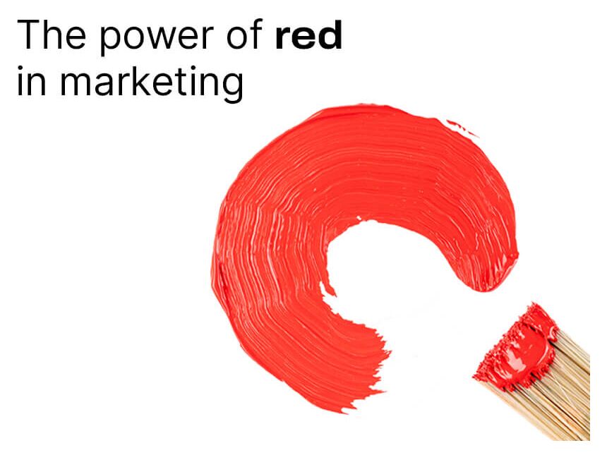

The Logo Guy
InkMyStartup | Fishy... • 8m
How many times has a client asked you to “try a few more color options”? Or as a client, how frustrating is it to wait for your designer to send back every single color version of your logo? 🎨 Imagine if you could change the colors yourself, experi
See More

AVISHEK NAYAK
It's all about the e... • 1y
Garrett Morgan’s Traffic Signal Legacy . Garrett Morgan invented the traffic signal, but one key scientific point that got completely missed was that red-green is the most common form of color blindness in humans. Almost 8% of men are color blind due
See More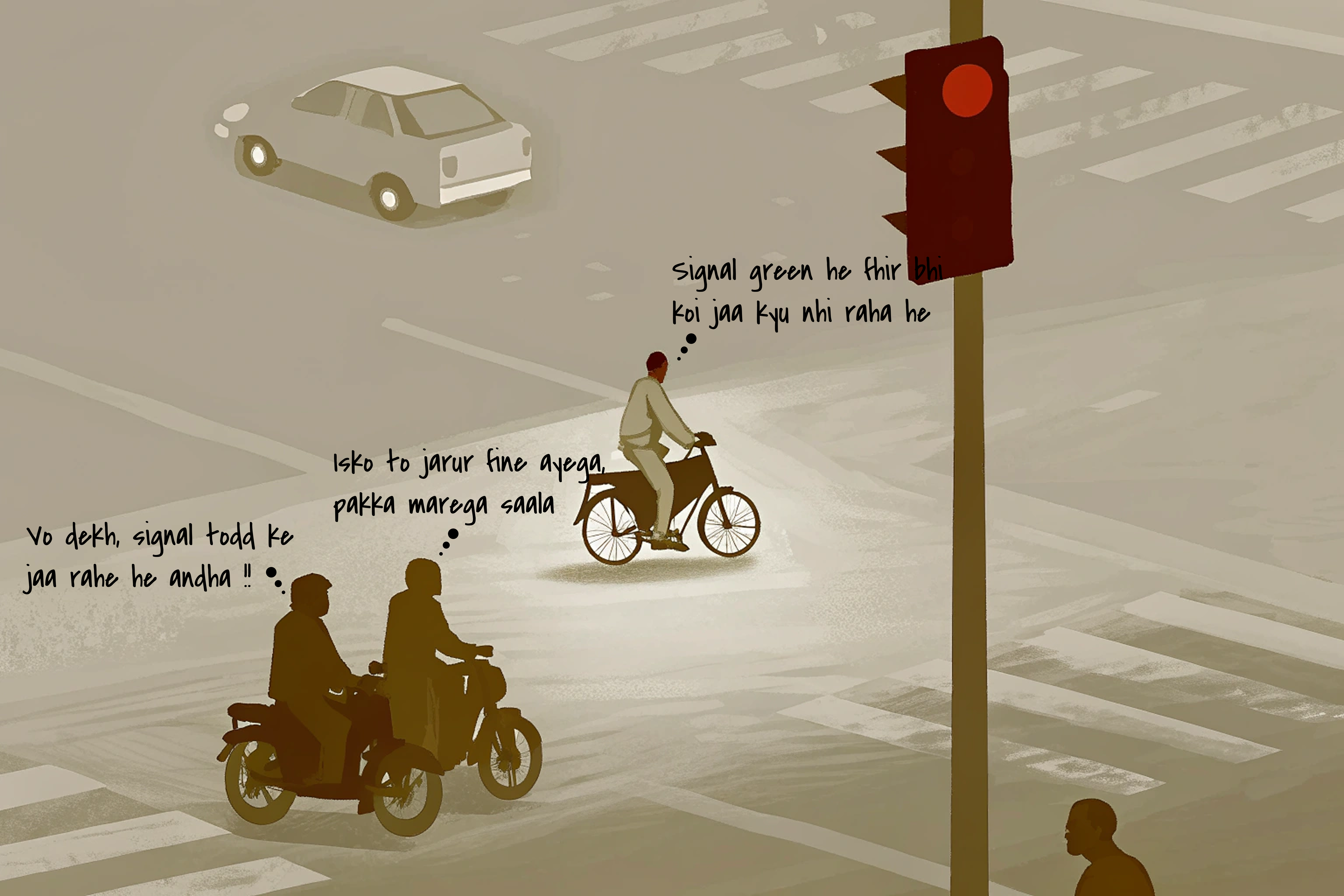
Anonymous
Hey I am on Medial • 1y
Color isn’t just about wavelength; context plays a crucial role too. For instance, an image of strawberries might appear red to us even if there are no red pixels. Our brains perform color correction based on lighting and familiar colors. This phenom
See More


/entrackr/media/post_attachments/wp-content/uploads/2021/08/Accel-1.jpg)


Download the medial app to read full posts, comements and news.