
Back


More like this
Recommendations from Medial

The Logo Guy
InkMyStartup | Fishy... • 8m
How many times has a client asked you to “try a few more color options”? Or as a client, how frustrating is it to wait for your designer to send back every single color version of your logo? 🎨 Imagine if you could change the colors yourself, experi
See More Reply
5


Aman meshram
Finding business gap... • 1y
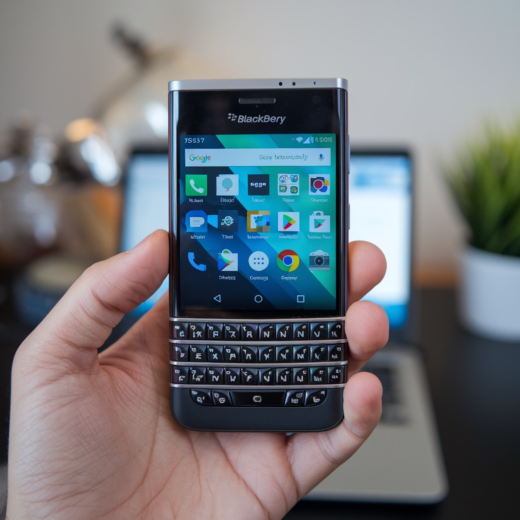
When I was in my teens I use to consider BlackBerry as a phone of strong professions like entrepreneur, business man, police, agents. The brand was a Character in itself and according to me no brand till now has able to match it's dashing character.
6 Replies
10


/entrackr/media/post_attachments/wp-content/uploads/2021/08/Accel-1.jpg)


Download the medial app to read full posts, comements and news.