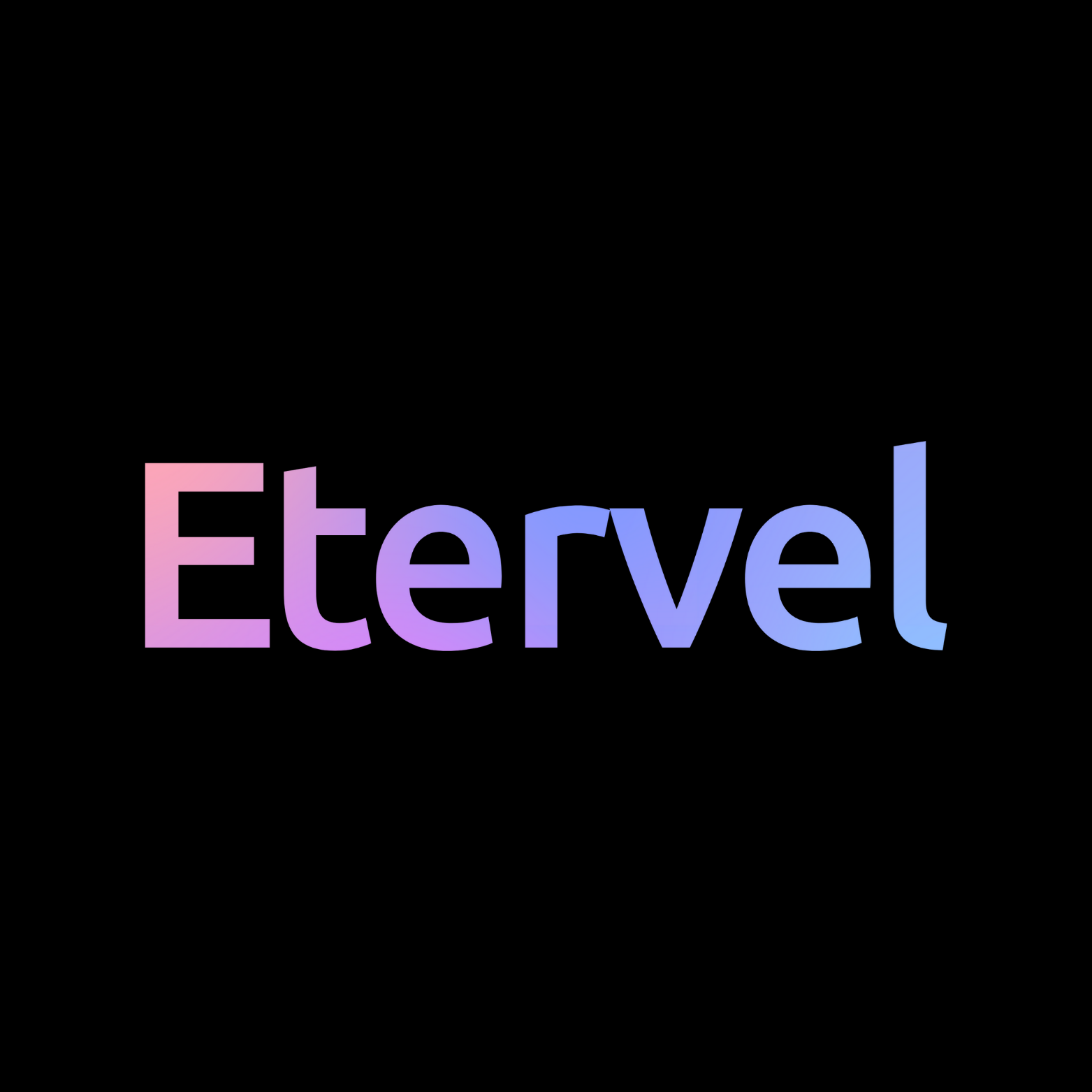
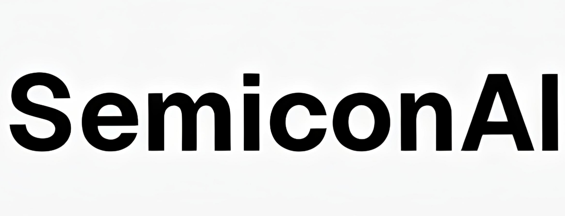
Just need a favour from you all please suggest color and tell me how the logo is
Any improvement needed or any font change etc etc please suggest me .
Its Him
Stealth • 1m
The "Arogya" text looks kinda bad, you should either keep both capital, or both title case, dont mix cases ever, it's hard to read. Also leave some spaces between the logo and the text, and make the logo a bit smaller. Logo looks good by the way.
0 replies
More like this
Recommendations from Medial
Shreyash Siddharth
Stealth • 8m
why does the app logo looks npm
1 replies3 likes
Rajesh R
Stealth • 3m
Hey enterpreneurs,
Just wanted to know your comments how the new logo looks for my website http://startup-forge.in/
Looks like Social Media will replace Matrimony Site 😂
📱 30% met online (Social Media, Dating Apps, Matrimonial Sites)
🤝 60% met offline (Work, Family, Social Gatherings)
🔀 10% through a mix of both!
Where did you meet your partner?
#Relation
See More
0 replies1 like
Saksham
•
Bebyond • 2m
Hidden IP Crimes Alert!
Startups, beware of lesser-known IP pitfalls like REVERSE CONFUSION. While we usually think of smaller brands copying bigger names, reverse confusion flips the script. Here, a giant unknowingly (or deliberately) uses a smalle
hey I don't know if this message is correct or not cause I can't see anything written in the text screen is it a bug cause the text and the background are both black in color can you please fix this medial pardhan...
@medial
4 replies2 likes
Sachin Patil
Stealth • 4m
Swiggy and Zomato both launched their group ordering features today.
Looks like the product managers have a secret WhatsApp group :)
#memes
2 replies1 like
Shivam Singh
Stealth • 13d
Hello everyone,
I am starting my yoga mats and herbal products business.
Please suggest which logo looks the best:
1, 2, 3, or 4.
Your feedback would mean a lot!
2 replies1 like
Anirudh Gupta
Stealth • 7m
For every business it is very important to consider PESTLE(Political economical socio-cultural technological legal environmental).
Let us learn how 7 up has given importance to the S in PESTLE.
So 7 UP has faced difficulty in positioning itself in
This is the image created by meta AI bot with just one liner text . It also has the feature to animate this. Looks like meta with Llama is gotta go a long way ahead. What you guys think? 🤔
5 replies3 likes
Apple
Stealth • 7m
Hello, Medial app your work on this app is good but here are some improvements that i want to suggest.
Font : every post need to be separated properly but because of the font every thing looks messy. To resolve this please add some borders arround t