Back
Trideep Hazra
•
P.C. Chandra Jewellers • 1y
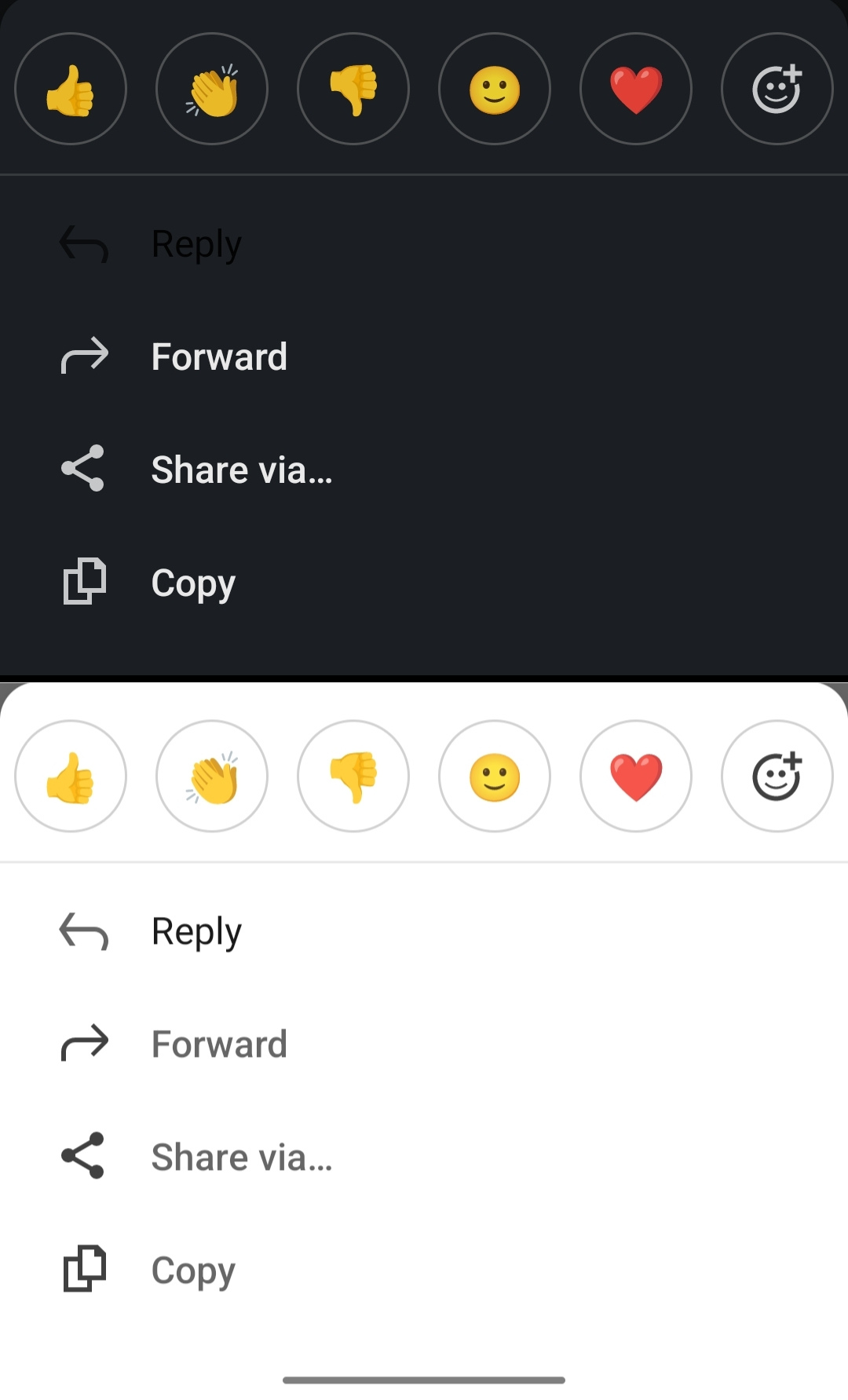
𝑨 𝑮𝒂𝒎𝒆 𝒐𝒇 𝑯𝒊𝒅𝒆 & 𝑺𝒆𝒆𝒌 𝒐𝒏 𝑳𝒊𝒏𝒌𝒆𝒅𝑰𝒏'𝒔 𝑪𝒉𝒂𝒕 I recently had one of those 𝒄𝒉𝒂𝒊-𝒃𝒓𝒆𝒂𝒌 moments of frustration on LinkedIn. Picture this: I'm trying to respond to a message, but the reply button is nowhere to be found. It was like searching for a specific 𝒎𝒂𝒔𝒂𝒍𝒂 𝒄𝒉𝒂𝒊 stall in a bustling market—utterly perplexing! Being a product manager, I can't help but think about how even a tiny design oversight can wreak havoc on user experience. LinkedIn's whole mission is about connecting professionals, and a seamless chat experience is essential to that goal. It's crucial for product managers to use the products they create. Think of it like tasting your own 𝒎𝒊𝒕𝒉𝒂𝒊 before serving it to guests. By experiencing the product firsthand, we can spot pain points elevating empathy and devise specific solutions that genuinely delight users. What are your thoughts? 🤔 Did you know that 𝟴𝟭.𝟵% of smartphone users prefer dark mode? 🤯 Check Reply 👇

Replies (1)
Download the medial app to read full posts, comements and news.


/entrackr/media/post_attachments/wp-content/uploads/2021/08/Accel-1.jpg)


