Back
Ambar Bhusari
UX Designer for User... • 1y
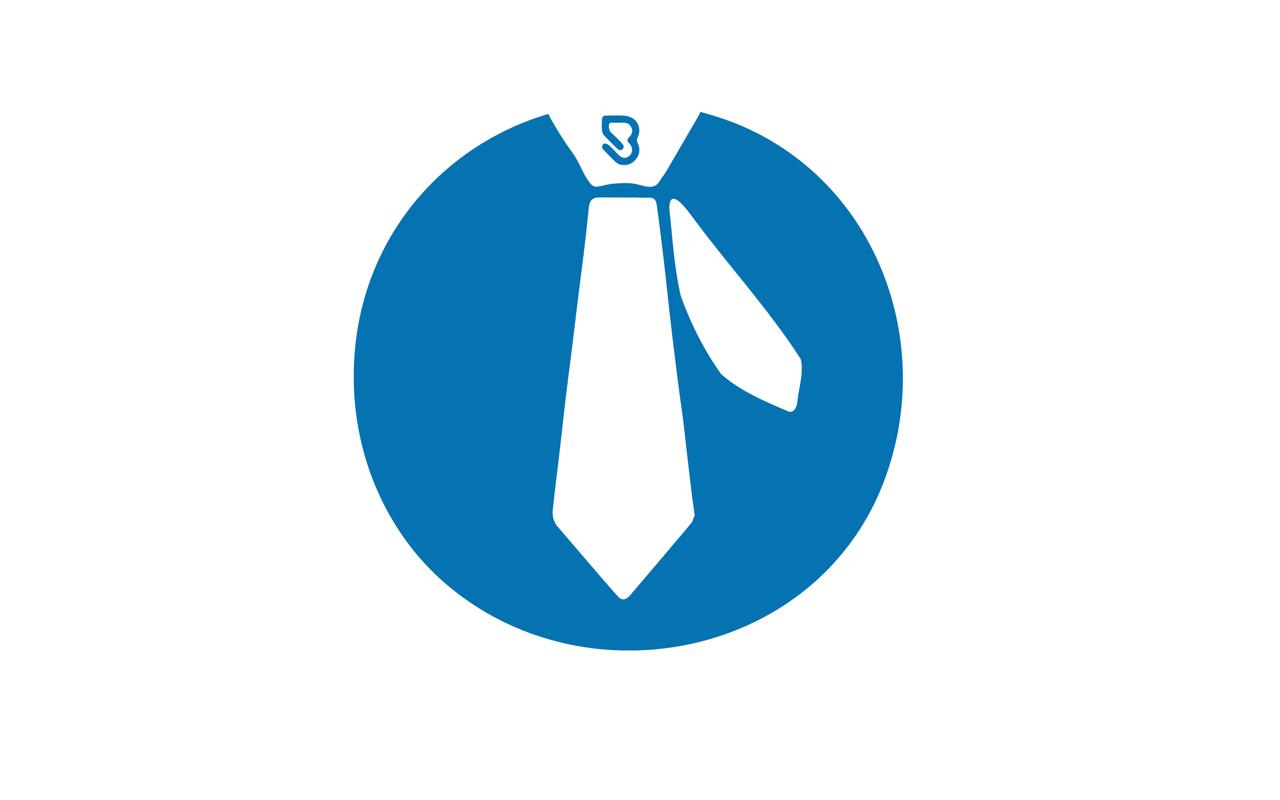
Unpopular opinion here. The job that a logo does is to help people identify a company, not explain what the company does. This logo is overeslling with multiple visual elements. the Tie, the B (Is that a paper clip?), the human figure (which doesn't come across as an I), and the multiple colors make it read like Boom.fy No hate here... just pointing out the details... trying to give a different perspective. ✌️
Replies (1)
More like this
Recommendations from Medial
The Logo Guy
InkMyStartup | Fishy... • 7m
How many times has a client asked you to “try a few more color options”? Or as a client, how frustrating is it to wait for your designer to send back every single color version of your logo? 🎨 Imagine if you could change the colors yourself, experi
See MoreDownload the medial app to read full posts, comements and news.















/entrackr/media/post_attachments/wp-content/uploads/2021/08/Accel-1.jpg)

