Back
Anonymous 2
Hey I am on Medial • 1y
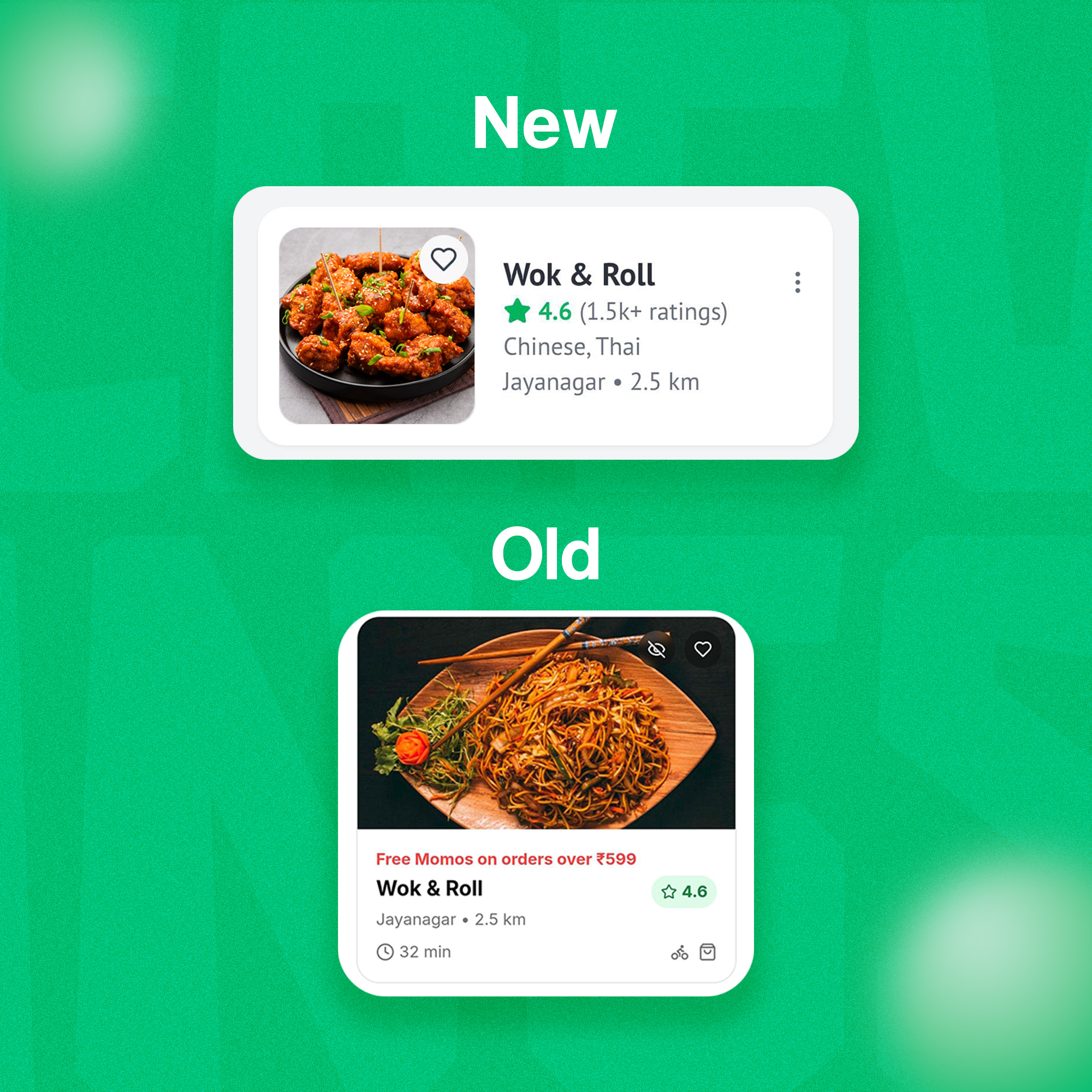
make sure they don't clutter the interface; too many labels might overwhelm users and detract from the user experience.
Replies (2)
More like this
Recommendations from Medial
Ali asger
Senior Frontend Deve... • 12m
AI 🚀 is powerful, but when it comes to solving real challenges, nothing beats human brain 🧠 creativity and experience. What if there were a platform where real users could tackle UI (User interface of web application and software) problems and codi
See MoreOnly Buziness
Everything about Mar... • 5m
The Paradox of Choice in marketing reveals that offering too many options can overwhelm consumers, leading to decision fatigue and regret. While brands think variety boosts sales, too many choices often paralyze buyers, making them avoid purchasing a
See MoreProgrammerKR
Founder & CEO of Pro... • 11m
Microsoft Unveils Major AI Upgrades at 50th Anniversary Microsoft celebrated its 50th anniversary by announcing major upgrades to its Copilot AI, introducing features like Copilot Memory, Copilot Vision, and a redesigned user interface. These update
See MoreAI Skynet Tools
Discover the Best AI... • 27d
AI Skynet Tools is an all-in-one platform designed to help users discover, compare, and choose the right AI tools with ease. From exploration to feature comparison and user reviews, everything is available in one simple and intuitive interface. Visit
See More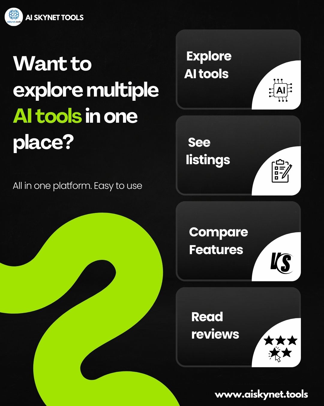
Download the medial app to read full posts, comements and news.








/entrackr/media/post_attachments/wp-content/uploads/2021/08/Accel-1.jpg)

