
Back
Hiral Jain
CA inter • 1y
Did you notice How are the brand logos changing? I mean yes they look good but colours are probably essential too, for ex Mc donalds their colours are well known and now mostly an app has either black or bold colour logos!
Replies (1)

More like this
Recommendations from Medial


Makarand Mohite
Brand Designer • 5m
Colour ≠ Luxury. The right colour combinations = Luxury. Anyone can pick a fancy shade like emerald green, royal burgundy, or gold. But what makes a brand truly feel premium is how these colours are paired. Deep green with muted gold. Burgundy with
See More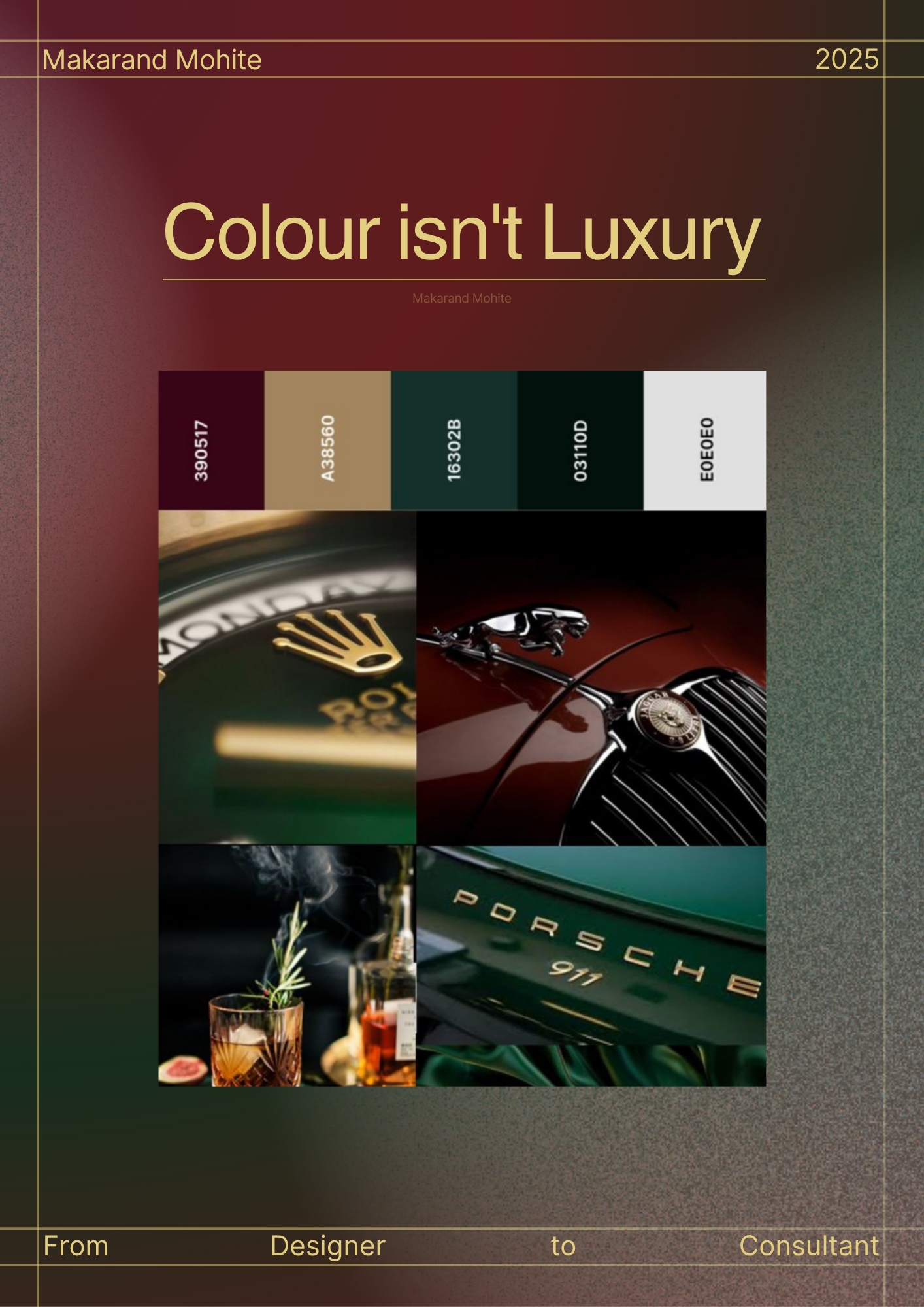


Sanket Bhosale
Post on Writing & Pe... • 1y
You probably are full of valuable ideas for content. But you just don’t notice. Because they become so normal. They’ve just become part of your day-to-day. The biggest misconception that you have. That you think, everyone is on pace with you or a
See More


Kartik Dhuria
Product led growth M... • 11m
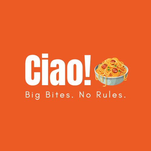
Please review and tell me out of these two logos which one is better the keywords of brand are Unfiltered • Modern • Youthful • Bold About the brand Ciao! offers pasta to-go made for cravings. It's hot, fast, a little messy, and always good. Perfect
See More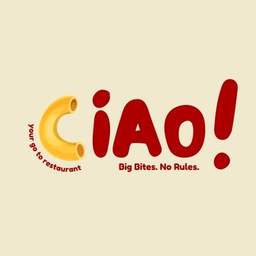


SHIV DIXIT
CHAIRMAN - BITEX IND... • 1y
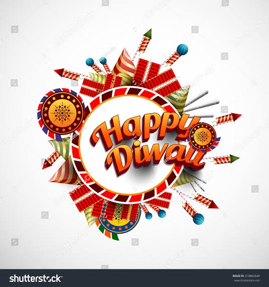
Idea For You Implement Now So guy's we all know that Diwali fire cracker and holi colour are so popular in India with the combined market size of 31000 crores and growth rate is around 5% . Problem — Currently in India colours and firecrackers a
See More


Bharath Varma
Sailing the sea to g... • 1y
Hello, Medial app your work on this app is good but here are some improvements that i want to suggest. Font : every post need to be separated properly but because of the font every thing looks messy. To resolve this please add some borders arround t
See More
/entrackr/media/post_attachments/wp-content/uploads/2021/08/Accel-1.jpg)


Download the medial app to read full posts, comements and news.