Back
ReepinderGoyal
Hungry? DM me • 1y
Logo should be made of bright yet dull colour
Reply
1
More like this
Recommendations from Medial
SHASHWAT PANDEY
Have a solid backgro... • 1y
I made this logo for my page Name : TeamLancers ( Related to Freelancing ) Logo Explanation 👇 Here the key is the main element visible, which is a symbol of #Solution. At the bottom of the key is T and L ( TeamLancers ), and Green colour represe
See More
Reply
2
Karunya Sivakumar
Founder cum CEO of a... • 1y
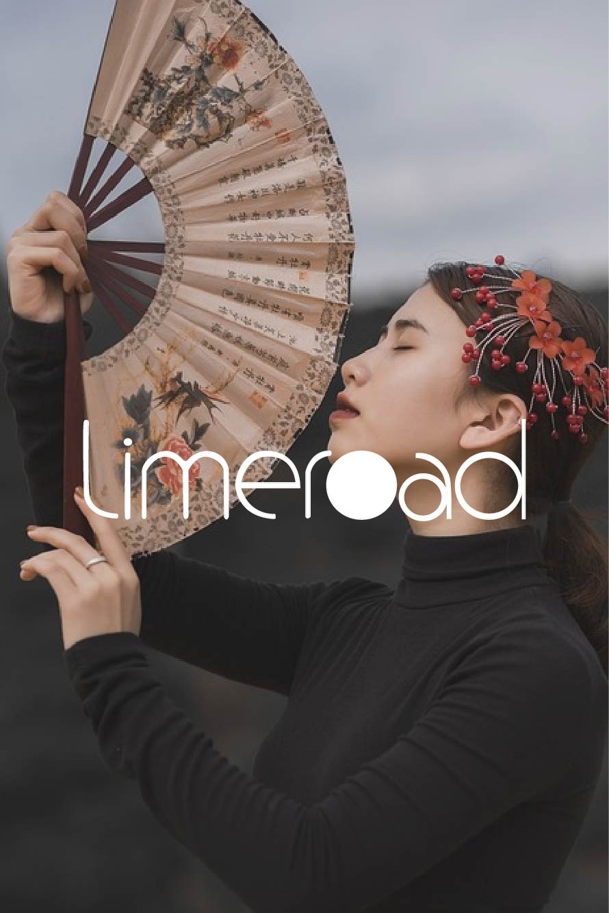
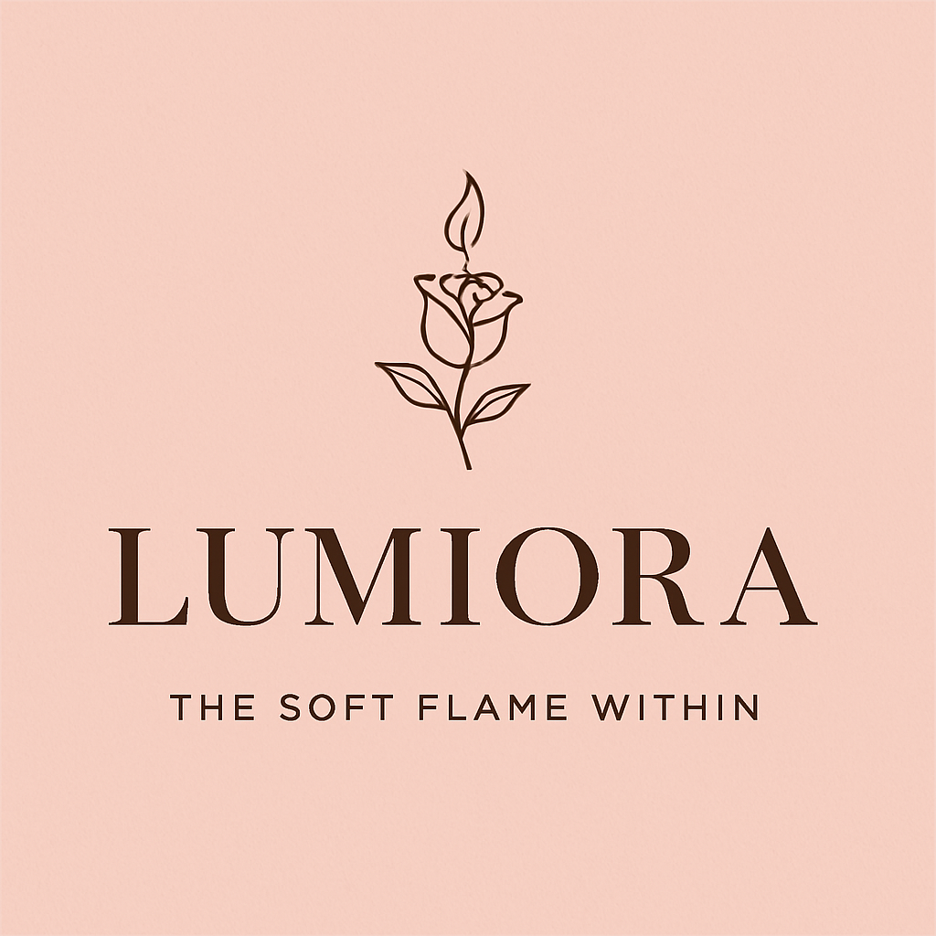
I’m not sure if I should be posting this here but I need inputs… Any suggestions to improve my logo? I want to keep this as simple as possible and how do I make sure it blends well with different backgrounds? (I’m not satisfied with the colour combi
See More
11 Replies
7
Download the medial app to read full posts, comements and news.














/entrackr/media/post_attachments/wp-content/uploads/2021/08/Accel-1.jpg)


