Back
Karunya Sivakumar
Founder cum CEO of a... • 1y
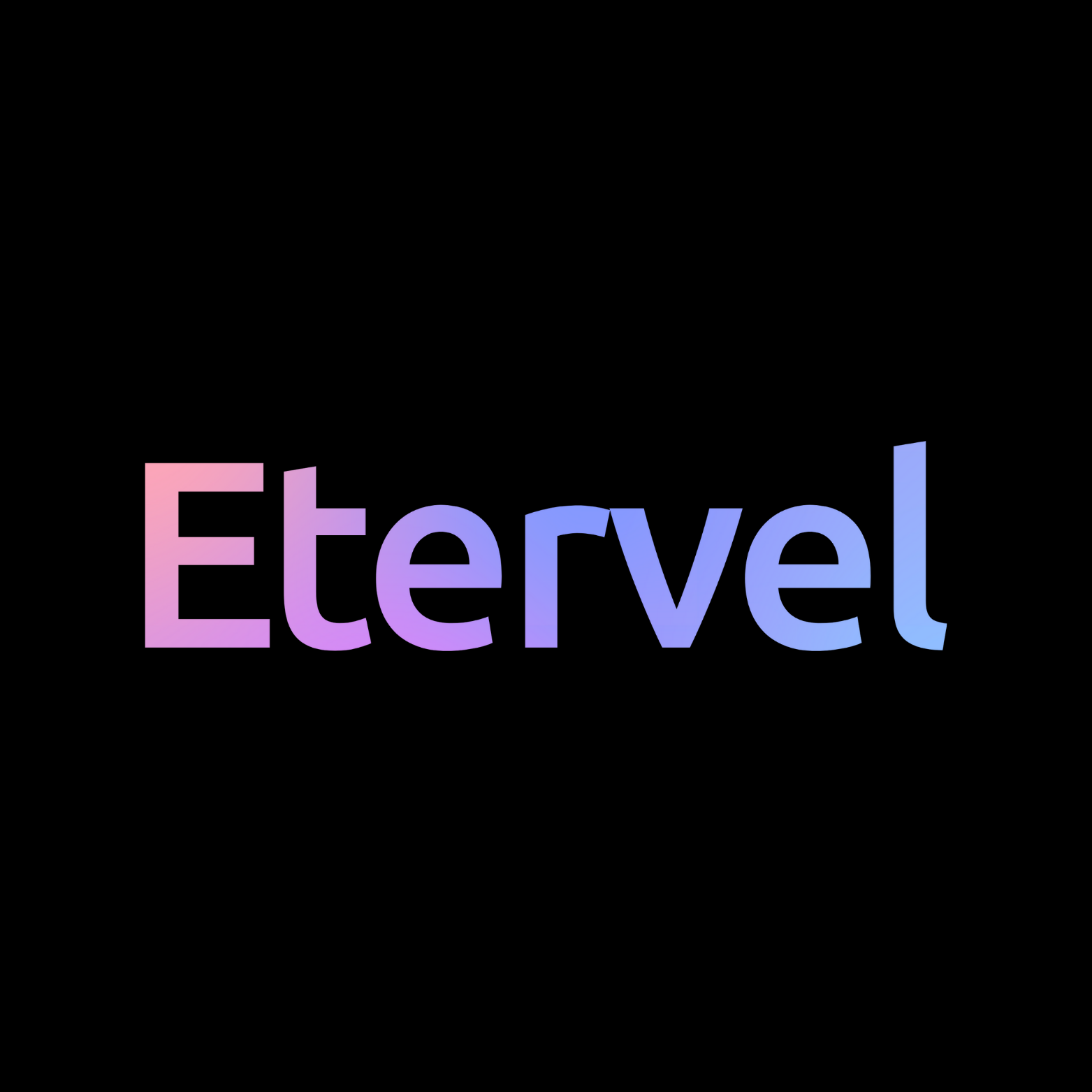
I’m not sure if I should be posting this here but I need inputs… Any suggestions to improve my logo? I want to keep this as simple as possible and how do I make sure it blends well with different backgrounds? (I’m not satisfied with the colour combination also)
11 Replies
7
Replies (11)
More like this
Recommendations from Medial
Anonymous
Hey I am on Medial • 1y
Hello I’m a Final Year Student in COMPUTER SCIENCE ENGINEERING and still I’m not sure that i want to continue building my career in this field as I’m surely a tech fanatic but where i lag is just coding i hate that part so as of now I choose the Fiel
See More3 Replies
1
4
Download the medial app to read full posts, comements and news.


/entrackr/media/post_attachments/wp-content/uploads/2021/08/Accel-1.jpg)


