Back
Kritarth Mittal • Soshals
Founder, Soshals | C... • 1y
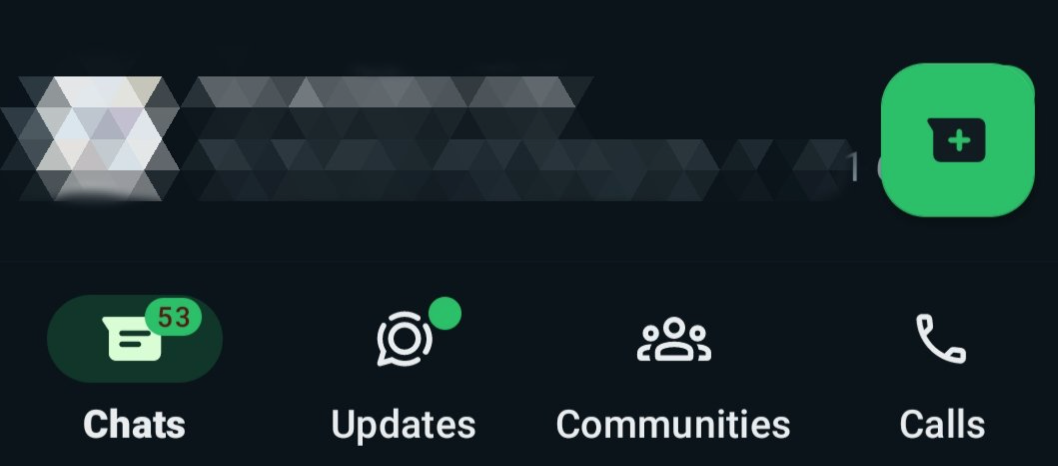
Is it just me or y'all are also annoyed by the recent changes in @WhatsApp UI/UX. Idk about iOS but WhatsApp Android is getting uglier. I mean what is up with this new neon color palette? Hurts my eye. We, humans, hate change. Team at WhatsApp, please slow down.
Replies (4)
More like this
Recommendations from Medial
Shamsuddin Essa Hamdule
Full Stack Software ... • 8m
✨ Before & After: Website Redesign for Parkar Eye Clinics ✨ We just gave a fresh new look to parkareyeclinics, focusing on modern colors, improved readability, and user-friendly design – while keeping the trusted content structure intact. 💻🌿 ✔ Sof
See More
Anmol Narang
Engineer, Entreprene... • 1y
As a developer, my review of this application is as follows: 1. The onboarding process is smooth, which is a positive aspect. 2. However, the application feels unresponsive at times, which needs improvement. 3. There are missing validations for user
See MoreVishnu Dileesh
Engineer | Entrepren... • 7m
It Starts in the Details No One Notices Not in a pitch. Not on Product Hunt. Not in the headline font of your landing page. It starts in the margins. A menu animation that feels too sharp. A color that doesn't sit right on the eye. The fourth revi
See MoreDownload the medial app to read full posts, comements and news.






/entrackr/media/post_attachments/wp-content/uploads/2021/08/Accel-1.jpg)

