Back
Anmol Narang
Engineer, Entreprene... • 1y
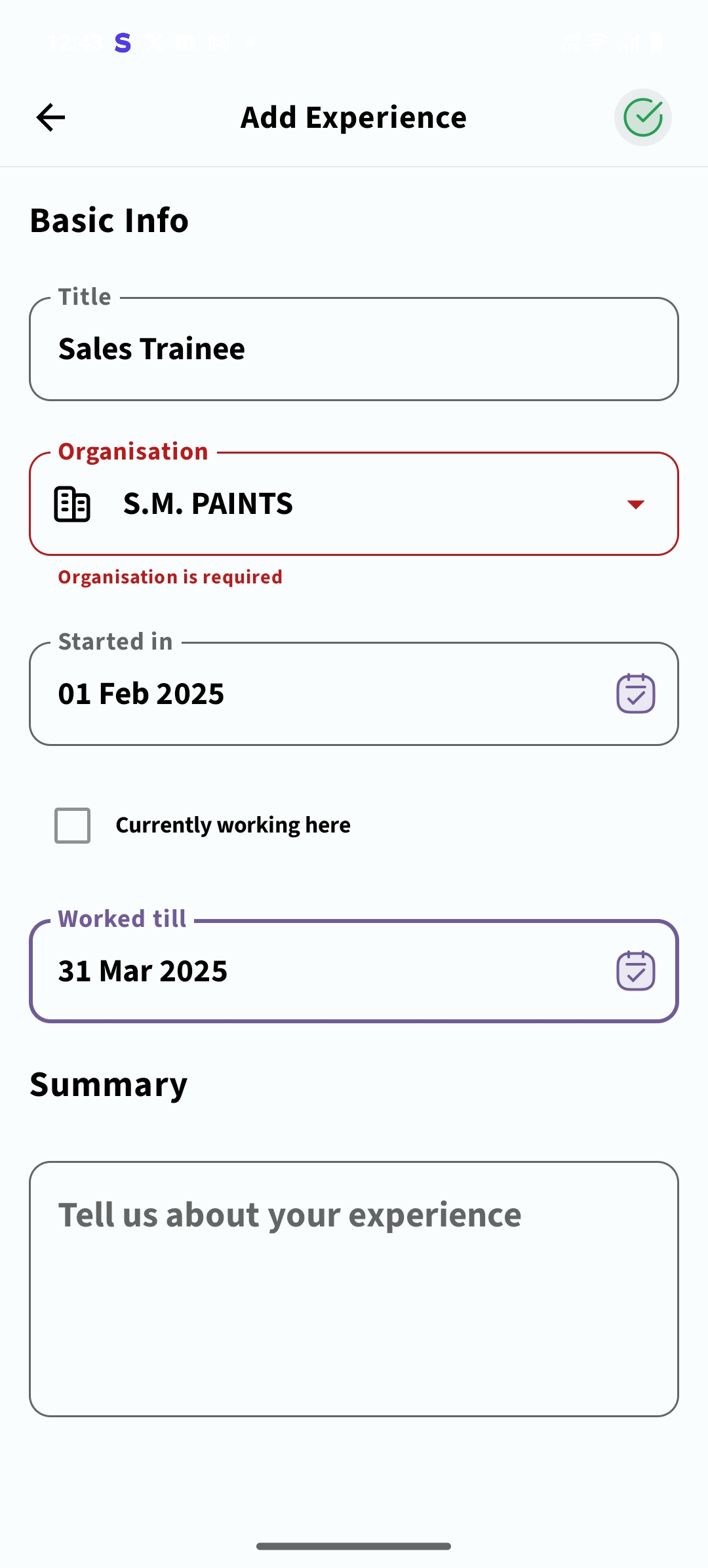
As a developer, my review of this application is as follows: 1. The onboarding process is smooth, which is a positive aspect. 2. However, the application feels unresponsive at times, which needs improvement. 3. There are missing validations for user data, which is a critical issue for data integrity. 4. The inability to add an organization, my case. 5. Personally, I find the color palette too dark, which might affect user retention. While I don't advocate for a white mode, incorporating a more user-friendly color scheme could improve the overall experience and reduce eye strain for long-term usage. Also there is saying that the young people love dark, but not this dark. 6- News section UI feels outdated. You guys can contradict me and add your opinions. Thankyou.
Replies (4)
More like this
Recommendations from Medial
shrikant shivangi
Hey I am on Medial • 11m
there is In-house application which is developed by only java and .jsp for frontend and databases is SQL and SQL Lite and there are multiple roles which are Admin , Client Manager, Client Resource, Manager and Resource there are Management sections l
See MoreDownload the medial app to read full posts, comements and news.













/entrackr/media/post_attachments/wp-content/uploads/2021/08/Accel-1.jpg)

