
Back

Makarand Mohite
Brand Designer • 5m
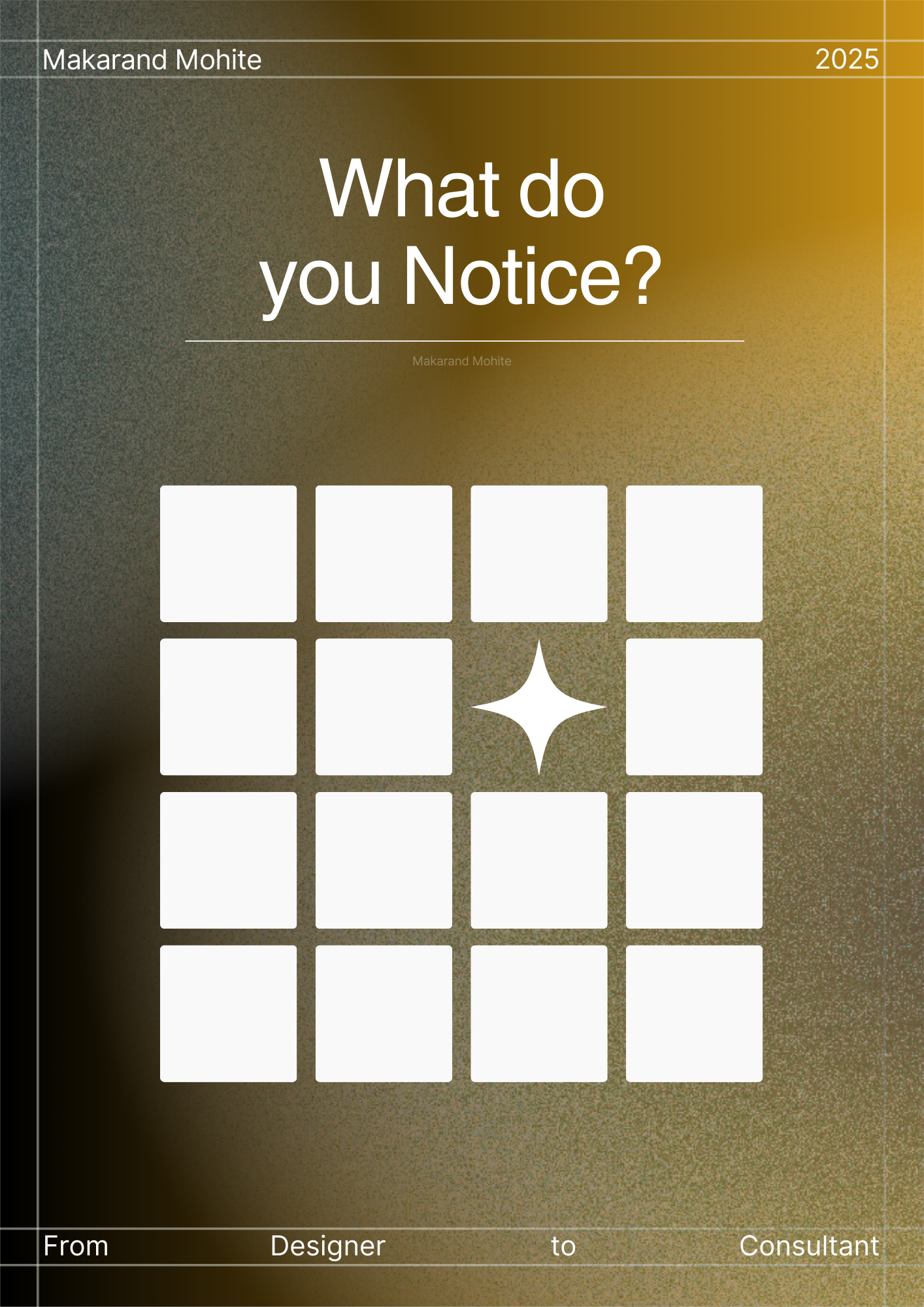
Ever wonder why some designs stay in your head long after you’ve scrolled past them? That’s the *Von Restorff Effect* at work. 👉 People remember what stands out from the pattern. In branding + marketing, this is gold. Here’s how to use it: Change color - A yellow CTA button on a calm blue layout. Change size - Make the key message bigger, not everything bigger. Change shape - A circular badge in a grid of rectangles. This little dose of visual friction makes the important stuff sticky in memory. Think of Apple’s “Think Different.” The ad was minimalist in a noisy world of clutter and maximalists, and that’s exactly why it was unforgettable. Your designs don’t need to scream louder. They just need to stand apart. If this helped sharpen your eye, check this out https://www.behance.net/gallery/235197569/MoonHead-Lifestyle-Gifting-Brand-Identity
More like this
Recommendations from Medial


Bokkisam sahith
Empowering Telugu Yo... • 14d
I took a long gap… not to quit, but to build something bigger. I’ve been researching deeply on one thing — Quality first, product next. Now I’m coming back with something that could change how we trust products. Stay tuned. This is just the beginnin
See More
Shiv Bharankar
Seize the day" • 1y
What’s the Story Behind PUMA Becoming PVMA? Have you noticed the buzz around a PUMA store rebranding itself as "PVMA"? It’s an interesting twist that has us all wondering—what’s the reason behind this change? Could it be a creative marketing move,
See More


Sai Venkat
Hey I am on Medial • 4m
We can get groceries, fashion, and essentials delivered in minutes. But when it comes to electronics, instant delivery is still a problem. Need it now? You’re stuck waiting days. That’s about to change. Launching soon in Bengaluru — electronics in
See More


/entrackr/media/post_attachments/wp-content/uploads/2021/08/Accel-1.jpg)


Download the medial app to read full posts, comements and news.