
Back

Anonymous 2
•
Wipro • 7m
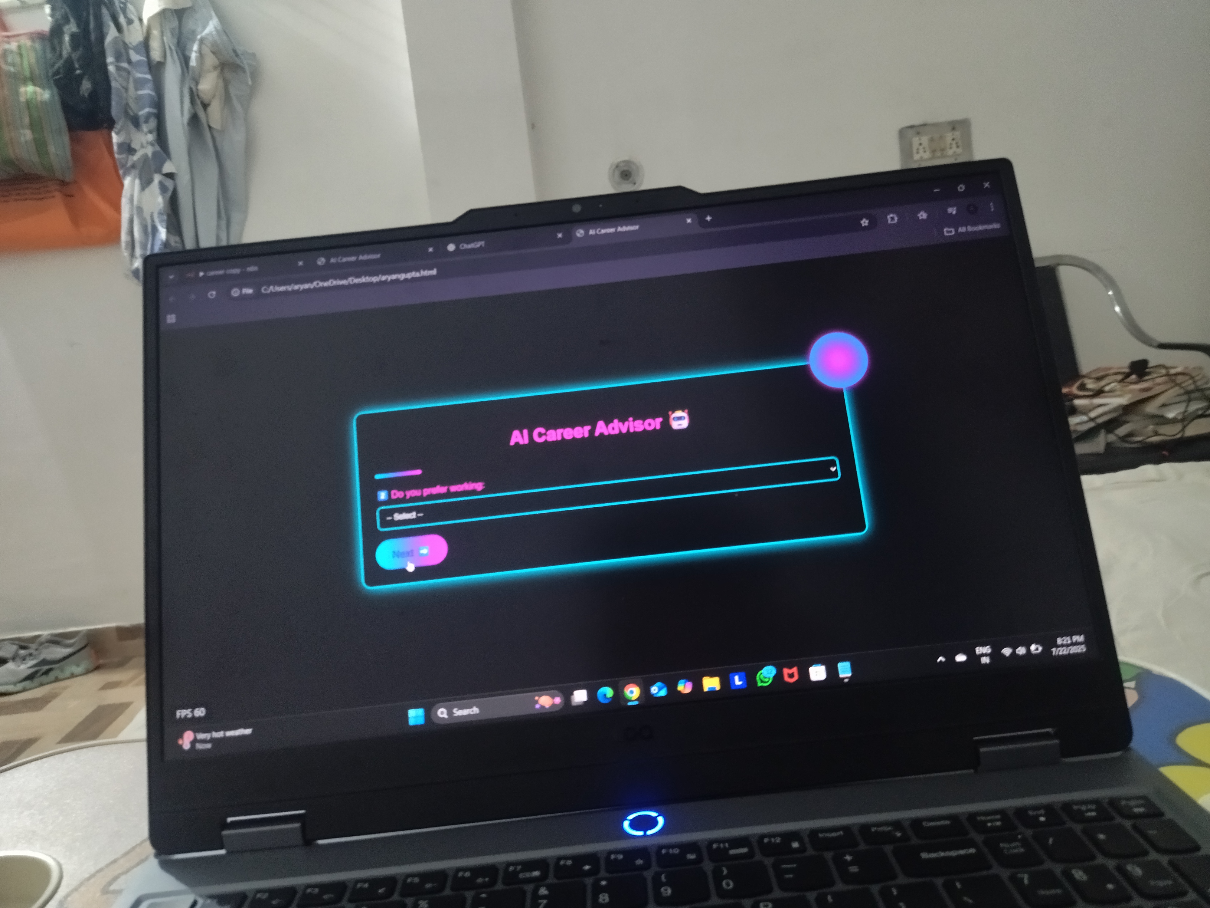
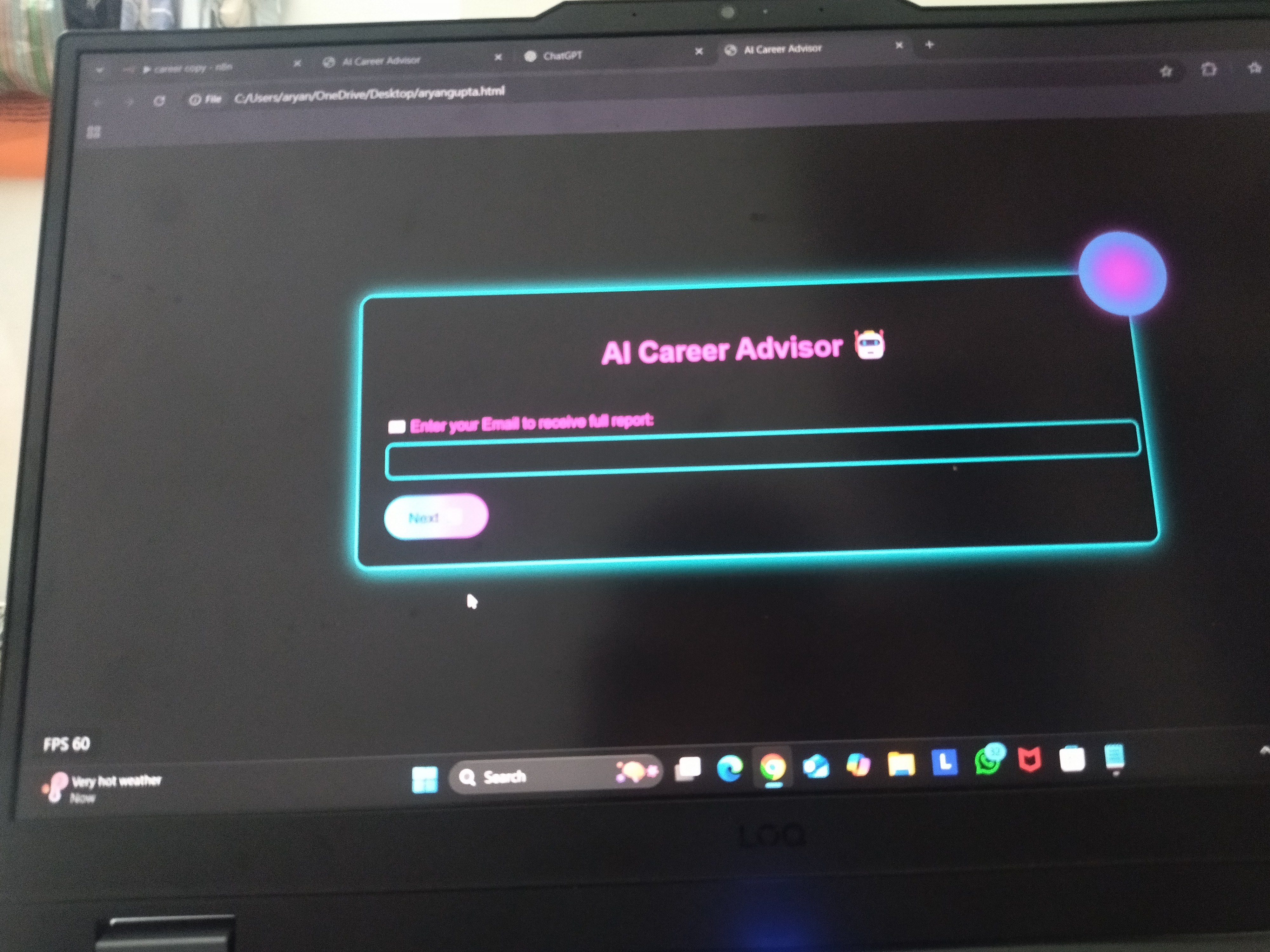
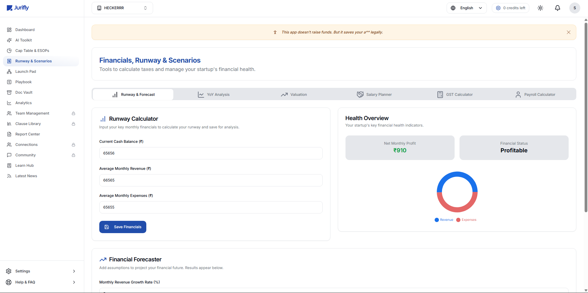
Ui looks…uhh
1 Reply
1
Replies (1)
More like this
Recommendations from Medial


/entrackr/media/post_attachments/wp-content/uploads/2021/08/Accel-1.jpg)


Download the medial app to read full posts, comements and news.
•
Wipro • 7m
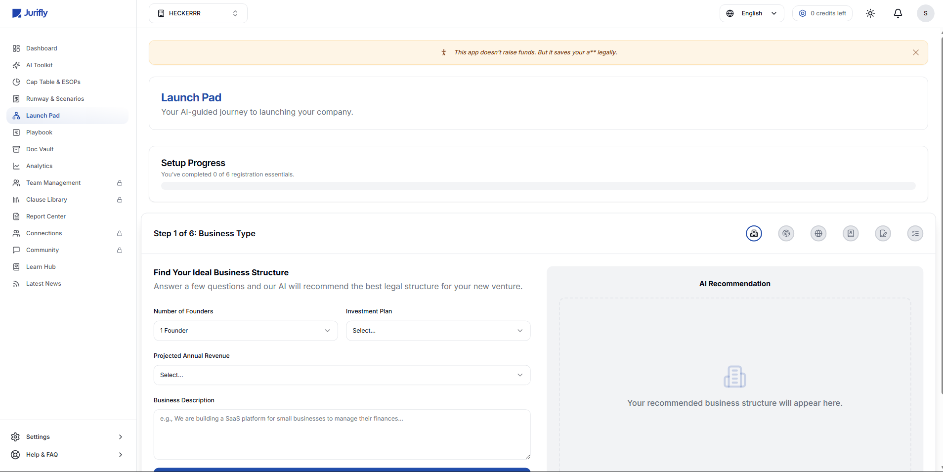
Ui looks…uhh
Download the medial app to read full posts, comements and news.