•
Stock Market Institute I Trade With Market I Financial Institute • 4m
[This post has been deleted by the creator]
Fail fast, learn fas... • 4m
Your logo's 'I' looks like a dumbbell placed upright! 🌚😁🤣
Founder | Kalika OS • 4m
6/10 I wouldn’t say it’s a bad logo. It actually looks clean, simple, and visually balanced. However, it does feel like something generated by AI, which makes it a bit generic. Without knowing the purpose or industry your app is targeting, it’s hard to judge how well the logo fits. The effectiveness of a logo really depends on how well it aligns with your brand and audience.
Hey I am on Medial • 4m
boring
Digital marketer • 4m
is se acha to ma bana du duga details bhej de mera pass
that's AI
Founder of StudyBFF ... • 4m
Kya hai bhai ye? Ai?
Aspiring Healthcare ... • 4m
the logo is okh but the thing that matter is how is your application/website/company representing it
4/10
Be creative and logi... • 4m
5. but good 👍
i would rate it 4. the colour scheme is just too bad. could be better
Founder and CEO Vegh... • 3m
Rate this logo...... ?/10
Start now what you j... • 5m
Rate this logo ?/10
One Idea... starting... • 5m
Rate this logo. ?/10
"Turning visions int... • 5m
The Institute of Chartered Accountants of India • 5m
Video Editor • 3m
rate logo../10
Rate the logo ?/10.
....... • 4m
rate the logo ?/10
Logo & Brand Identit... • 11m
(Rate this logo scale 1-10 ) It is a sample logo of a cupcakes bakery.
Hey I am on Medial • 2m
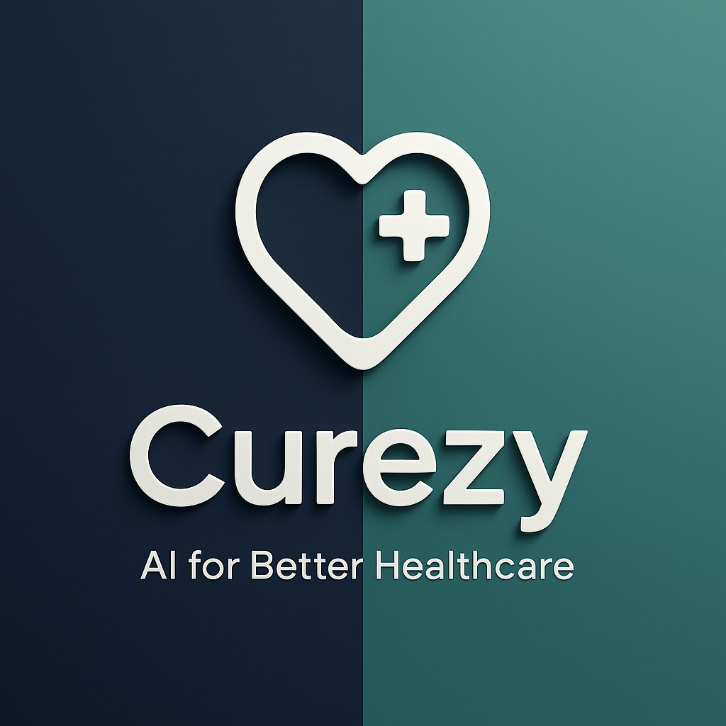
Rate this logo out of 10. (clothing brand with a mystical vibe)
August AI raises $3 million fundi ...
Discord data breach affects at le ...
Walmart partners with OpenAI for ...
Download the medial app to read full posts, comements and news.