Hey I am on Medial • 10m
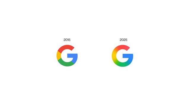
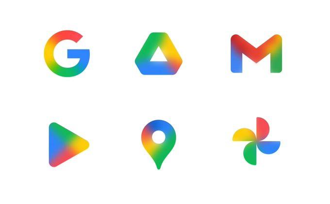
Minimalism isn’t dead, but it’s getting softer. Google just quietly updated its iconic “G” for the first time in almost a decade. No more flat. Subtle gradients. Quiet shift. But very intentional. Why the change? Screens got better. Old displays
•
ADJUVA LEGAL® • 10m
Honestly, it looks worse than before.
Hakuna matata • 10m
everyone: it can't be worse than before the worse:
Hey I am on Medial • 2y
2024 looks wayyyyy worse than 2023. Brace yourselves. 😞
The Clueless Company • 1y
Unpopular opinion: Regret is far worse than failure.
All Range Developer ... • 9m
Medial Team , Please add a message delete option in DMs . I just mispelled "it" , way worse than you think it could be .
Medial • 1y
Tried this after the launch. Must say it’s worse than sting.
Founder • 8m
Doing nothing is even worse than doing things in the wrong way.
Hey I am on Medial • 1y
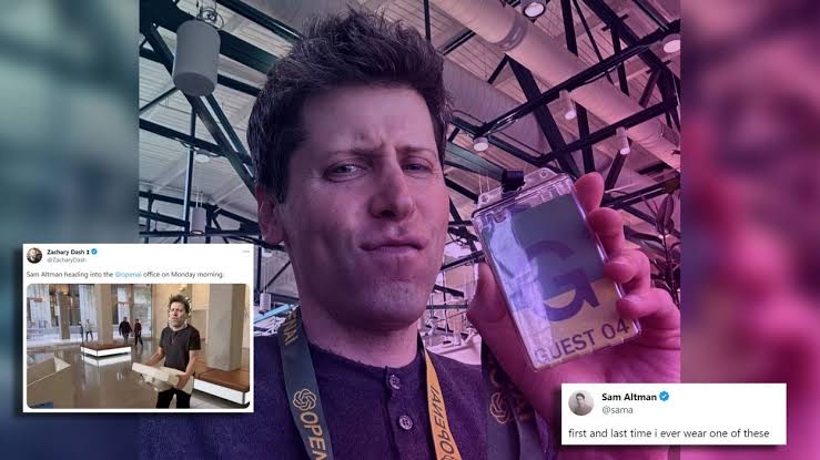
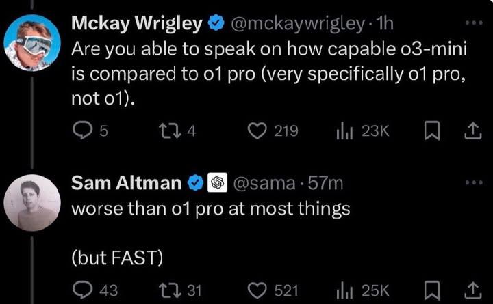
Sam Altman says the o3-mini will be worse than the o1 pro 👀
Do less • 1y
Honestly such UI only looks good on figma, irl a more native touch would make it more interactive, rn it's just labyrinth of features that idk how to navigate
I don't play the gam... • 2y
Honestly, this app's user interface almosy looks like that if X which in a separate audiance base on interest basis .
Swiggy laysoff 400 employees. Flipkart laysoff 1000 employees. Microsoft laysoff 1900 employees. 2024 is getting worse than 2023.
Theia Insights Raises $8 Million ...
Miravoice Secures $6.3M in Seed F ...
Silurian — $6M Raised, Investors, ...
Download the medial app to read full posts, comements and news.


/entrackr/media/post_attachments/wp-content/uploads/2021/08/Accel-1.jpg)


