Back
More like this
Recommendations from Medial
Aman Vishwakarma
Founder | Edvigo.in • 9m
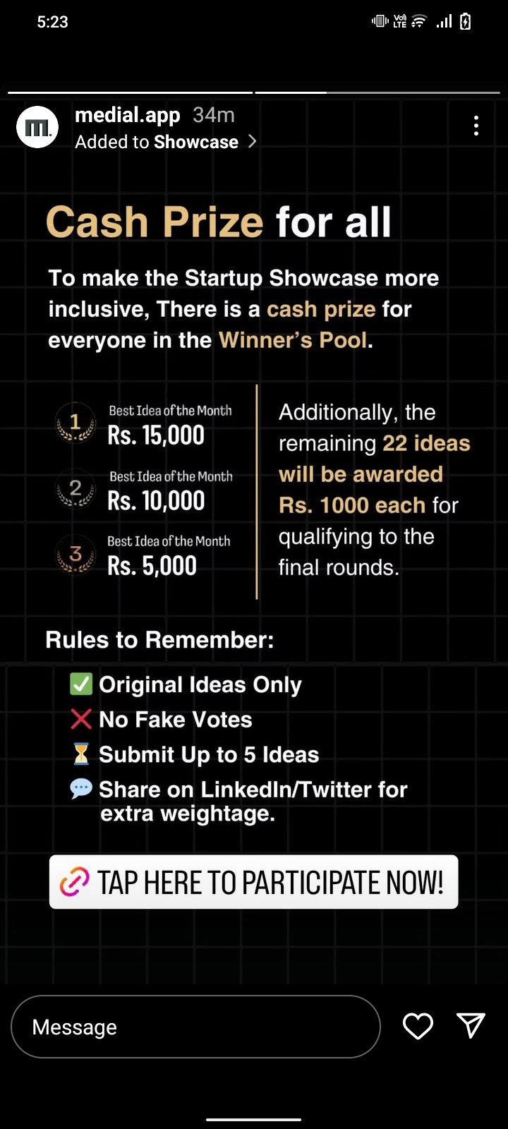
I just hopped onto Midial and I'm trying to get into it, but the UI is a bit of a hurdle. The continuous flow of high-contrast text and font without much visual structure is actually pretty uncomfortable on the eyes. A more polished and less visually
See MoreDivyansh
I don't play the gam... • 3m
Is there anyone here who knows how to build app and could collaborate with me. I'm just looking for serious people who can make apps and are enthusiastic in starting up something. Just text me or comment and I'll tell you the real plan. It's just n
See MoreSudarshan Mozar
Entrepeneur ||Proble... • 1y
Medial is good app but the app owner should focus on 1. how to increase active users rather than increase in new users. 2.Make the conversation criteria somehow different rather than 50% completion of profile. 3.Make phsychology behind colours to inc
See MoreAccount Deleted
Hey I am on Medial • 4m
Hey everyone, check out this new site I built: GoMemer.com It's an AI toolkit to make your social life easier: Meme Generator: Instantly create viral memes. AI Rizz Assistant: Get witty openers & replies for your chats. Text Your Ex: Find the right w
See MoreDownload the medial app to read full posts, comements and news.











/entrackr/media/post_attachments/wp-content/uploads/2021/08/Accel-1.jpg)

