
Back

Hemant Prajapati
•
Techsaga Corporations • 1y
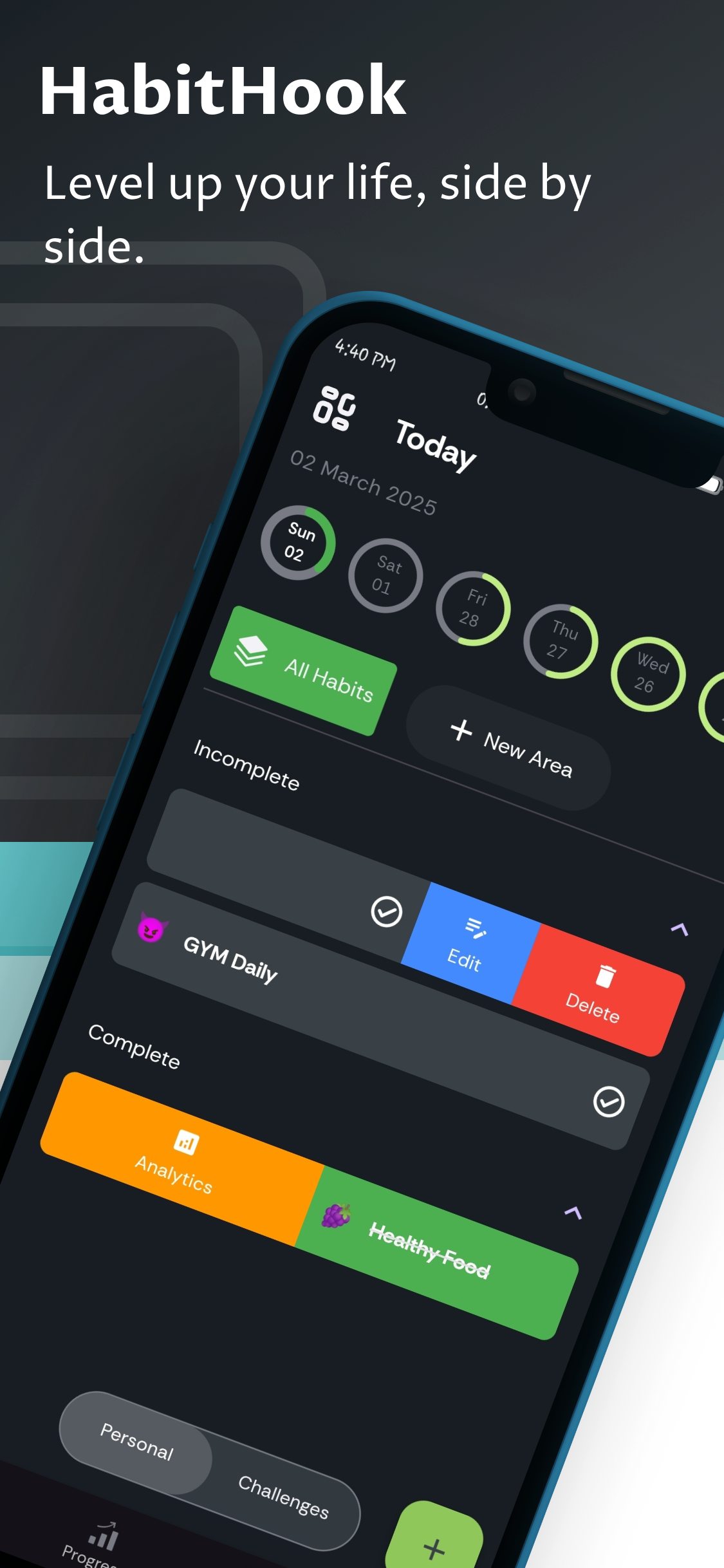
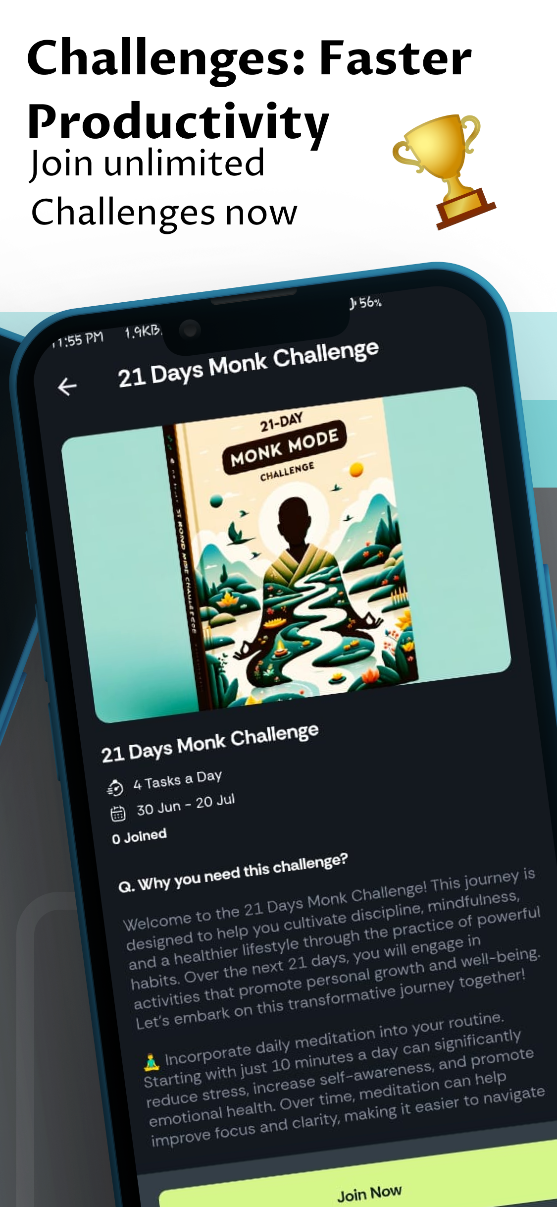
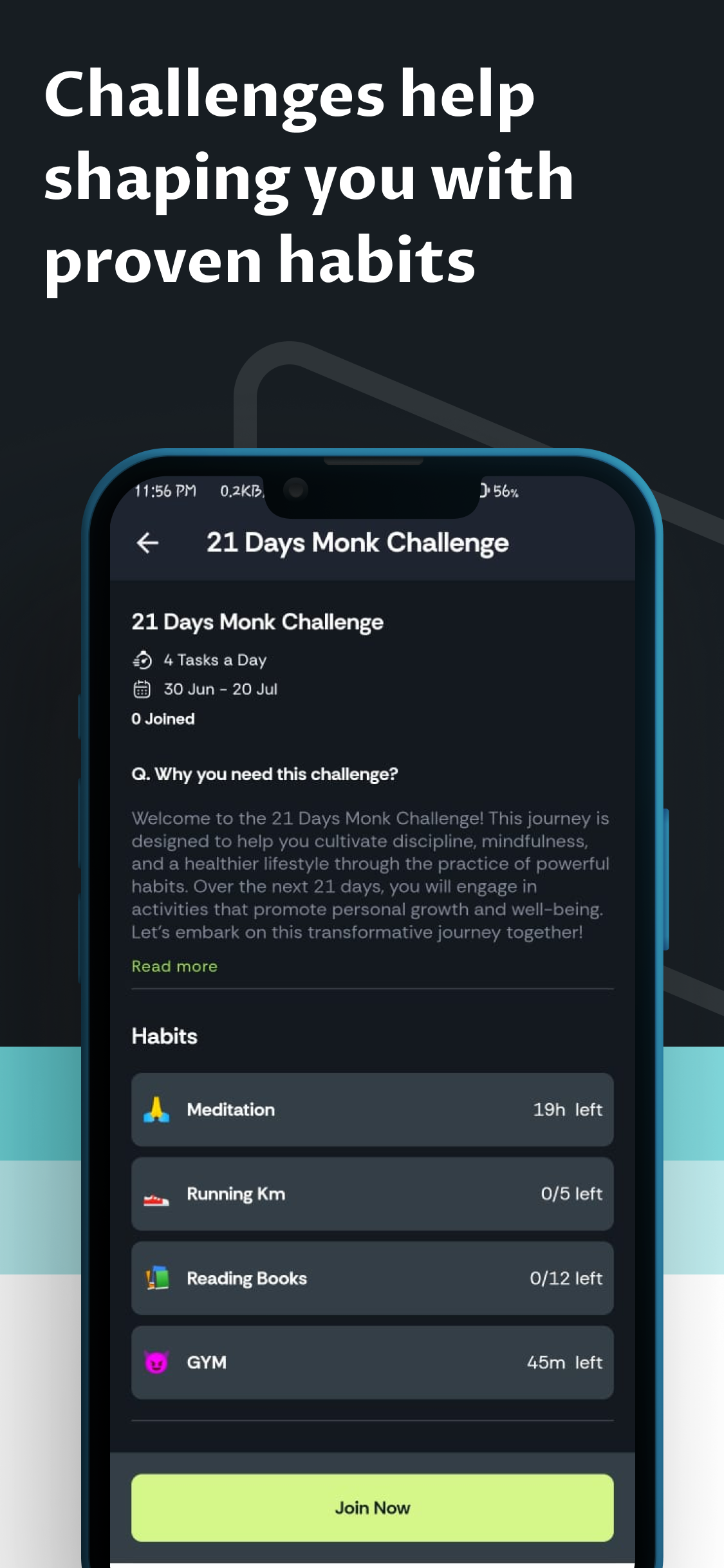
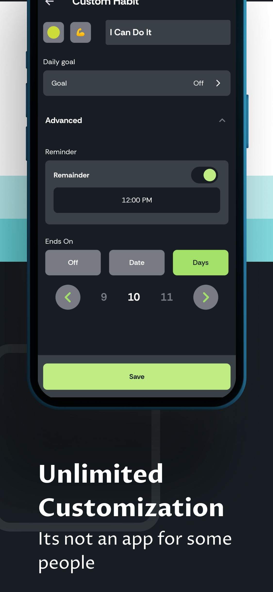
I just finished designing the app screenshots for 𝗛𝗮𝗯𝗶𝘁𝗵𝗼𝗼𝗸 𝗗𝗮𝗶𝗹𝘆 𝗣𝗹𝗮𝗻𝗻𝗲𝗿. It’s a small step, but an important one for the 𝗣𝗹𝗮𝘆 𝗦𝘁𝗼𝗿𝗲. 𝗦𝗰𝗿𝗲𝗲𝗻𝘀𝗵𝗼𝘁𝘀 𝗮𝗿𝗲𝗻’𝘁 𝗷𝘂𝘀𝘁 𝗽𝗶𝗰𝘁𝘂𝗿𝗲𝘀 — they show what the app does and why someone should download it. While working on them, I realized a simple Figma tip: • 𝘒𝘦𝘦𝘱 𝘵𝘩𝘦 𝘵𝘦𝘹𝘵 𝘴𝘩𝘰𝘳𝘵 𝘢𝘯𝘥 𝘤𝘭𝘦𝘢𝘳. • 𝘜𝘴𝘦 𝘤𝘭𝘦𝘢𝘯 𝘮𝘰𝘤𝘬𝘶𝘱𝘴 𝘵𝘰 𝘴𝘩𝘰𝘸 𝘸𝘩𝘢𝘵 𝘵𝘩𝘦 𝘢𝘱𝘱 𝘭𝘰𝘰𝘬𝘴 𝘭𝘪𝘬𝘦. • 𝘚𝘵𝘪𝘤𝘬 𝘵𝘰 𝘺𝘰𝘶𝘳 𝘢𝘱𝘱’𝘴 𝘤𝘰𝘭𝘰𝘳𝘴 𝘴𝘰 𝘦𝘷𝘦𝘳𝘺𝘵𝘩𝘪𝘯𝘨 𝘧𝘦𝘦𝘭𝘴 𝘤𝘰𝘯𝘯𝘦𝘤𝘵𝘦𝘥. These little things help with 𝗔𝗽𝗽 𝗦𝘁𝗼𝗿𝗲 𝗢𝗽𝘁𝗶𝗺𝗶𝘇𝗮𝘁𝗶𝗼𝗻 (𝗔𝗦𝗢) — making sure the app looks good and stands out. I’d really appreciate your feedback. • Do the screenshots grab your attention? • Is there anything you’d change to make them better? Would love to hear your thoughts.
Replies (1)


/entrackr/media/post_attachments/wp-content/uploads/2021/08/Accel-1.jpg)


Download the medial app to read full posts, comements and news.