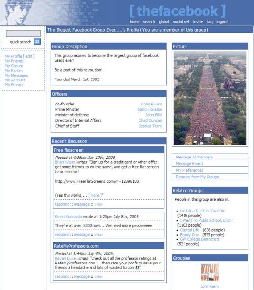
Remember this how Facebook looked when it launched.
Don’t waste time building and testing too much in MVP stage. Just launch your hero feature, if there’s need people will still use a buggy or bad UI.
Focus on validation first.
Just ship it.
sharukh
Stealth • 5d
But you should compare facebook with a UI that existed at that time in the market. Then you know that it's pretty decent.
What a user feels is UI, for a naive user UI is very important.
But yeah don't overdo it. You can improve it by overtime.
Another story of a failed product by a tech giant!
In 2013, Facebook launched Facebook Home, an ambitious project aimed at revolutionizing smartphone interfaces by deeply integrating the social media platform into Android devices. The idea was to tr
Which OTT platform has the best User experience and UI from product perspective?
Answer like a product manager.
2 replies6 likes
PRATHAM
Stealth • 8m
Can you name a startup that had the following but are dead now :
Good USP
Solving A great problem
Decent Business model
( Don't include the one copied from foreign)
11 replies27 likes
Anji Reddy
Stealth • 5m
#hiring
We are #hiring looking for mobile app development interns .
Key skills: REACT NATIVE, MONGODB, NODE.JS, BOOTSTRAP, AWS
Job description
Intern should work on UI/UX
Decent knowledge on REACT NATIVE
Decent knowledge on AWS
Sh
See More
0 replies4 likes
Mr Z
•
Medial • 1m
Facebook offered him $3 Billion for his company.
He turned them down.
Now, his company is worth 5x what Facebook offered.
5 lessons from the crazy story of Evan Spiegel:
Imagine being 23 and turning down $3 billion.
Most would call you crazy. Yo
"MISTAKES MADE BY FACEBOOK"❗
Facebook started with a simple idea: connect people. But somewhere along the way, they messed up. Let's see what we can learn from their mistakes to make your startup a winner!
Fun to Frustration:
Facebook was exciting