Back
Vishnu kumaran
Design guide for you... • 1y
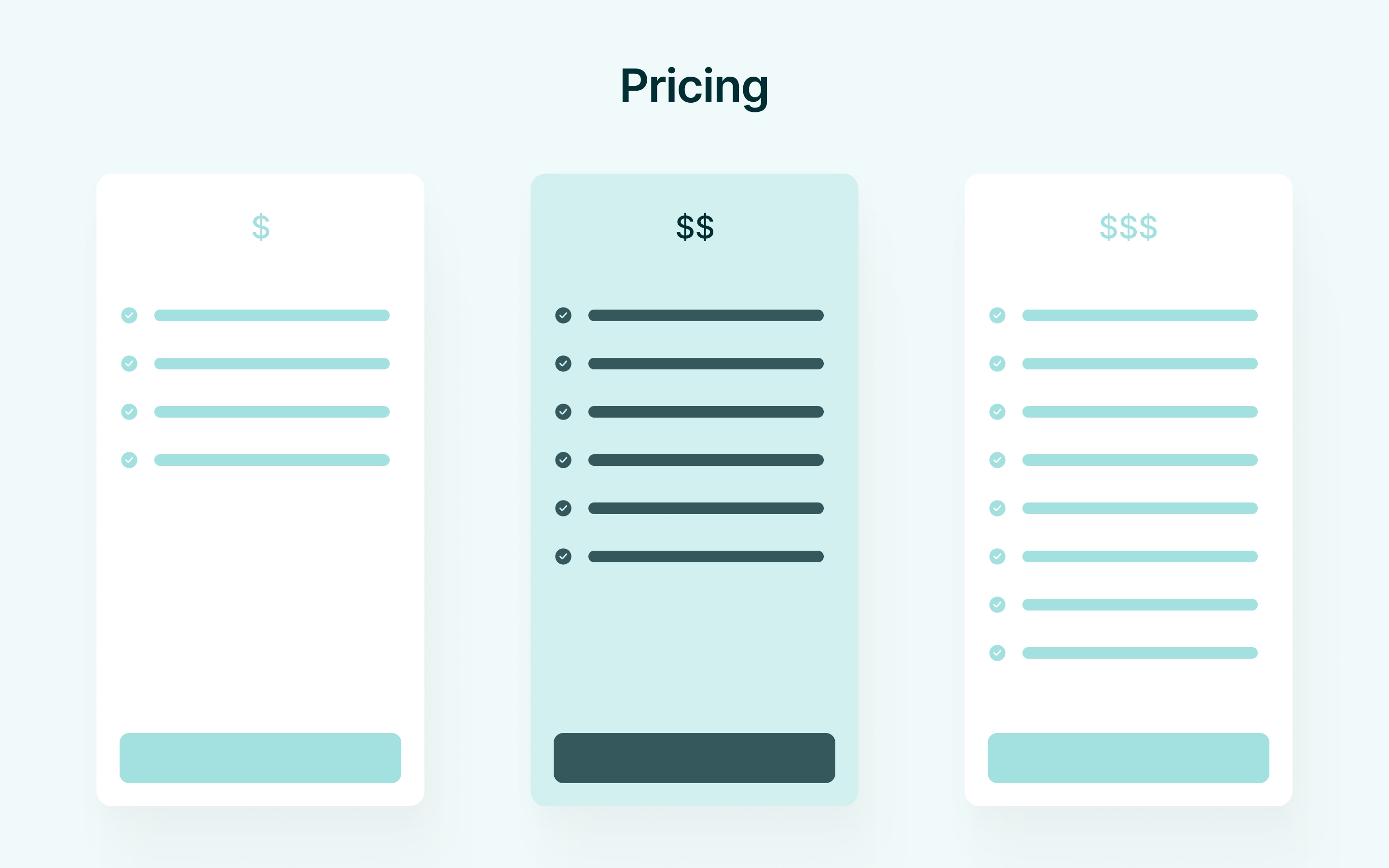
Pricing is the core of your SaaS offering. It’s crucial to handle well, but it needs to be done right. What makes a pricing section nearly perfect? ~ Clarity and Simplicity: Display pricing and features clearly with easy-to-read layouts. Avoid confusing or overwhelming information. ~ Highlight the Best Option: Use visual cues to emphasize the most popular or best-value plan, helping users make quicker decisions. ~ Transparency: Be upfront about all costs, including fees and taxes. Clearly show whether pricing is monthly, yearly, or one-time. ~ Free Trial or Plan: Offer a free trial or freemium option to attract hesitant users and highlight upgrade incentives. ~ Strong CTA Buttons: Use clear, action-oriented buttons (e.g. "Start Free Trial") to guide users, making them stand out visually. ~ Minimize Risk: Offer money-back guarantees, trial periods, or flexible upgrade/downgrade options to reduce hesitation. *Some pricing strategies may vary depending on the SaaS offering.
Replies (6)
More like this
Recommendations from Medial
Hemant Prajapati
•
Techsaga Corporations • 1y
Follow for more || Bookmark for sure || Share your support:--- . . 📈 Guide to Implementing the Freemium Model for Your Business 🚀 . . 🎯 Identify Core Value |:-> Offer your most compelling features for free to attract users. --:-> Stat: 90% of user
See More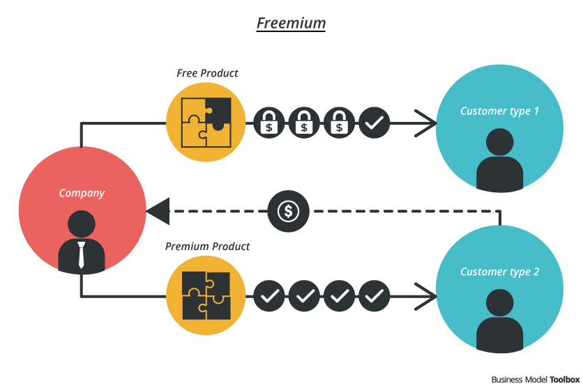
Abdul Rahaman Khan
CEO at StartupSphare... • 9m
Pricing Dilemma: How do we strike the perfect balance where users feel they're getting value without overpaying, and founders feel fairly compensated? Your Thoughts: What pricing models have you seen that achieve this balance? Any insights or experi
See MoreSarthak Gupta
17 | Building Doodle... • 6m
This Image is not generated by your Fancy ChatGPT. This is made using my brand new app called StyleSnap with pricing keeping Indian users in mind 😀 500 rs for 250 images or if you just wanna try it we have a Free Trial too. Dm me and I'll send you t
See More
Abdul Rahaman Khan
CEO at StartupSphare... • 9m
🧠 Pricing Dilemma: How do we strike the perfect balance where users feel they're getting value without overpaying, and founders feel fairly compensated? 💬 Your Thoughts: What pricing models have you seen that achieve this balance? Any insights or
See MoreSatyam Kumar
Pocket says nil.. Mi... • 8m
Freemium Model for Startups: Smart or Trap? What is it? Freemium = Free + Premium. You offer a basic product for free, and charge users for advanced features, limits, or perks. Who should consider it? ✅ Startups in SaaS, Edtech, Productivity, Devel
See More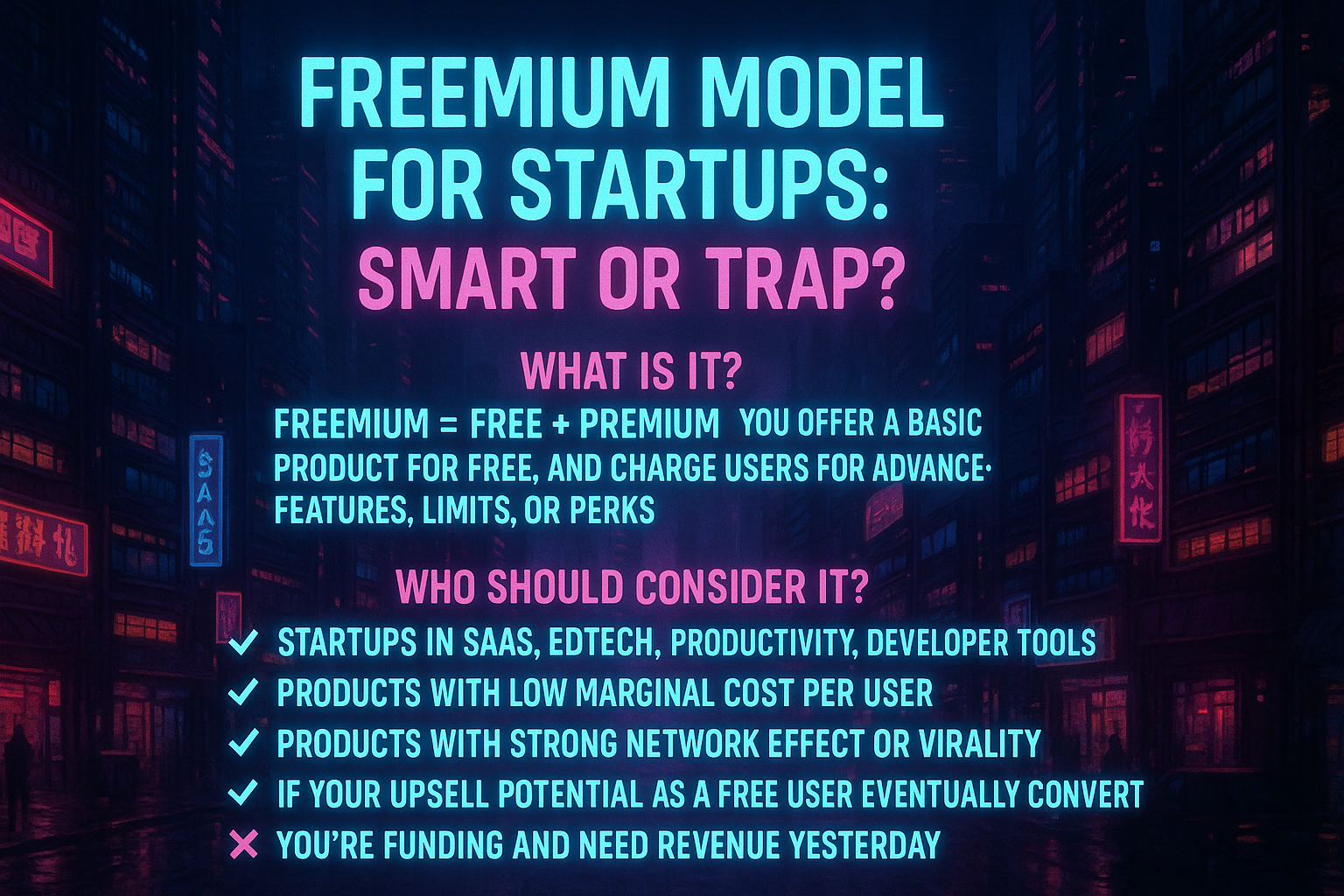
Download the medial app to read full posts, comements and news.




/entrackr/media/post_attachments/wp-content/uploads/2021/08/Accel-1.jpg)

