Back
Prakriti Khandekar
Mission Anaska 🚀 (s... • 1y
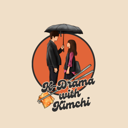
You know what... as of my design experience I have learnt one thing that putting all good elements together does not necessarily form a good output. Whatever feels good is just because of good combination of their elements. Like somebody's face may looks good but it's not necessary to be good alone of its nose, eyes, mouth etc. You have used a simple circular shape in background then you have a font which is not so simple and a bit fancy. Also the illustration is somehow complicated, in the age of simplicity it should be a little minimal. Every elements you use should go with each other, try to follow a color scheme. These are just some improvements according to me however you have made a great design...
More like this
Recommendations from Medial
Ahemad Raza
Senior Graphic Desig... • 2m
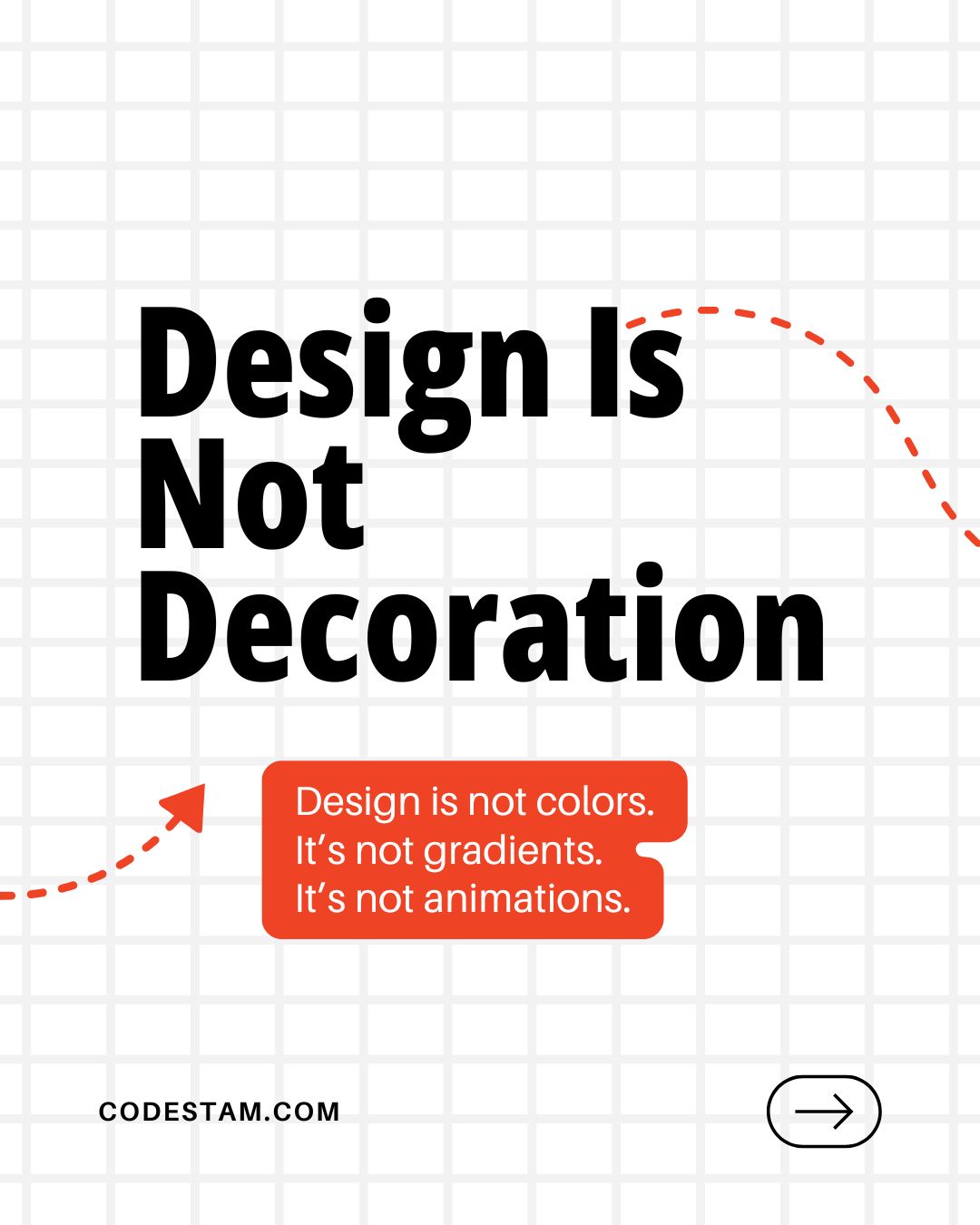
My designs started improving after this realisation. Early on, I believed good design meant doing more. More colours. More elements. More visible effort. If a design felt simple, I assumed it was weak. With experience, I realised something import
See MoreDownload the medial app to read full posts, comements and news.







/entrackr/media/post_attachments/wp-content/uploads/2021/08/Accel-1.jpg)


