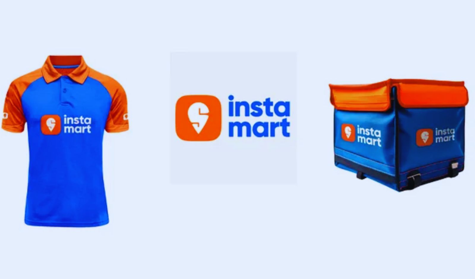
Instamart turns blue 🔵 & Here’s Why It Matters! 🔵
If you’ve noticed Instamart’s app icon and branding switching from bright orange to a fresh new blue, you’re not imagining things it’s a strategic rebrand with a purpose! 🛒✨
Why Blue?
Colors aren
See More
Anonymous 1
Hey I am on Medial • 3d
the blue looks way more premium than the old orange…
Instamart turns blue 🔵 & Here’s Why It Matters! 🔵
If you’ve noticed Instamart’s app icon and branding switching from bright orange to a fresh new blue, you’re not imagining things it’s a strategic rebrand with a purpose! 🛒✨
Why Blue?
Colors aren
the premium users posting 5X more content than regular because they want to win the creator program as ROI for the premium they paid
it's good or bad for long-term ?
Niket Raj Dwivedi
Harsh Dwivedi
2 replies5 likes
Chamarti Sreekar
Passionate about Pos... • 1d
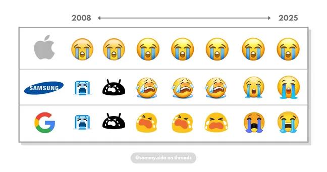
Apple has never changed its emoji design for more than 17 years, but it still looks good to this day.
0 replies7 likes
Comet
#freelancer • 8m
Started in 2023, Digital Labour Chowk is a Noida-based startup that created India’s first online job portal for blue-collar workers.
The platform aims to replace the old way of workers gathering at physical labour chowks to find daily jobs.
By mo
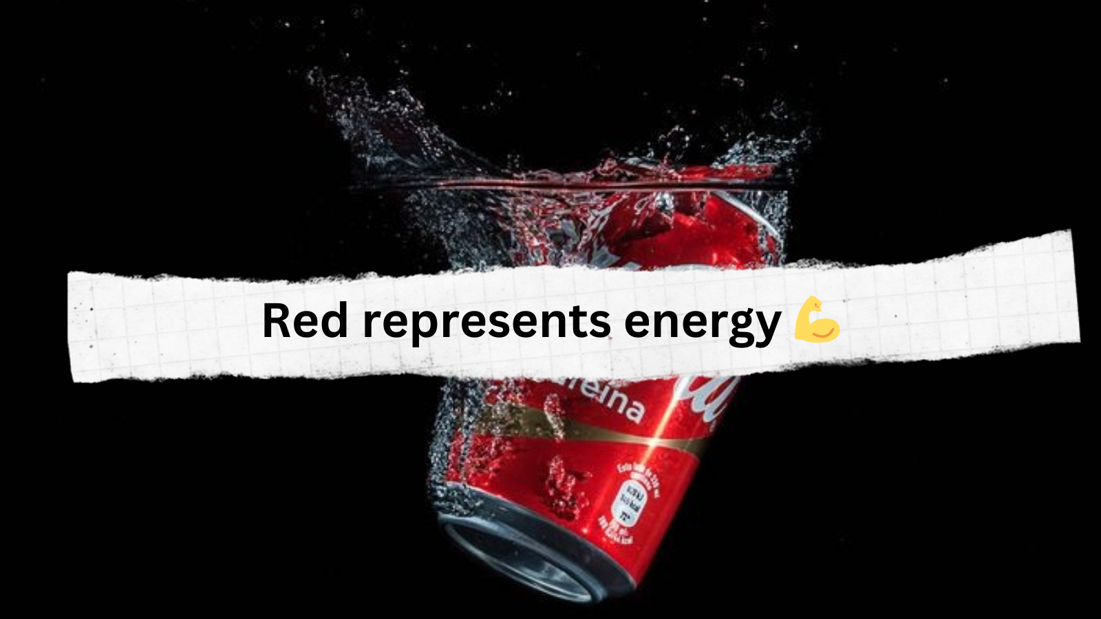
𝗪𝗵𝘆 𝗶𝘀 𝘁𝗵𝗲 𝗖𝗼𝗰𝗮-𝗖𝗼𝗹𝗮 𝗹𝗮𝗯𝗲𝗹 𝗿𝗲𝗱?
Because every brand color conveys some meaning which connects the customers emotionally 🖤
↳ Emotional Influence:
Colors evoke emotions; e.g., Coca-Cola’s red conveys energy, while Faceb