
Back

Makarand Mohite
Brand Designer • 20d
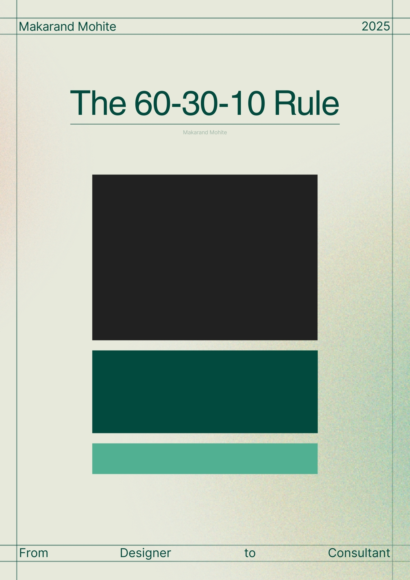
Good design is not about random colors. It’s about balance. The 60-30-10 rule is one of the simplest yet most powerful tools to instantly make your layouts look professional. Here’s how it works: 60% is your dominant color 30% is your secondary color 10% is your accent color This proportion creates visual harmony and keeps your design from looking messy or overwhelming. Whether it’s branding, UI, or even interiors, this rule is universal. Once you start applying it, your work automatically feels more intentional and polished. And that’s what separates a beginner from someone who understands the science behind design. 👉 If you found this helpful, check an example related to this - https://lnkd.in/d72JBQns
More like this
Recommendations from Medial


Makarand Mohite
Brand Designer • 18d
The Golden Ratio (1.618) isn’t just a math concept; it’s a timeless design secret used by nature, art, and top brands. It helps bring balance, harmony, and a sense of “rightness” into your visuals. Here’s how you can apply it in your design process:
See More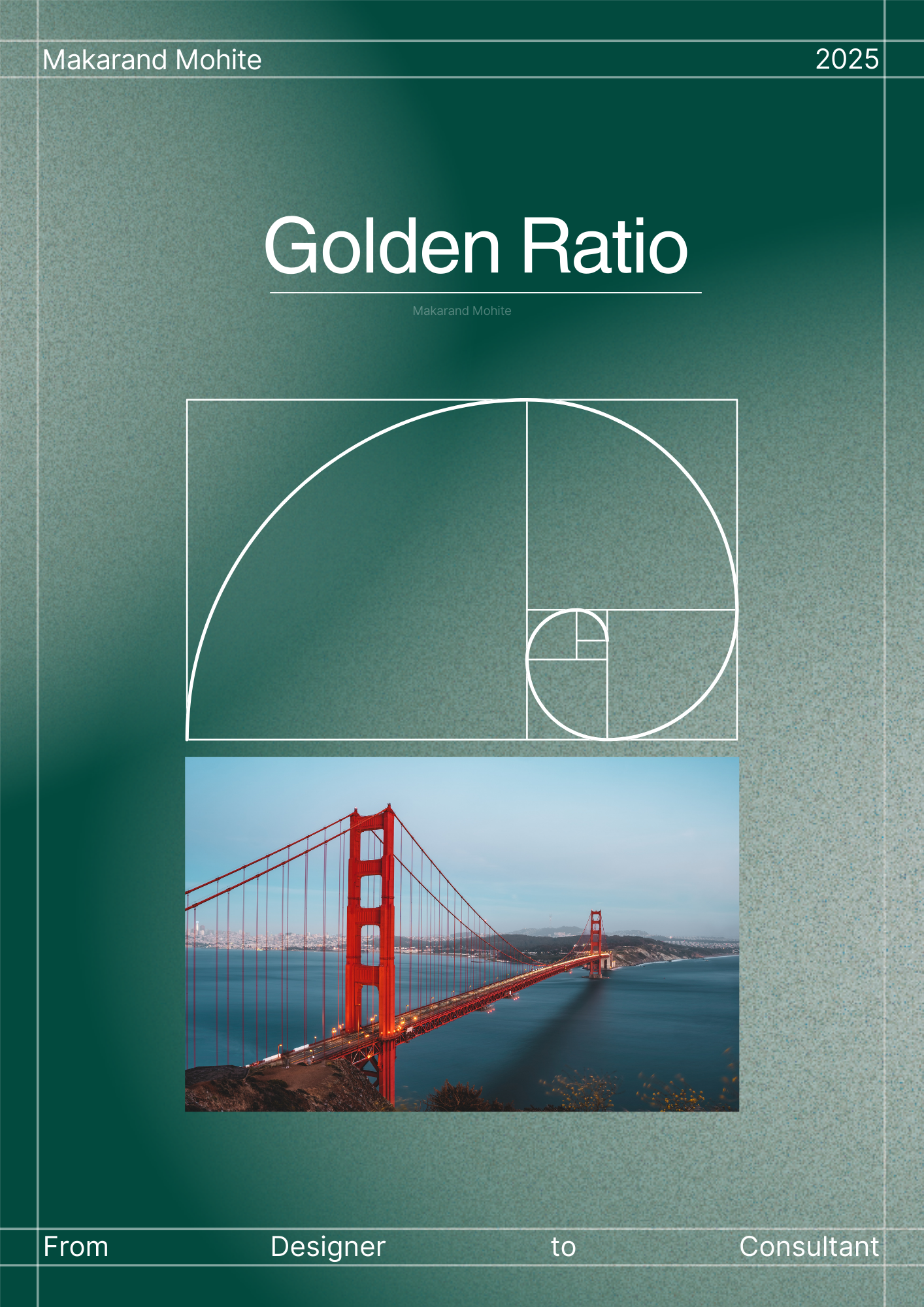


Download the medial app to read full posts, comements and news.