
Back

Comet
#freelancer • 4m
Graphic Design Roadmap – Step 2: Graphic Design Principles Master these *timeless principles* to create clear, engaging, and professional designs: 1️⃣ *Balance* ⚖️ Distribute elements evenly (symmetrical/asymmetrical) for visual stability. 2️⃣ *Hierarchy* 🔺 Guide the viewer's eye by making important elements stand out (size, color, weight). 3️⃣ *Proximity* 👥 Group related items together to show relationships and improve readability. 4️⃣ *Alignment* 📏 Keep elements visually connected through clean alignment (grid system helps a lot!). 5️⃣ *Repetition* 🔁 Repeat colors, fonts, and shapes to create consistency and strengthen brand identity. 6️⃣ *White Space* 🌬️ Give your design room to breathe. Empty space is powerful—it improves focus and elegance. 7️⃣ *Contrast* ⚫ Use differences (color, size, font) to highlight key parts and improve visibility. 8️⃣ *Simplicity* 🧹 Don’t overdo. Clear beats complex. Strip down to essentials for better communication.
More like this
Recommendations from Medial


Maniraj N G
Marketing & Systems ... • 1y
Symmetrical vs. Asymmetrical Business Models Understanding these two models can help you analyze how businesses operate and grow. Here's a simple breakdown: Symmetrical Business Model You get paid directly for the value you deliver. Example: A
See More
Kavya Chhabra
Crafting Visuals- Gr... • 1y
Here's what I have learnt in the Graphic Design institute : Tools and tools Graphic design institutes only teach tools like Photoshop and Illustrator. They never focus on basic concepts or foundation. They don't teach about color, typography, eleme
See More

Harsh Bhardwaj
Witness The Future • 6m
I'm looking for a talented graphic designer to help develop the visual identity for my new brand. This includes designing a logo, brand color palette, and overall branding elements. If you're creative, detail-oriented, and have experience in brand de
See More
Only Buziness
Everything about Mar... • 5m
“ Guide the Eye, Win the Click: Mastering Visual Hierarchy in Marketing” Visual hierarchy is the design principle that guides the viewer’s eyes to what matters most—in the right order. Great marketing doesn’t just look good; it leads attention. Si
See More


Pulakit Bararia
Founder Snippetz Lab... • 10m
There has been some controversy surrounding the JioHotstar logo, particularly about the irregular pattern around the star. Some argue that a more traditional, symmetrical design would have been a safer choice, but that's precisely what makes this l
See More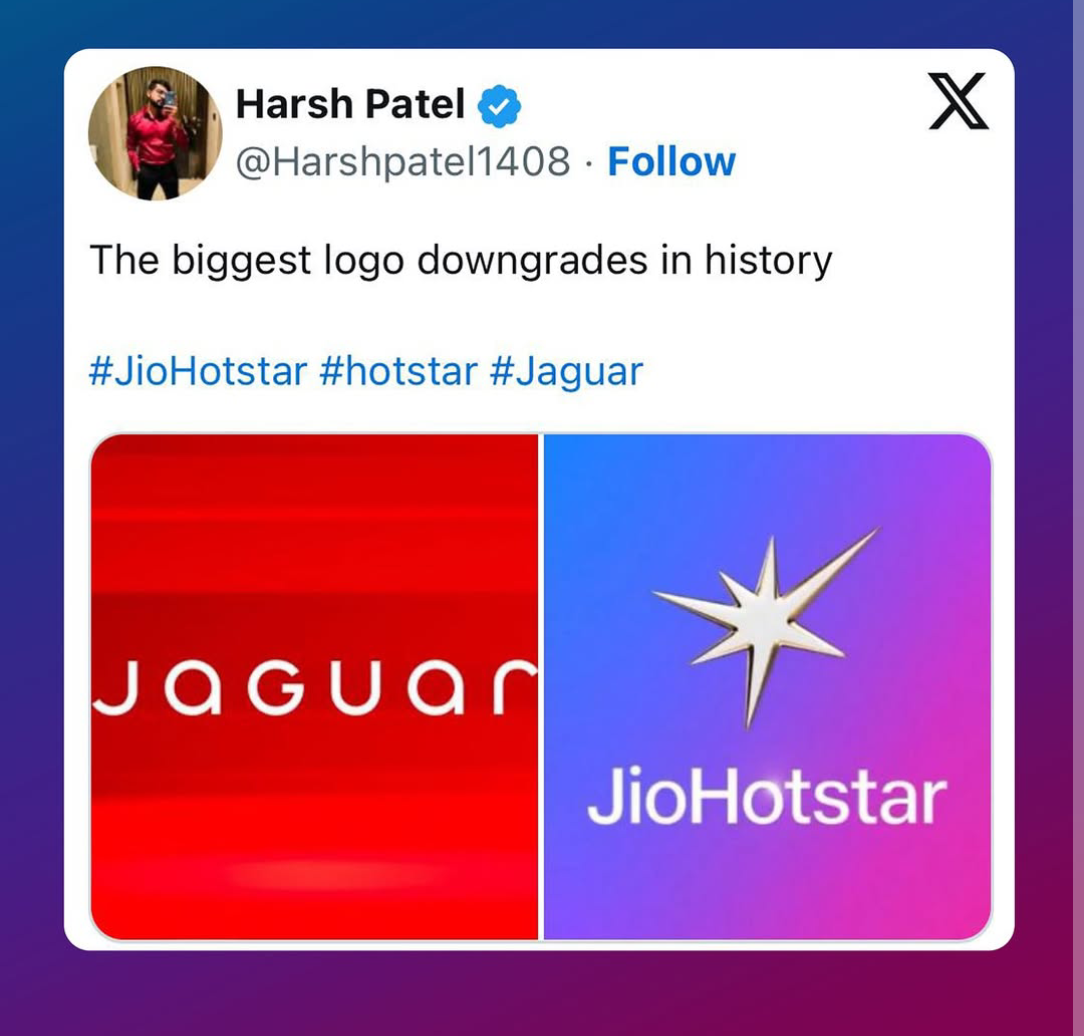


Download the medial app to read full posts, comements and news.