Back
vishakha Jangir
•
Set2Score • 2m
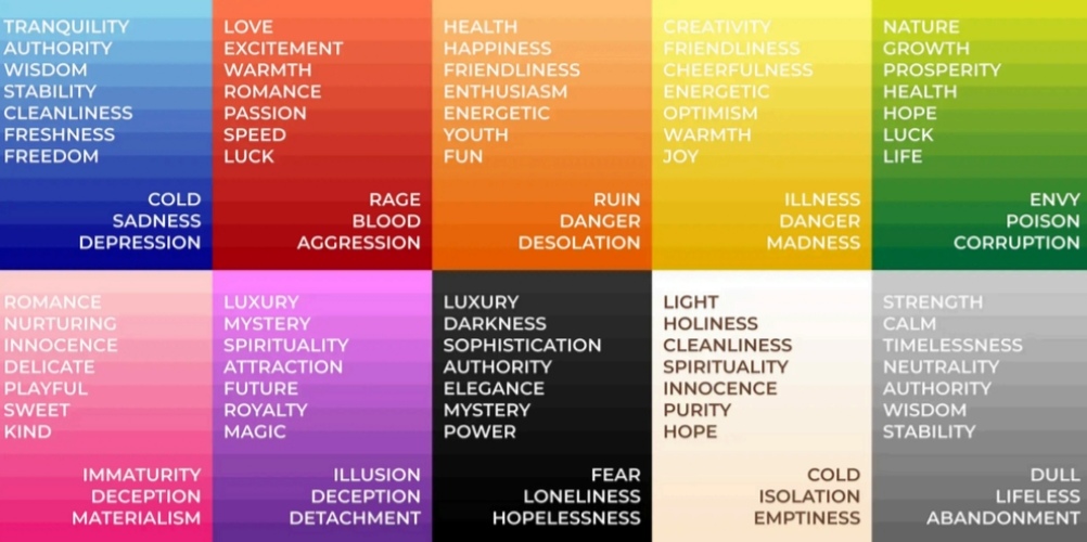
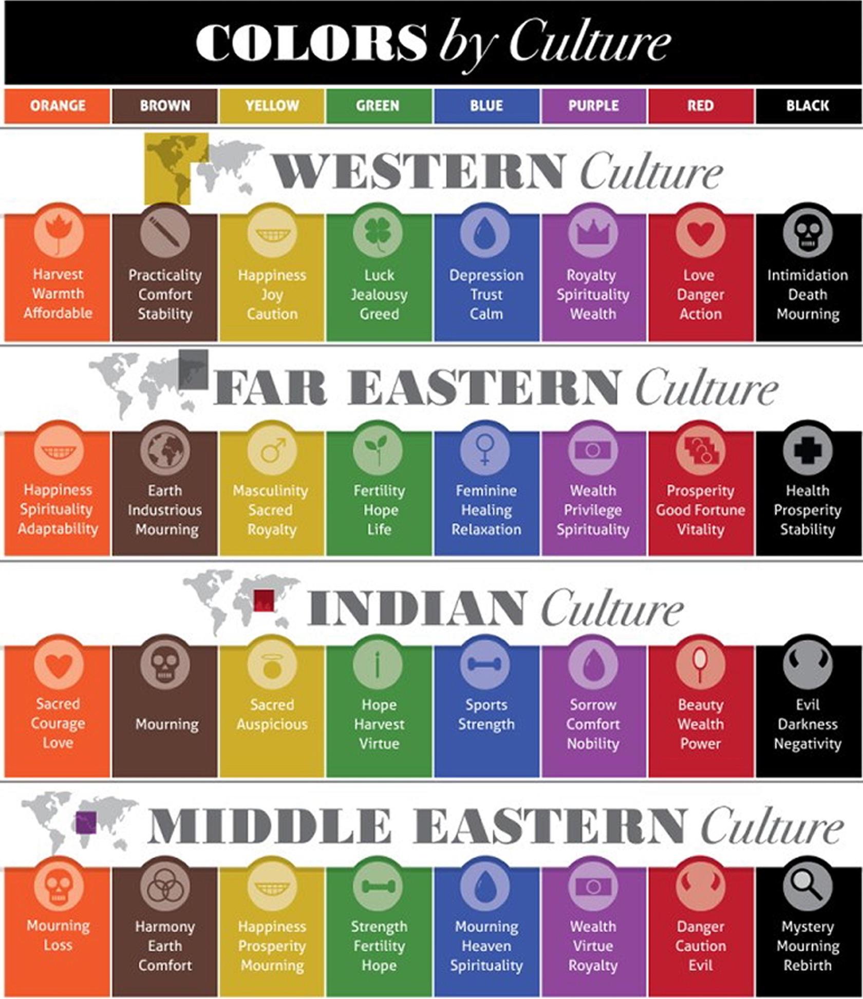
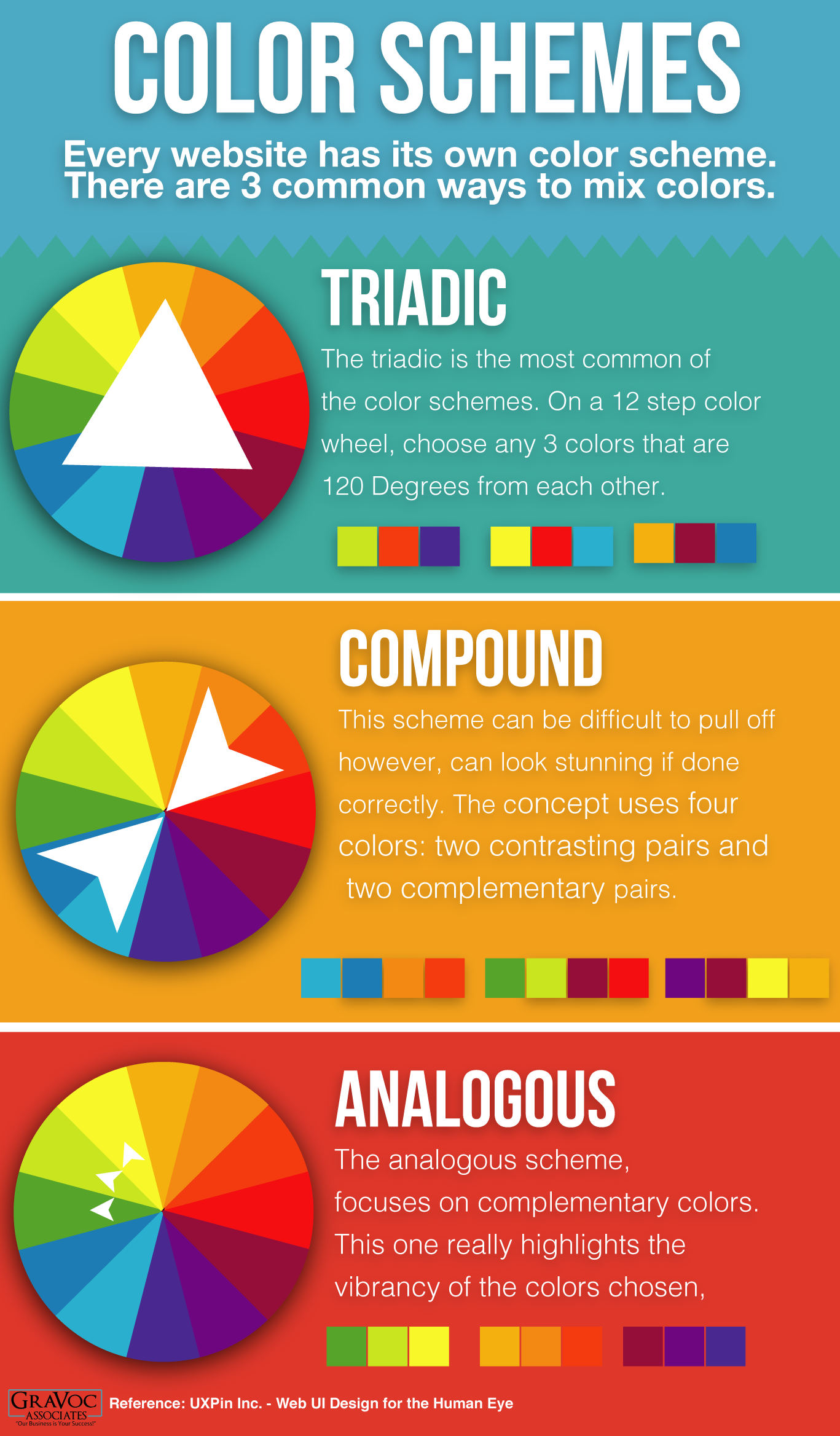
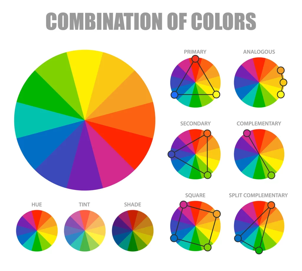
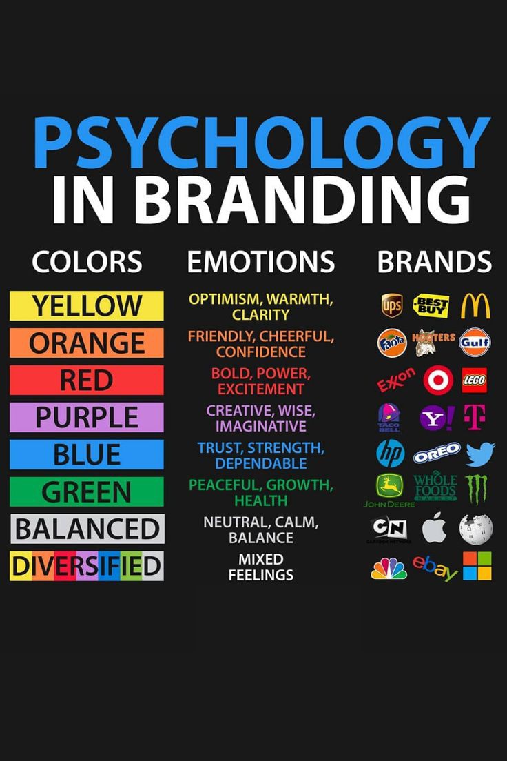
𝗚𝘂𝗶𝗱𝗲𝗹𝗶𝗻𝗲𝘀 𝗳𝗼𝗿 𝗖𝗵𝗼𝗼𝘀𝗶𝗻𝗴 𝗮 𝗖𝗼𝗹𝗼𝗿 𝗖𝗼𝗱𝗲 𝗳𝗼𝗿 𝘆𝗼𝘂𝗿 𝘀𝘁𝗮𝗿𝘁𝘂𝗽 !! 1. Define Brand Identity: Choose colors that reflect urgency, safety, trust, and professionalism. Think about how you want people to feel when they see your brand (e.g., alert, secure, confident). 2. Understand Color Psychology: Red evokes urgency, emergency, and alertness. Blue conveys trust, calmness, and reliability. White signifies cleanliness, clarity, and simplicity. Black represents authority and seriousness. Orange draws attention and signals caution. Green implies safety, approval, and success. 3. Limit the Number of Colors: Stick to 3–5 core colors for consistency. Use one primary color (e.g., red for emergency focus). Add one or two secondary colors (e.g., blue for trust). Include accent colors for highlights (e.g., orange or green). Keep neutral colors for backgrounds (white, gray, or dark shades). 4. Ensure Visual Contrast & Accessibility: Make sure text stands out clearly against backgrounds. Use high-contrast color combinations. Test colors with tools like WebAIM Contrast Checker for accessibility compliance. 5. Be Consistent Across All Touchpoints: Apply your color scheme uniformly on your website, app, signage, uniforms, and printed materials. This strengthens brand recall. Study Competitors and Industry Standards: Research color usage in emergency services and safety tech companies. Avoid copying exactly—differentiate while staying relevant. 6. Use Color Palette Tools: Explore palettes with tools like Coolors, Adobe Color, and Material Design Palette. Generate and test multiple combinations to find what feels right. 7. Test Emotionally and Practically: Show your color palette to potential users or team members. Ask what feelings the colors evoke—adjust based on feedback. Example GHV Emergency Palette (suggested): Primary Color: #D32F2F (Strong red for urgency) Secondary Color: #1976D2 (Deep blue for trust) Accent Color: #FFC107 (Amber for attention and alerts) Neutral Background: #F5F5F5 (Light gray) Text Color: #212121 (Charcoal black) Follow vishakha Jangir for more such business insights.
More like this
Recommendations from Medial


Anonymous
Hey I am on Medial • 1y
Color isn’t just about wavelength; context plays a crucial role too. For instance, an image of strawberries might appear red to us even if there are no red pixels. Our brains perform color correction based on lighting and familiar colors. This phenom
See More
Tushar Aher Patil
Trying to do better • 2m
💡 Why the color red makes you spend more — and you don’t even realize it. Walk into a store or open any shopping app. Spot something? 🟥 Red. Red sale signs. Red banners. Red timers ticking down. It’s not just about looking bold. It’s behavioral sci
See More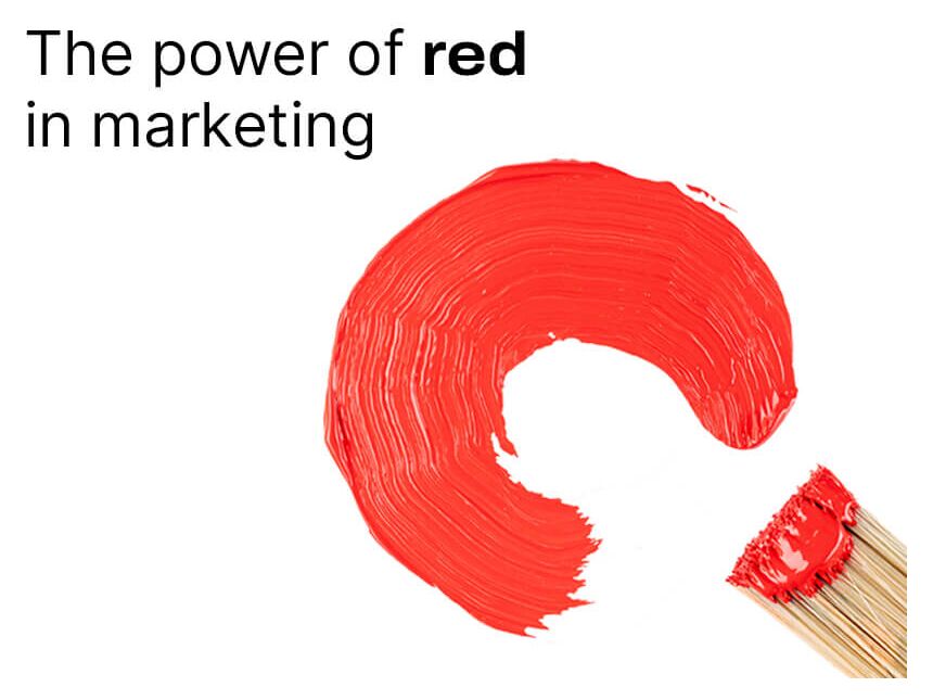
Download the medial app to read full posts, comements and news.


