
Back

Sresh
....... • 8m
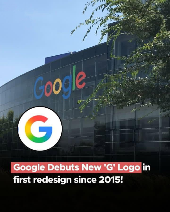
Google has unveiled a refreshed ‘G’ logo,the first major redesign since 2015 featuring a smooth, multicoloured gradient that replaces the segmented look. The new design reflects Google’s evolving visual identity, aligning with its AI-driven products like Gemini and AI Mode in Search.
Reply
12
More like this
Recommendations from Medial


JAY LAD
business-driven mind... • 1y
"A bold and dynamic logo featuring the initials 'RB,' symbolizing strength and fitness. The design reflects energy, health, and determination, perfectly aligning with the gym and fitness industry." rate the design (-/10)⚡ Comment down views✨ . . DM
See More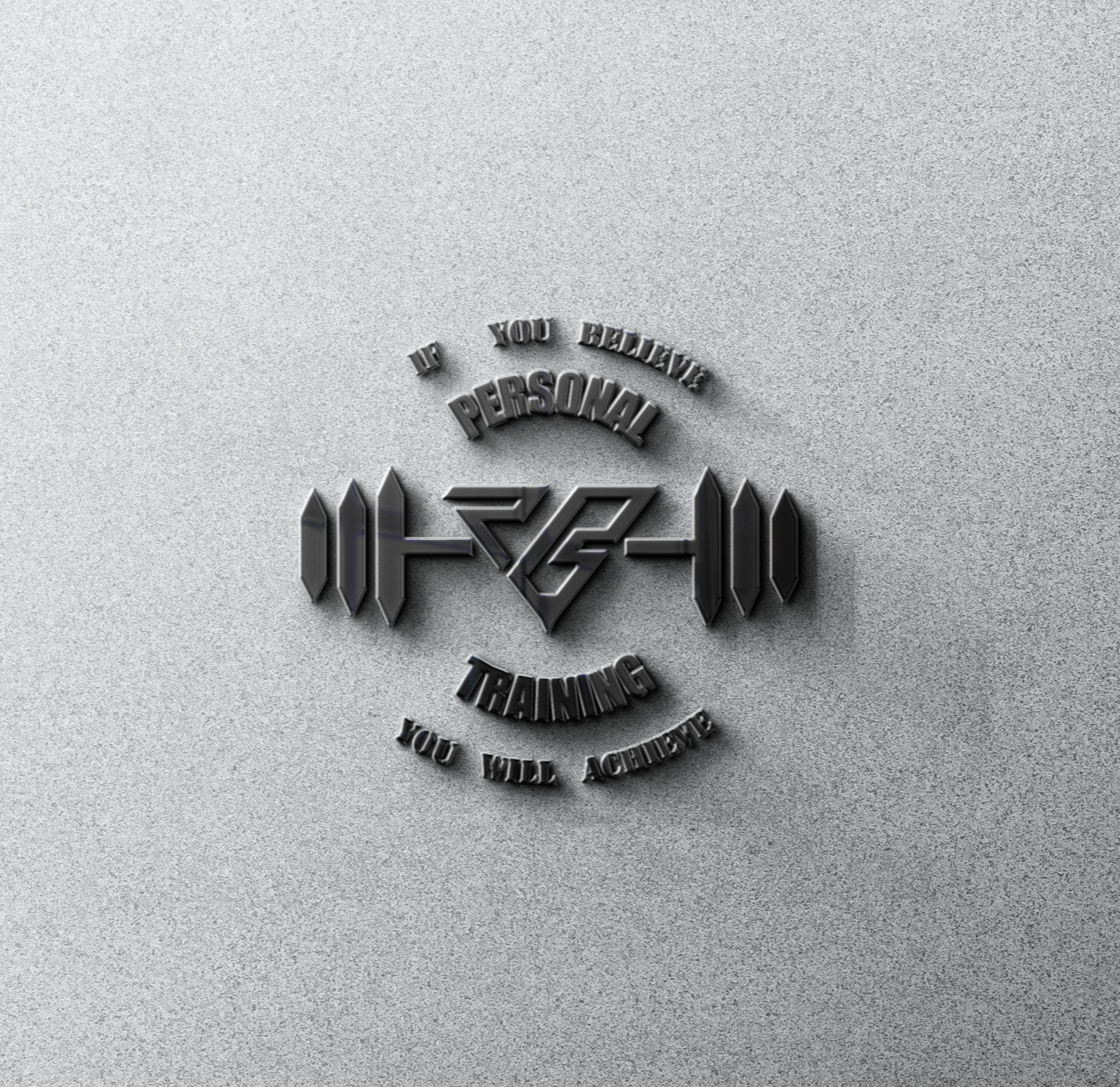
1 Reply
2


Download the medial app to read full posts, comements and news.