Back

Anonymous

Anonymous

 • 

Nebeskie • 6m

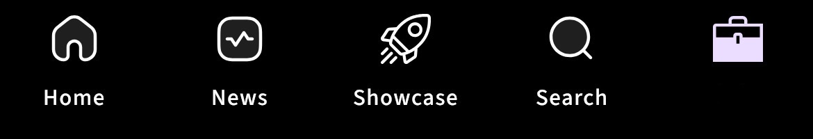
Harsh Dwivedi in light mode, why are the icons on the bottom navigation bar different. For example, the home, search, news icon are "duotone" but the showcase & jobs icon is "regular". It feels so asymmetric😅

5 Replies
3
Replies (5)

More like this

Recommendations from Medial

Image Description
Image Description

Niket Raj Dwivedi

 • 

Medial • 6m

Bottom Nav Bar is changing in the next release. Guess the new icon 👀

29 Replies
3
17
Image Description
Image Description

Jeevan

Learned a lot, a lot... • 22d

When I'm using the Medial app in light theme or in system theme, the status icons in the status bar turn into white colour due to which I'm unable to see those icons. Not sure if this is happening for all of you or just me. Maybe this was missed dur

See More
4 Replies
5

Vagle

Hakuna matata • 1m

I miss the time when the navigation bar on iOS and Android were completely different 🥲

Reply
7

Aayush Tripathi

 • 

YouTube • 11m

WhatsApp's update you must know about 👇 ✔ Chat filters: Find messages faster without scrolling through your inbox ✔ Voice messages: Send voice messages that disappear after being listened to ✔ Chat lock: Use a secret code to protect sensitive conve

See More
Reply
1
6
Image Description
Image Description

Armaan Nath

Startups | Product • 1y

A privacy policy that no one can read in dark mode, this privacy policy only works in the light mode. Ps: Glitch found ! Cc: @teammedial

2 Replies
4
Image Description
Image Description

Armaan Nath

Startups | Product • 1y

Dear Product Manager at WhatsApp, We just want to know the reason behind... 1. The big "search bar" on top instead of that search button. 2. The unknown shade of green color on notification and send button (dark mode). 3. Changing sweet and calm "ty

See More
6 Replies
1
10
Image Description
Image Description

Niket Raj Dwivedi

 • 

Medial • 1y

Are you using Medial in Light Mode or Dark Mode? You can change your device display settings and Medial’s app theme will change. I use the dark mode for less strain on eyes. Also, we are introducing in-app theme switch in the next release. 🤘🏻

2 Replies
3

ProgrammerKR

Founder & CEO of Pro... • 2m

Introducing ProXIcons- The Lightweight & Modern Icon Pack for Developers I'm excited to share ProXIcons v1.4.3–an open-source icon pack crafted specially for modern web and app development! Built with simplicity, scalability, and customization in mi

See More
Reply
3
Image Description
Image Description

Vishnu kumaran

Design guide for you... • 4m

9/10 AI companies use the "⭐" icon? Look around, almost every AI-powered feature has a star icon attached to it. But why? It’s not just a random choice. It’s branding psychology at play. Let’s break it down: 1. Stars symbolize excellence & trust T

See More
3 Replies
1
10

Download the medial app to read full posts, comements and news.