Back

Anonymous

Anonymous 1

Hey I am on Medial • 1y

The logo on the first glance looks a bit static, make it relatable to the concept of the app

1 Reply
2
Replies (1)

More like this

Recommendations from Medial

Image Description

Shreyash Siddharth

Engineer at Lana Hea... • 1y

why does the app logo looks npm

1 Reply
3
Image Description
Image Description

Chander Prakash

On the way to build ... • 1m

Hey folks. How the logo looks for our ongoing social app. must do comment

4 Replies
12
Image Description
Image Description

Vaibhav

IIIT Ranchi '25 | 3... • 1y

Trying out this app, on my first impressions looks like a twitter rip off

3 Replies
7
Image Description

Vikas Acharya

 • 

Welbe • 3m

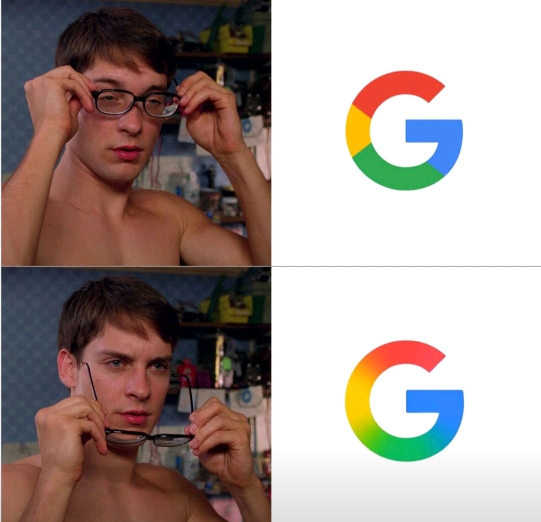
Google just updated their logo for the first time in 10 years ! your thoughts on this ?

1 Reply
4

Ayaan Ahamed

 • 

Urmila Info Solution • 1m

If your startup app feels like homework — you’re losing. Founders: Ask yourself this 👇 Would you use your own app if you weren’t the creator? We help turn: 🧠 Boring dashboards → Addictive interfaces 📱 Static flows → Behavior-driven journeys 📈 C

See More
Reply
1
Image Description

Mohammad Asaad Sayed

My mind to me a king... • 6m

A case study on “Brand Logo and Its Importance” Logo = your brand’s first handshake. Case study: “FitFlex” (fitness app) swapped their cluttered dumbbell logo for a sleek, dynamic “F” (symbolizing motion + progress). Results: -62% higher app downl

See More
1 Reply
2
10
Image Description

CHANDAN N

Start Up Enthusiast • 1y

Hi, Basically I liked the idea of this app, but here is the feedback I would like to give: 1.Maybe the UI should be more attractive, a bit of more colors, this is because now the feed looks like just a pile of notes. 2.I liked the smooth transition

See More
1 Reply
6

Download the medial app to read full posts, comements and news.